







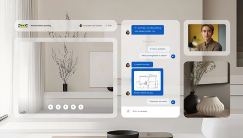













White Space

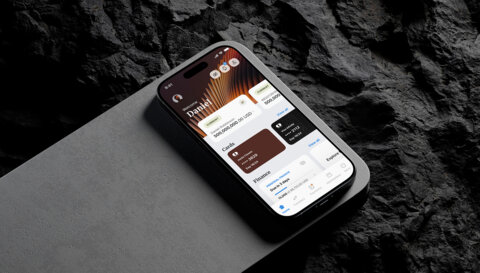
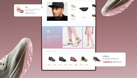
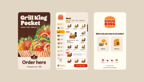
White space is a term used to describe the empty space around and between different elements of a digital product's design. Some refer to it as negative space. Designers intentionally use white space to balance the content elements of a product, like design components or texts.
White space is a valuable part of every design. It can make content more spread out and easier to scan, read, and digest given information. Users don't have to strain their eyes nor be scared by the content amount as it is given to them in smaller, neat pieces. Designers also use white space to make the design less cluttered and draw users' attention to the most important elements of the digital product: headlines, calls to action, and key information. As a result, white space enhances user experience because users can easily find the information they need without being overwhelmed by too many colourful elements or walls of text.
White space also provides designs with that clean, modern look that is considered to be visually appealing.
How to use white space effectively? Firstly, use it intentionally. Take into account your design's objective and consider how white space can contribute to achieving it. When you're establishing visual hierarchy or separating elements, white space could be most of use as it enhances the readability of your designs. However, the key to the effective use of white space is balance. Too little? Users will find the design cluttered and overwhelming. Too much? Poor and unappealing. Take your time and see what works for the project you're working on.
There are also certain things to avoid. When managing the white space, you shouldn't forget about the brand's guidelines. In other words, manoeuvre white space in line with your brand's visual identity. While you're focused on making beautiful designs, you shouldn't forget about the users. Do not sacrifice usability or accessibility in the name of aesthetics.
White space is a great tool, and in the hands of skilful designers, it really makes the designs pop.


