


A refreshed digital presence
of Poland's second-largest
beauty retailer.
Hebe
E-COMMERCE
B2C
RETAIL & FMCG
2019

[ around the web ]
[ PROJECT SUMMARY ] Launch an all-new e-commerce platform for Hebe – the second most popular health and beauty retailer in Poland. In under two months. Who needs beauty sleep, anyway?
Industry:
Retail & FMCG
Products:
E-commerce website
Market:
Poland
[ HIGHLIGHTS ]
-
Part of Jerónimo Martins Group – a Portugal-based international group specialising in food and retail
-
Group turnover of €20.889bn (2021)
-
Owner of the Hebe brand – a favourite among Polish women
-
Operates more than 290 Hebe stores across Poland
[ Challenges ]
(Not only) cosmetic
changes
Turn offline services into online experiences
Hebe were late to the digital transformation party. So it was our job to guide them safely through the pitfalls and complexities of the process – and get them looking fresh for a new audience of online buyers.
Create a flawless digital complexion
The new e-commerce platform is a significant milestone for Hebe. And it has to show the brand in its best possible light. As well as the usual discovery, strategy and design phases, rigorous quality assurance would be crucial.
Launch a thing
of beauty
Building a slick, high-converting e-commerce site in such a short time would always be a challenge. But with our mega-talented in-house team and our experience of similar projects, we knew we had the skills to deliver.
Over the past month, we have been doing internal and external user testing. The feedback about the design, navigation, intuitiveness, and ease of use has been extremely positive. The work Flying Bisons produced, the ideas they had, and what we were able to put into practice so far is very positive.
Francisco de Almeida
ECommerce Director, Hebe
[ Discovery ]
Good foundation is a key
Great businesses are built on exceptional experiences. To make those experiences possible, you first have to understand your users’ needs, motivations, pains, goals, and behaviours.
So that’s where we started with Hebe, as we do with all our clients. And we soon arrived at a key insight. Although our specific job was to digitise their offline services, we had to ensure the online offering provided the same consistent, first-class experience that customers receive and expect across all channels.

[ Approach ]
Nailing the process
Google Analytics and CRM data analysis
Based on our qualitative research and insights from the discovery phase, we created a clear and simple model of how the new e-commerce site would work. We defined the essential user flows and patterns, which let us move to the project's next stage with as little risk as possible.

Clarifying the scope and content of the new e-commerce site.
The old Hebe website was heavy on content and had dozens of subpages. So, before we could start creating any sketches, we needed to organise and prioritise the scope of the new platform.
We added multiple pages focused on e-commerce while identifying and removing old content with low view counts. Thanks to that, we could keep time and costs to a minimum and focus on the essential parts of the site.
Defining essential subpages and the interaction design.
Many designers start their design process with sketches, before jumping straight into wireframes. In doing so, they miss a crucial step: wireflows. Wireflows are simple sketches of the screens and interactions a user must follow to complete a specific task. And, on this occasion, they would prove to be an essential building block for the new platform’s success.
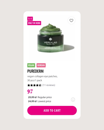
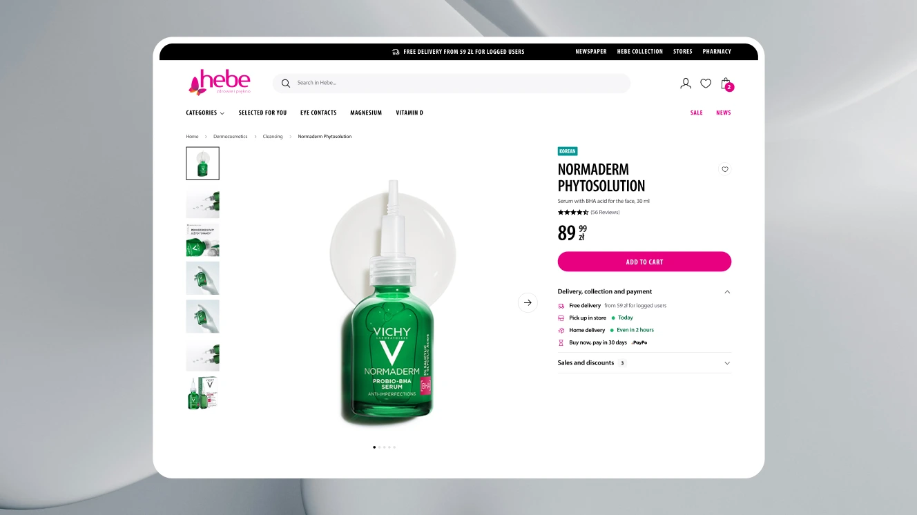
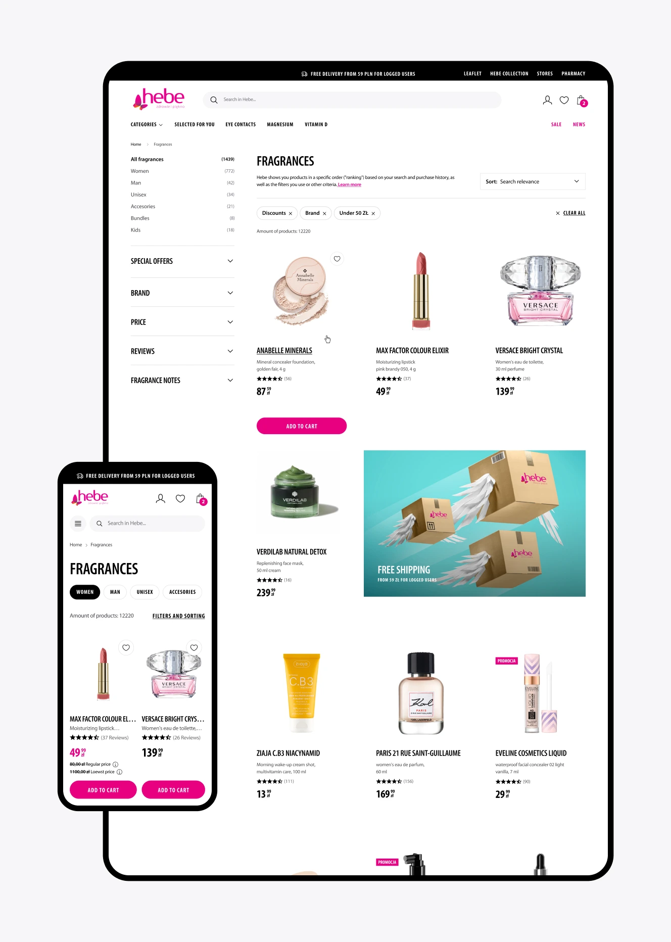
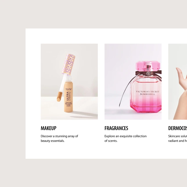
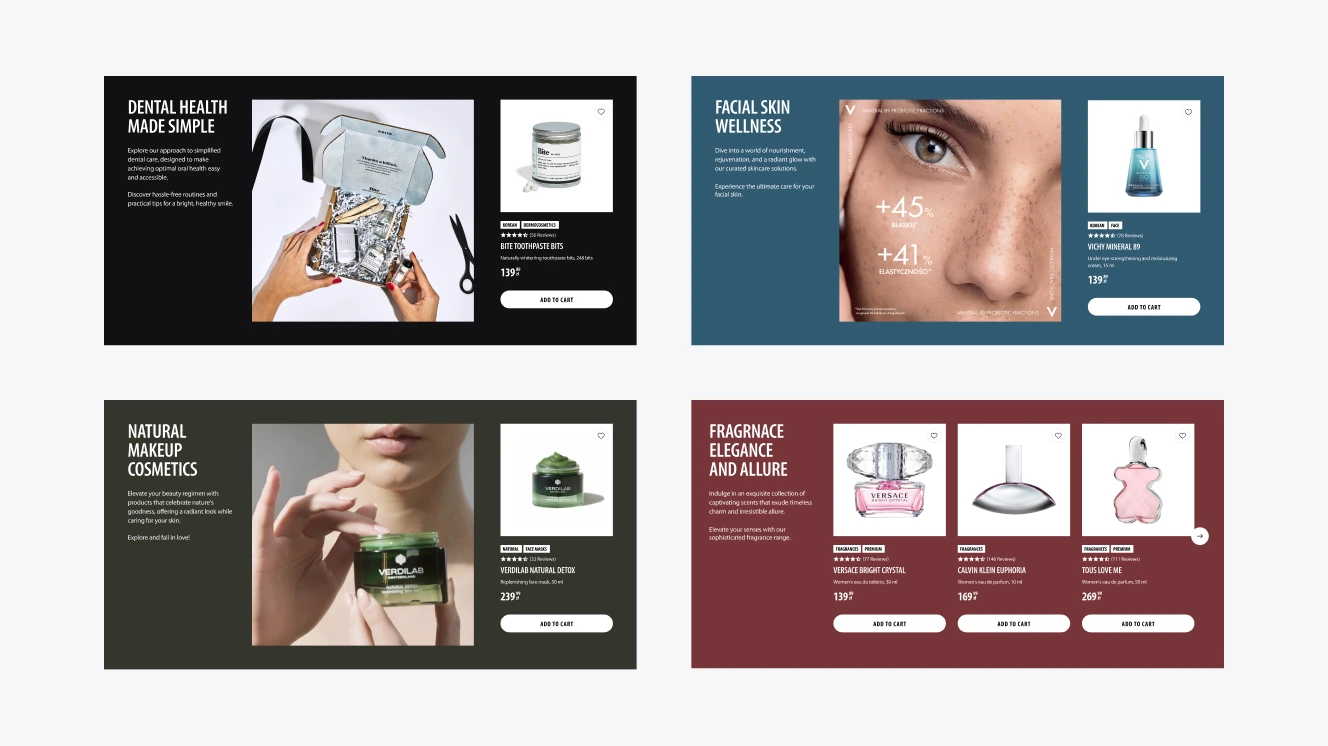
Simplifying the experience of browsing products and categories.
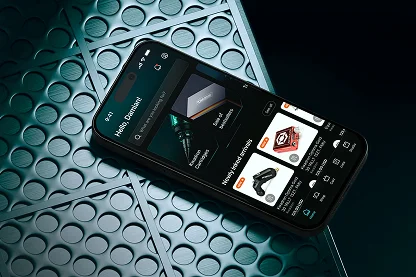
Finding simple, user-friendly ways to present product categories is challenging in any e-commerce project. In Hebe's case, we solved it by creating unique collections for all the main product categories – giving users an easy way to explore the most attractive offers.
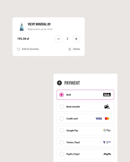
Getting the wireframes right.
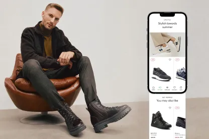
We created wireframes of 200 unique screens for web, mobile and tablet touchpoints. All our design decisions were based on our previous research and client collaboration, which minimised the risk of any major changes being needed after launch.
[ Results ]
No more blushing, the
results are stunning
They say beauty is only skin deep – and that’s as true in design as in life. An e-commerce site might look stunning on the surface, but if the underlying user experience is poor, customers won’t stay attracted for long.
Our process means that visual beauty and practical functionality are always delivered as standard. We think the new Hebe website looks like a million dollars zloty. And we’re sure it’ll be worth the same to the company’s bottom line – many times over.
More Case Studies
More
Case Studies


Unleash Your
Digital Potential
- Today.
Join our list of clients. You’ll be in good company.


