Presenting the power of
personalization for the
shoe e-retailer leader.
eobuwie
WEBSITE
2021
[ around the web ]
[ PROJECT SUMMARY ] Create a modular, highly customisable homepage for eobuwie – one of Poland’s largest and most popular online footwear retailers. It’s a task that might have had some consultancies shaking in their shoes. But not us. No, sir.
Industry:
Fashion & Textiles
Products:
Website
Market:
Poland
[ HIGHLIGHTS ]
-
Market leader for footwear retail in Central and Eastern Europe, with an emerging Europe-wide e-commerce platform.
-
Tech innovator for brick-and-mortar stores in Poland, focused on simplifying the shopping process.
-
Known for their exceptional user experience, and for sharing their passion for tech and fashion with customers.
-
Read about esize.me – eobuwie’s 3D foot-scanning tool that recommends shoes with the perfect fit.
[ Goals ]
Put a spring in
eobuwie’s step
Decrease bounce rates by improving the user experience.
Inspire users and encourage them to explore the site further.
Refresh the design to make the website more visually attractive.
Our new homepage meets all our business needs. It’s beautiful, customisable, and presents our offer in an amazing way. It’s great to work with Flying Bisons, as they’re a partner who truly understand your business.
Marcin Wcisło
Head of ecommerce experience design, eobuwie

[ Challenges ]
Making a little go
a long way
Limited scope
We could only make changes to the homepage.
The need for validation
All major modifications would need to be A/B tested.
Design constraints
The general design of the system had to be preserved.
Building in flexibility
The homepage needs to be easily modifiable for time-sensitive events, such as sales promotions and brand partnerships.
[ Approach ]
Making it
modular
Modules were the ideal solution to this challenge. Why? Because they’re perfect for e-commerce sites that regularly need updating. And because they give clients the flexibility to add and adapt content as their needs change.
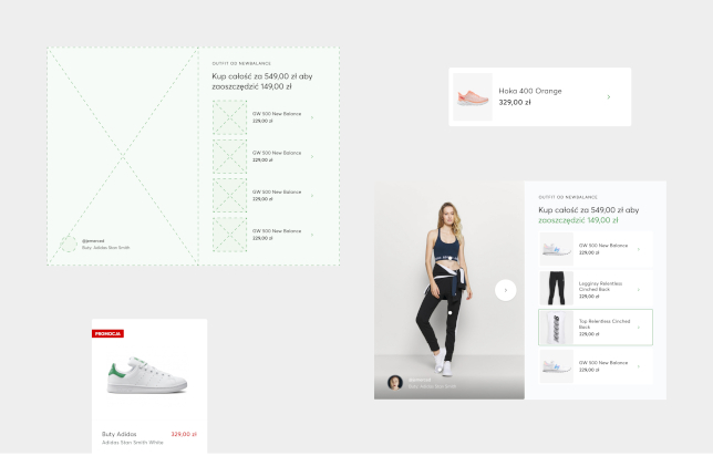
With a modular design, clients can set components freely (following our expert recommendations, of course). Their website is easier to maintain. And they have the power to choose different elements for specific types of content and promotional activities.
As designers, we love modules for their convenience when creating e-commerce sites. We can focus on a specific module, polish each element of it, and easily remember all the states. What’s more, we can be confident the website will always look great, thanks to the clear and practical guidelines we create for each client.
-
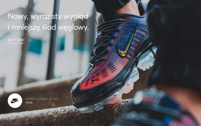
Editorial freedom
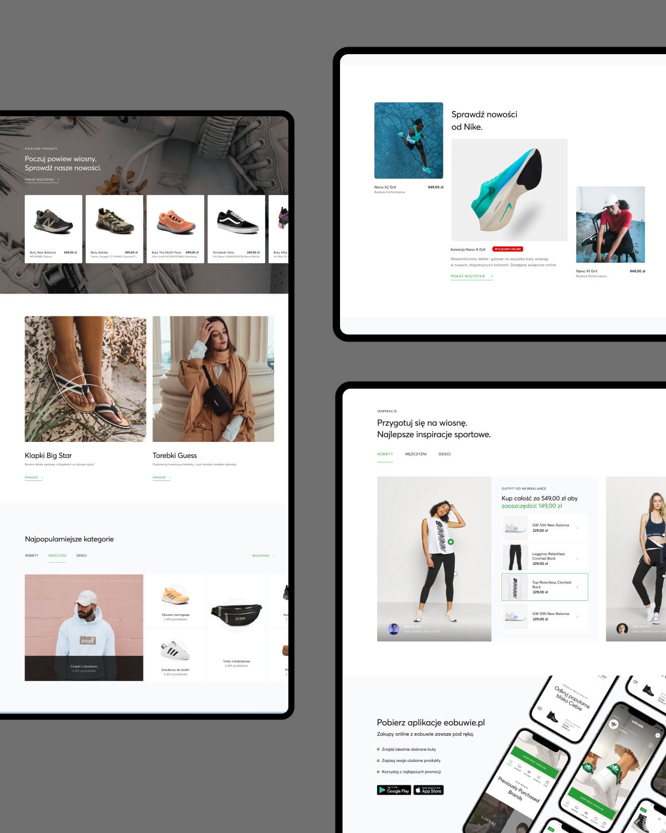
The eobuwie website features an editorial section. It plays an important role in promoting specific brands, presenting new arrivals, and inspiring the user to explore the range. We created five different versions of this section, giving the client much-needed flexibility and creative options.
-
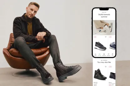
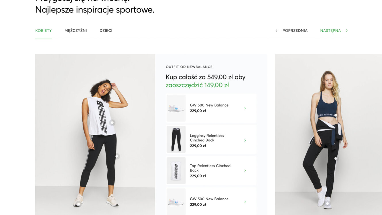
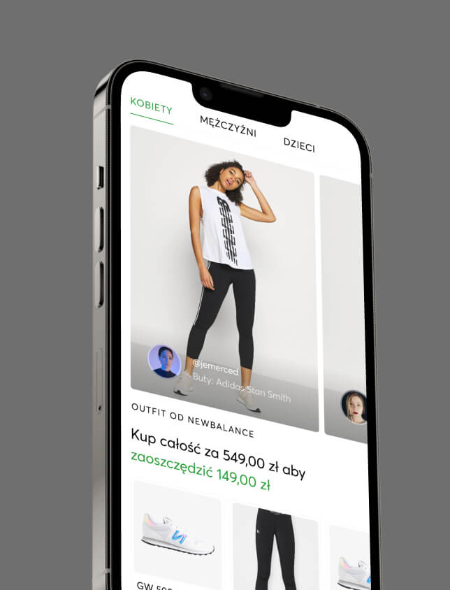
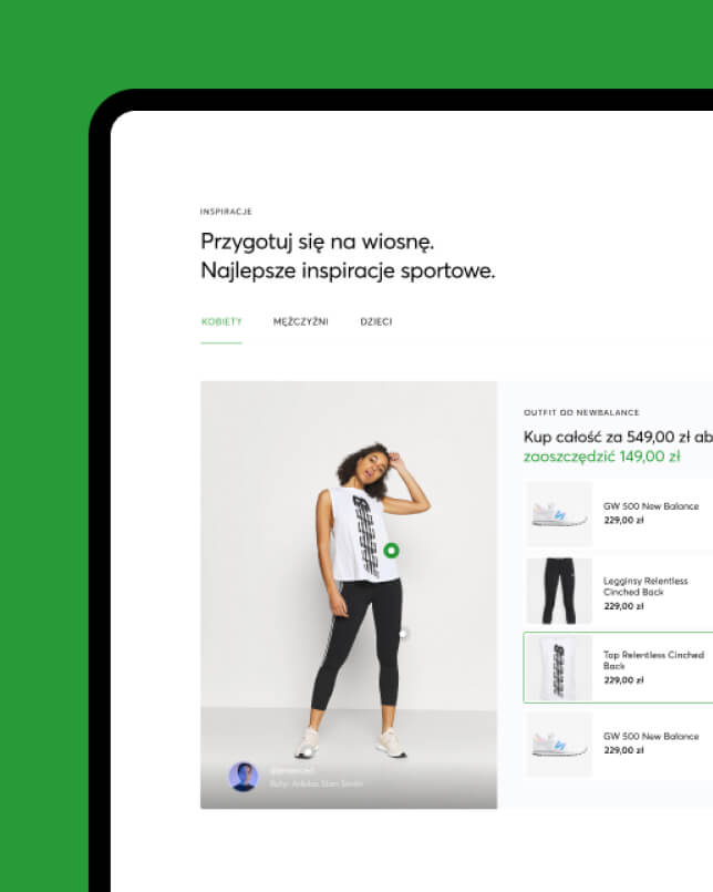
Outfit inspiration
Inspiring users was one of our main goals. We also needed to show that there’s more to eobuwie than just shoes, and that many other accessories are available too. We designed an outfits section that shows off the full range, while also promoting products from Modivo – eobuwie’s sister fashion brand.
-
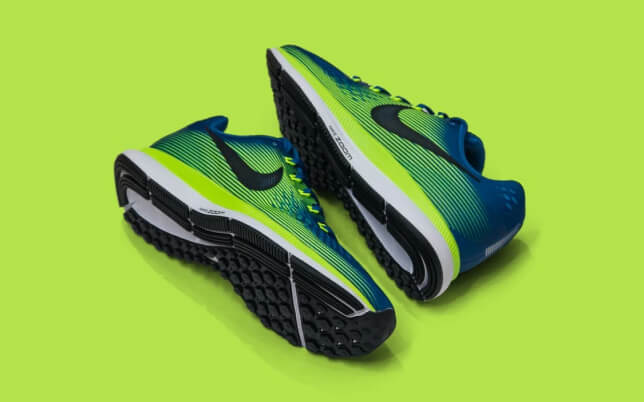
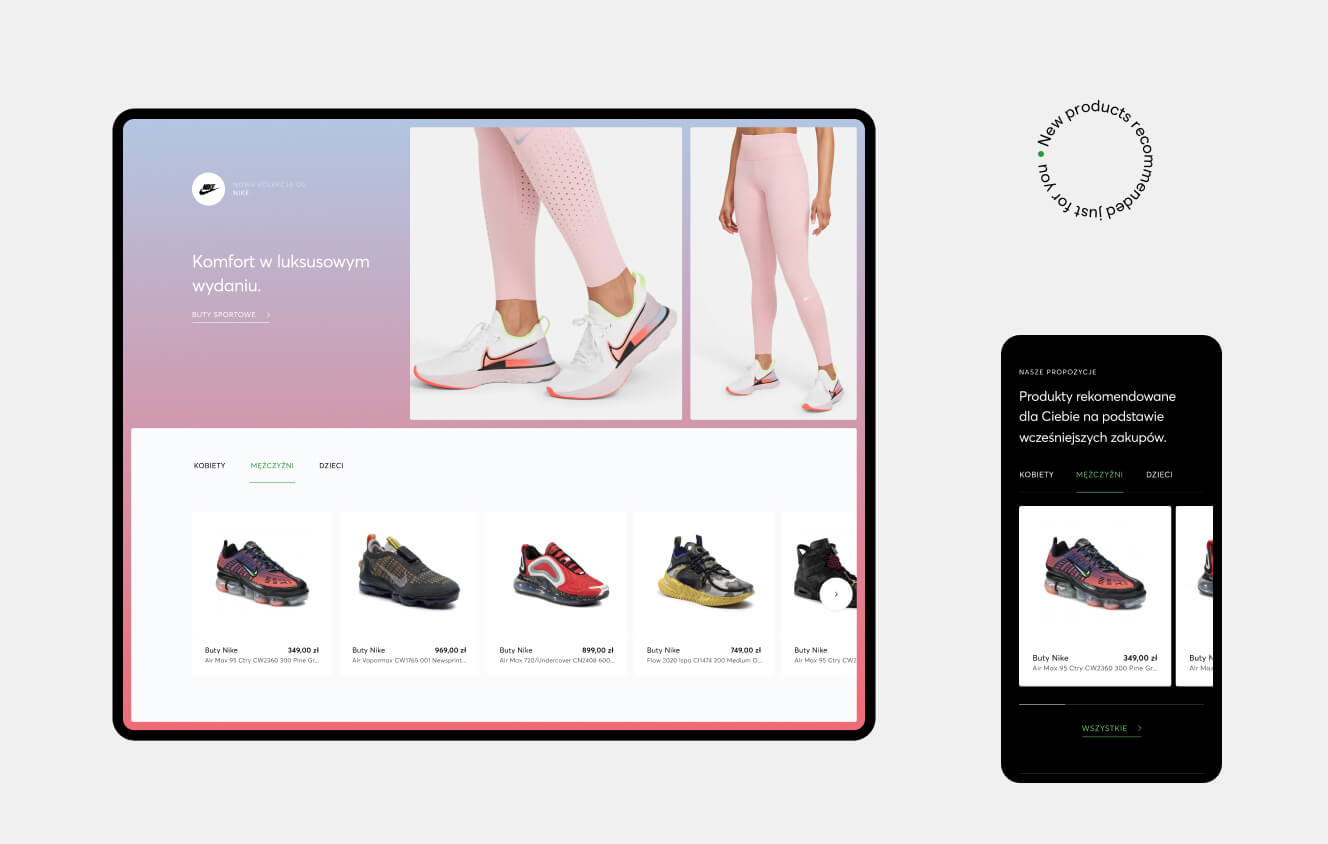
Impactful product carousels
We created various versions of the product carousel, each with different colours, layouts and elements. This was important, as we wanted to give eobuwie a solution for every situation, every promotional activity, and every idea they have for presenting products to their users.
[ Results ]
A fresher, more
efficient website
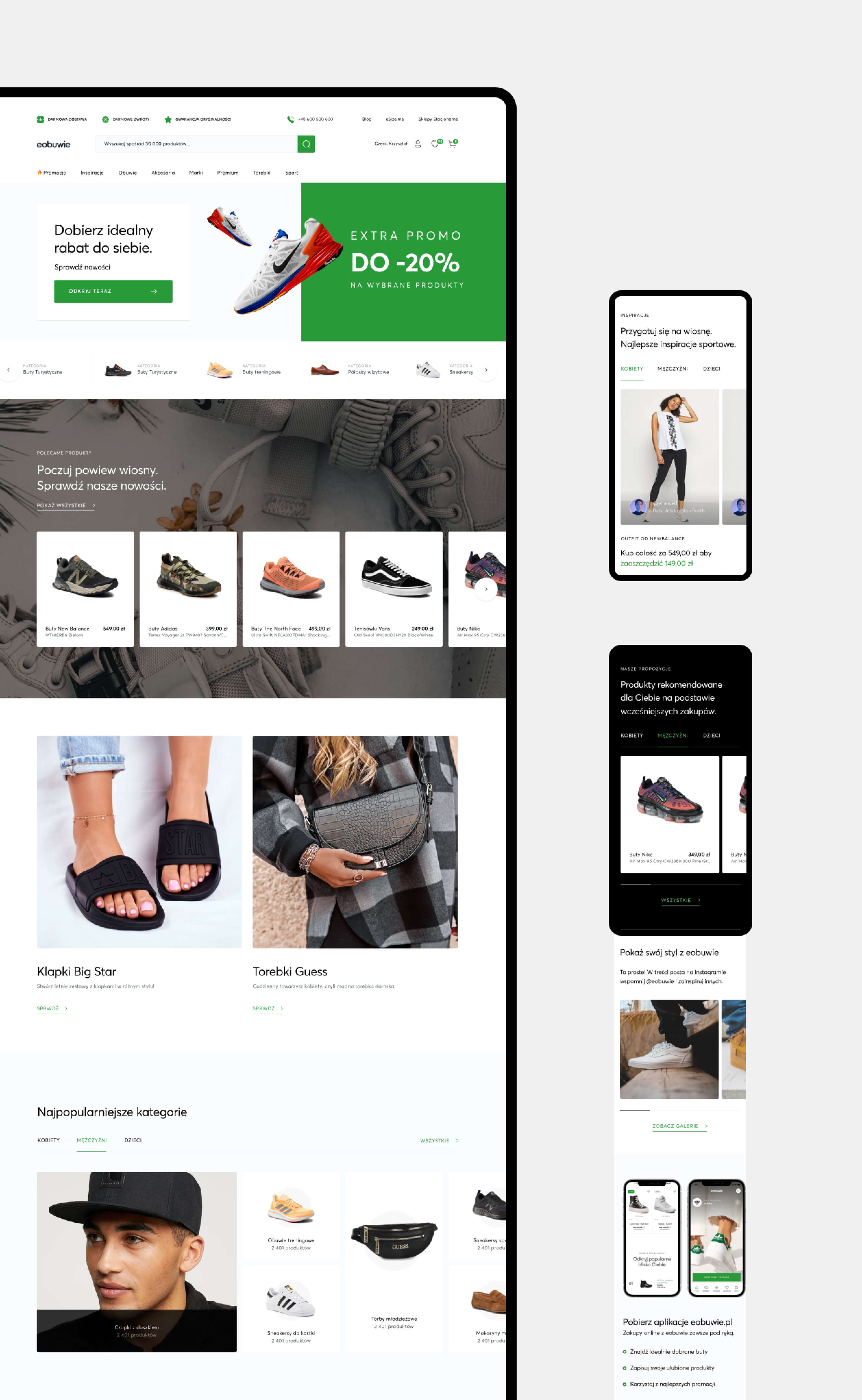
Gone is eobuwie’s old, ineffective and visually underwhelming homepage. In its place, we’ve created a new, vibrant and altogether more inspiring version. One that showcases the full range of products from various brands. And which has almost endless potential for customisation.
What we
delivered
32 unique components
We created 32 modules to use on the homepage.
12 product modules
The product sections are the most important parts of the homepage. We built 12 product modules, allowing eobuwie to customise the page for any promotions they need to run.
8,500 possible homepage versions
With the new modules, over 8,500 different page versions are possible. That’s a lot of potential to get your head around. So, to make it more tangible for our client, we provided clear and precise guidelines for how to build the site from the blocks we’d created.
“We wanted to create a Lego-like tool for eobuwie, with guidelines to help them create different versions of the site to suit their needs at any given moment.”

Natalia Sidor
UX Designer, Flying Bisons
More Case Studies
More
Case Studies
Unleash Your
Digital Potential
- Today.
Join our list of clients. You’ll be in good company.
