Mentoring DareIT to superb
UX optimisation, eye-catching
rebranding, and messaging uplifts.
DareIT
Online Courses & HR services
2023
Education & HR
B2C
[ around the web ]
[ PROJECT SUMMARY ]
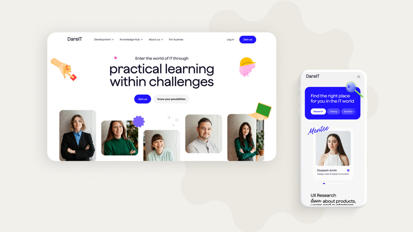
DareIT has supported many women in launching their IT careers. This time, however, it was the mentoring service itself that needed help. Specifically, with some design uplifts, branding magic and communication improvements on its e-learning platform.
So, did we… dare?
Industry:
Education & HR
Products:
Online Courses & HR services
Market:
B2C / B2B
[ HIGHLIGHTS ]
-
Leader and pioneer in local online tech education
-
Research cooperation with Stanford University
-
Wide range portfolio of global clients: Deloitte, Affirm, Brainly, Goldman Sachs, ING, Allegro
-
Best hiring and maintenance rate of alumnis
Scope of work
[ Challenges ]
Shaping the platform's
new communica-
tion
Creating a clear and convincing Unique Value Proposition for B2B and B2C offering
Optimising user experience along the entire customer journey
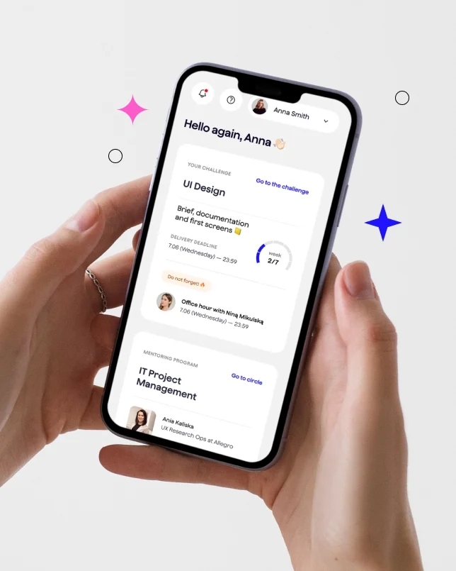
Bringing all the features of DareIT at the hand of the user
Building the brand perception of IT experts that will support users on their way to their first job in IT
DareIT is our passion project, to which we have dedicated a significant part of our lives. Therefore, choosing a partner to refresh our brand could not be random. Through our collaboration with Flying Bisons, we managed to uncover the hidden potential of our platform and elevate it to a higher business level.

Aleksandra Bis
founder, dare it

[ Background ]
Finding the missing link
Although DareIT has helped many people switch careers and improve their lives, they themselves faced some internal challenges limiting their potential.
Mainly – despite having valuable content, they needed help with presenting it effectively. Specifically, they would benefit from improved communication, branding, user flow, and the overall presentation.
On top of that, their educational platform was based on off-the-shelf SaaS solutions that weren’t optimal for delivering the best overall experience.

[ Goals ]
Formulating a consistent messaging
and improving the overall experience
Creating a new visual identity for the brand that will resonate with both B2C and B2B audience
Developing a compelling value proposition for the target audience
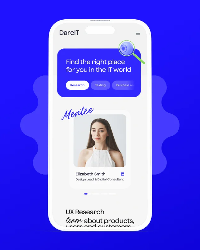
Preparing new UI designs for the website and the user platform
Working out the strategic assumptions about the business approach, brand positioning and the way of communicating their offer
“From the beginning of our partnership, we felt we were heading in the right direction. This was all thanks to the dedication and professionalism of the Flying Bisons team, along with their extensive knowledge of branding and design.”

Aleksandra Bis
founder, dare it
[ Discovery ]
Getting closer to the
target audience
To create an effective communication strategy, defining the user group precisely is a must. So, our common journey started with a detailed analysis and segmentation of DareIT’s core audience.
In general communication, DareIT supports women in their professional shift towards IT. This message is clear and explanatory, but it has one issue – it's very general. A precise and efficient communication demands more details. So, our analytics team started digging deeper.
By analysing users data, we figured out that the main audience can be divided into three groups – two B2C and one B2B:
-
Preppers (B2C)
People at the beginning of their journey in the IT world, who need motivation, support and (almost parental) guidance in the new environment.
-
Seekers (B2C)
We can call them the "grown" preppers. They actively seek new job opportunities, so they only need a little theoretical knowledge – and also guidance like preppers. They also benefit from practical experience and networking.
-
Companies looking for new talent (B2B)
DareIT is also a place for companies. So, the third target group includes organisations looking for new talent that want to enhance their brand awareness, employer branding, and are building an industry leader position.
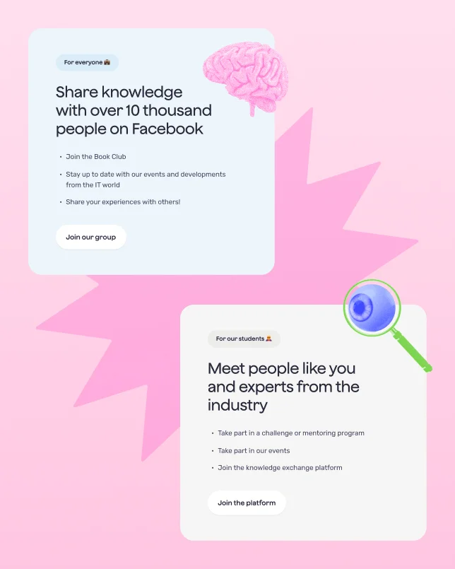
To precisely address the needs of the main target groups, we had to focus on articulating a clear and compelling value proposition.
By understanding the challenges of shifting careers – especially in IT – DareIT carefully defines its role as a crucial support system and a place with comprehensive offers for individuals and businesses.
Here are key insights from our work on the unique value proposition:

-
Strategic partnerships

DareIT establishes itself as an indispensable bridge for those transitioning into IT, providing a range of support from specialised courses to mentorship and business collaborations.
-
Unique support system

By showcasing its partners like the Stanford University, and success with global clients, DareIT emphasises its commitment to quality and extensive support network.
-
Visual and mission alignment

The brand's refreshed identity vividly conveys DareIT's mission, reinforcing the bond between its values and services, making DareIT a reliable ally in career transformation.
[ Branding ]
Building a playful
umbrella brand
The term ‘playful’ captures a mood of enjoyment, creativity, curiosity, and humour, ideal for those exploring new opportunities in a supportive setting. This concept guided us through the branding process for DareIT's platform.
Whereas the umbrella brand symbolises the coverage of the three target personas – preppers, seekers, and hiring companies – under one, consistent branding.
So, what was the journey that led us to this result?

-
Communication Challenges
Despite DareIT's effective e-learning platform aiding significant career transitions, their messaging lacked consistency across different mediums. Social media portrayed a playful, supportive brand, whereas the website emphasised acquiring practical skills for IT jobs, leading to confusion.
-
Strategic Redesign

To unify the communication and ensure the playful approach, our team redesigned the messaging of the platform. From crafting a unique value proposition tailored to both individual job seekers (B2C) and potential business partners (B2B), to ensuring consistency and clarity in DareIT's messaging on all platforms.
[ ux/ui design ]
Three perspectives,
one brand
After the discovery and branding, we had to teach the platform’s visual side to speak in its new, refreshed language.
The main challenge was to address multiple perspectives – preppers, seekers, and companies looking for new talents – simultaneously, ensuring inclusivity and functionality for all. This required an all-round approach to the platform functionality and content.
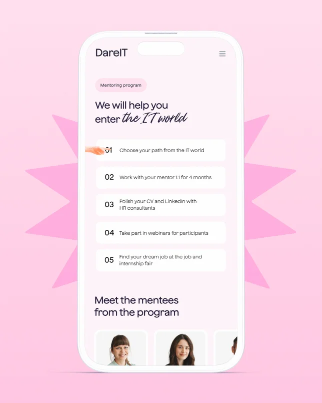
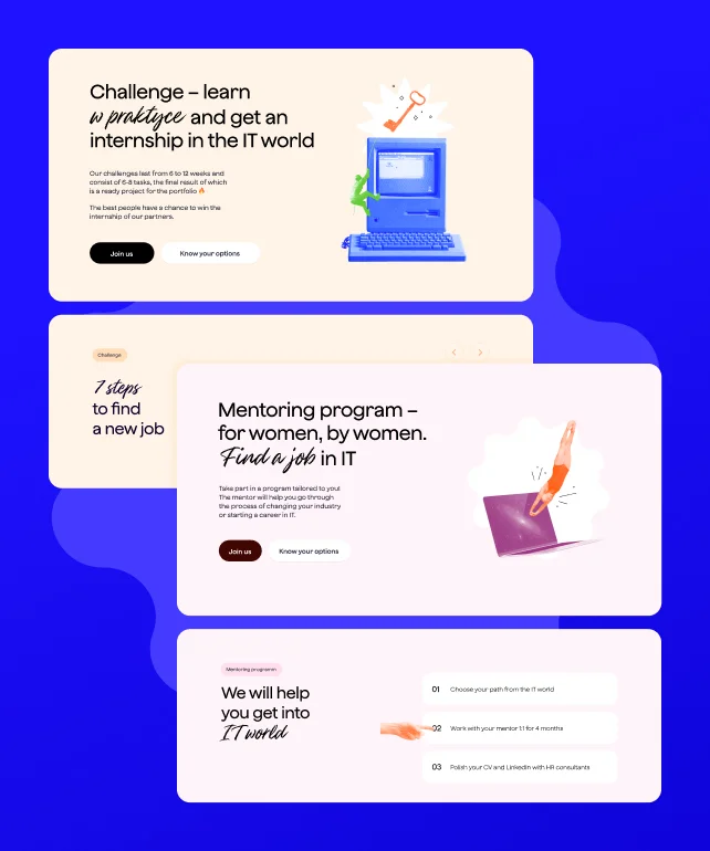
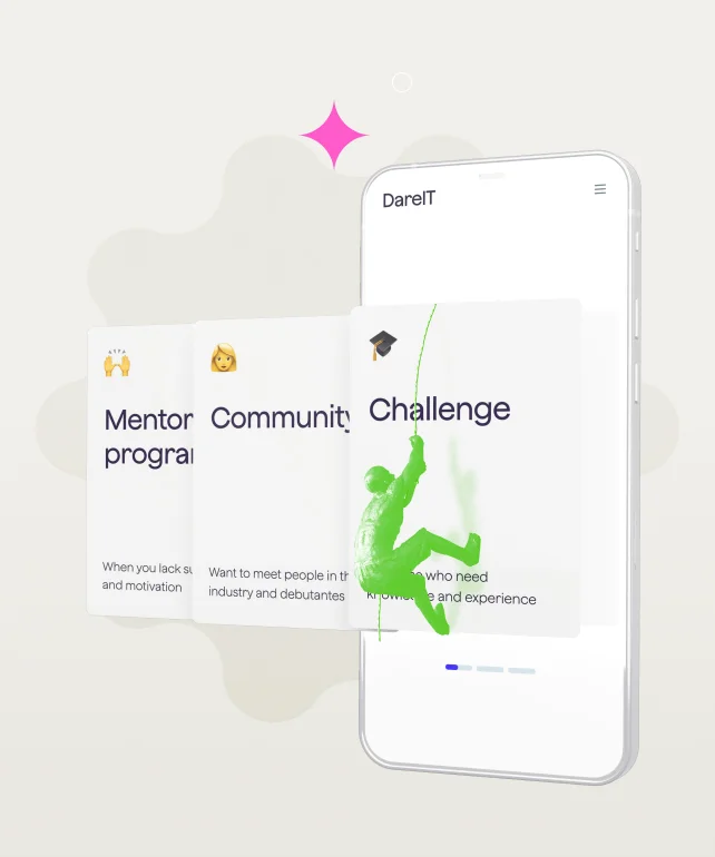
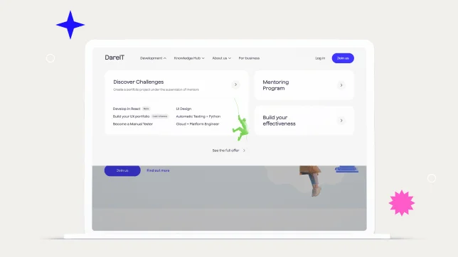
Our team began with a competitor analysis and benchmarking to grasp the digital solutions that resonated with similar audiences and to identify best practices. This research informed the redesign of DareIT's website with an emphasis on clear information architecture and intuitive navigation.
Optimisation of the platform’s key elements
By structuring the website to clearly present all offerings at once and providing easy access to detailed information about specific initiatives, we helped DareIT present a unified brand. This approach also effectively met the diverse needs of their audience, enhancing both engagement and user experience.
Key improvements included:
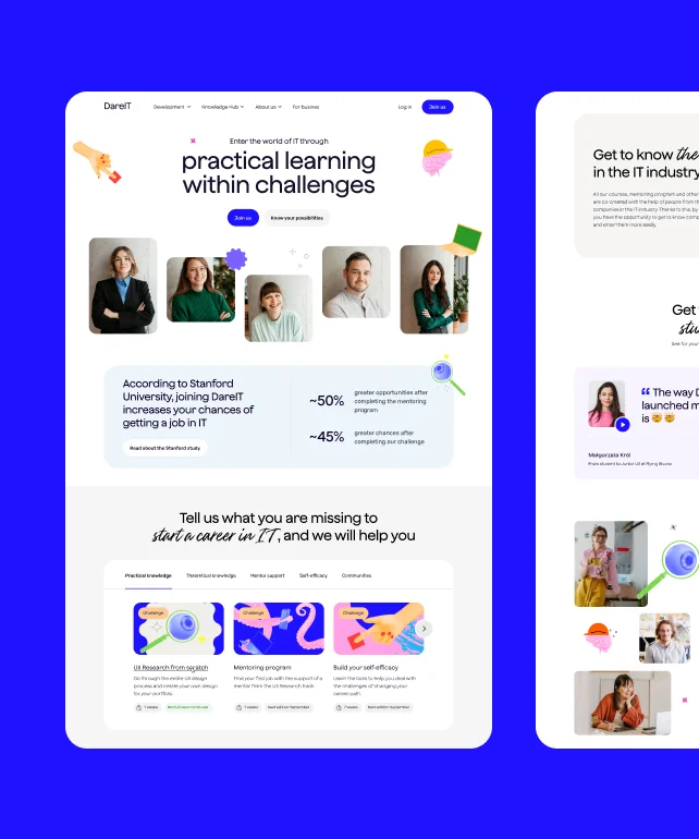
-
Hero section

Instantly communicates DareIT’s mission, setting the tone for the user experience.
-
Credibility and trust

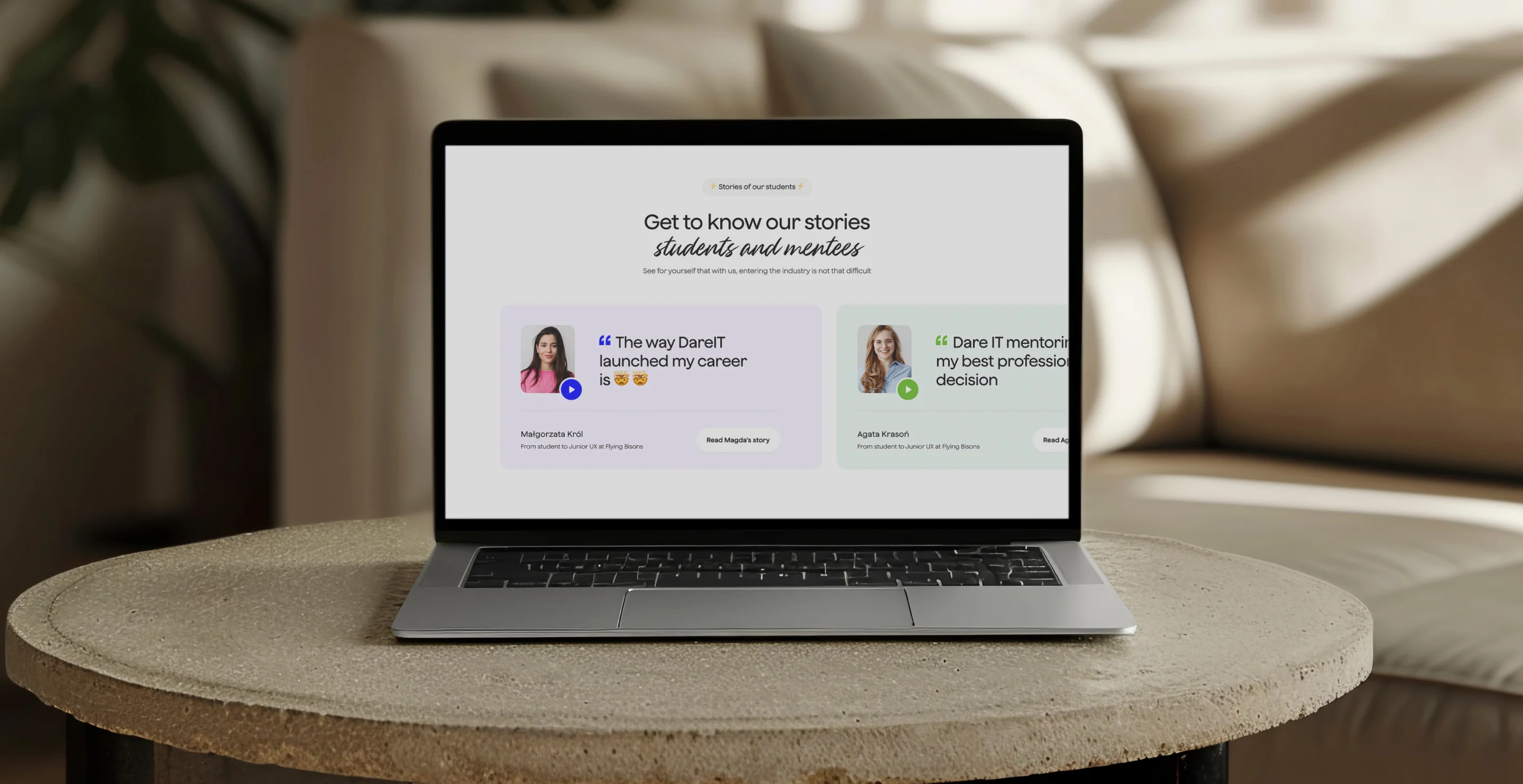
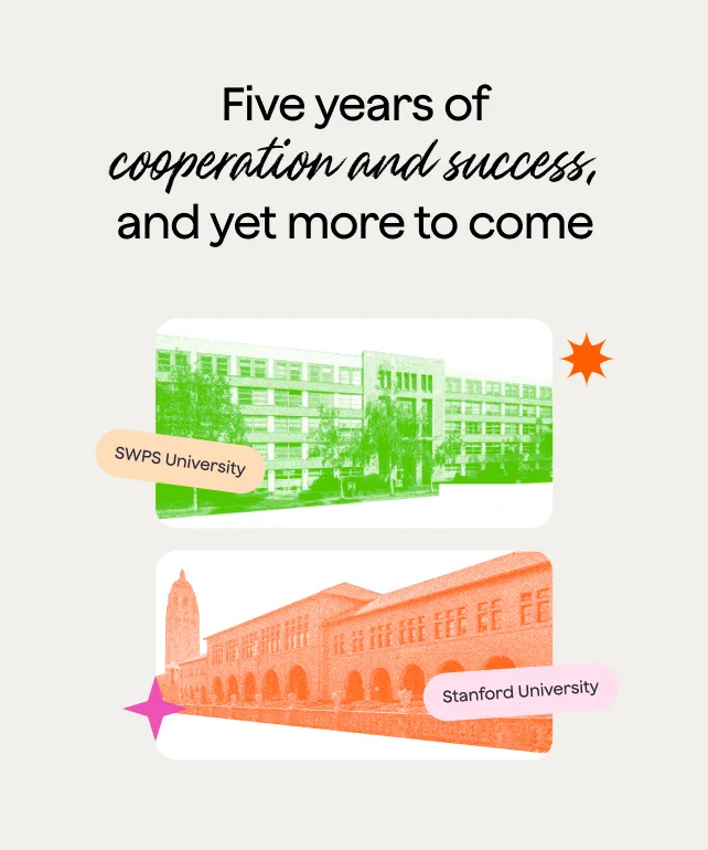
Highlighted testimonials and partnerships – like with Stanford University – establish trust and credibility.
-
Targeted subpages

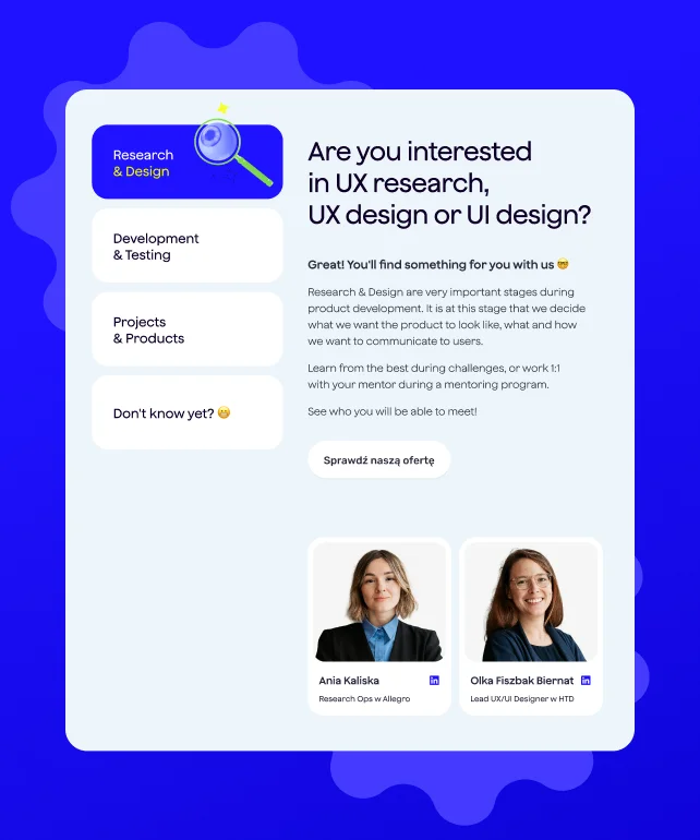
For example, the "Development" subpage was optimised to allow users quick access to relevant parts of the offering – such as challenges or mentoring programs, tailored to their specific needs.
[ Results ]
New website front
addressing users’ way of
thinking
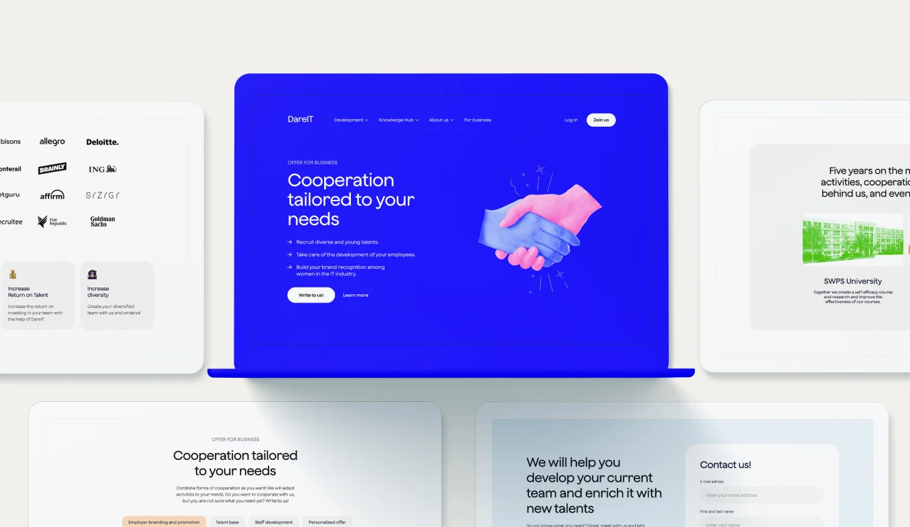
DareIT, a platform dedicated to empowering people to kickstart their IT careers, went through a comprehensive rebranding and UX/UI redesign to enhance its appeal and functionality. The project aimed to address the platform's challenge of effectively communicating its value and offerings, utilising detailed audience segmentation to tailor the experience to key demographics – notably women aged 25-35 not currently working in IT.
A "playful umbrella brand" was introduced to merge professional career support with a joyful learning environment. This strategic shift not only improved the platform's usability but also aligned its messaging across various channels, ensuring a consistent and engaging user experience.
The redesign, emphasising a playful yet professional vibe, successfully reinforced DareIT's position as a leader in online education and career development in the IT sector.


“Flying Bisons approached our project very methodically. They started by understanding our needs and challenges, provided substantive support, and finished with a final refresh of our platform. We felt that we were in good hands.”

Aleksandra Bis
founder, dare it
More Case Studies
More
Case Studies
Unleash Your
Digital Potential
- Today.
Join our list of clients. You’ll be in good company.


