
















Creating an innovative corporate
website for Poland’s largest brewing
group.
Kompania Piwowarska
RETAIL & FMCG
CORPORATE WEBSITE
B2C
B2B
[ around the web ]
[ PROJECT SUMMARY ] Create an international corporate website that clearly communicates who Kompania Piwowarska (KP) are, and correctly channels their new visual branding. Hold our beer – we’ve got this.
Industry:
Retail & FMCG
Products:
Corporate Website
Market:
Poland & International
[ HIGHLIGHTS ]
-
Founded in 1999
-
Poland’s largest brewery group
-
Notable brands include Tyskie, Lech, Żubr, and Książęce
-
Owned by the Japanese beer giant Asahi
[ Discovery ]
Is the glass half full
or half empty?
We started, as always, with a series of discovery workshops with the client – and a deep-dive into their business’s context, goals and challenges. During our research, we discovered that the existing kp.pl website was overloaded with content, which was causing a significant slowdown in loading times. And we found that the site’s navigation left a lot to be desired.
The old KP website was supposed to communicate the company’s values in a clear and interesting way, while educating readers about the product range. Instead, it was proving to be a source of frustration, with users getting lost on the site and receiving a poor user experience.
[ Approach ]
Drop by drop
to the goal
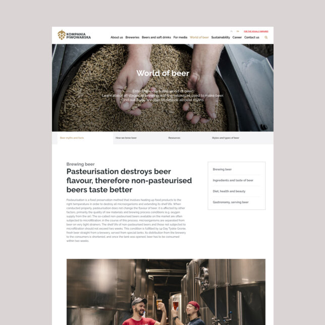
Our primary goal was to create a new website that captures the spirit of brewing, while raising a glass to KP’s proud beer-making tradition. But thanks to our findings in the discovery phase, we also knew the site would need to be fast, modern, well-organised and visually appealing if it were to achieve its aims.
-
A question of content
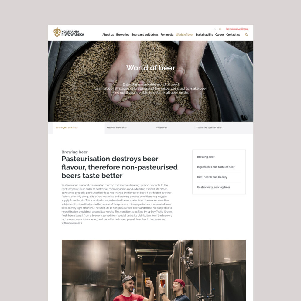
When structuring the new website, we first had to think carefully about what content it should include. KP has a vast range of products and corporate matters to communicate, and we needed to strike the right balance between informativeness and usability.
We reviewed all the existing content before working with the client’s priorities to build the entire new site from scratch.
-
Intuitive navigation
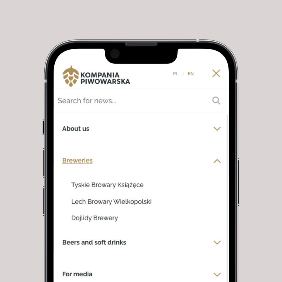
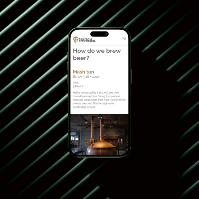
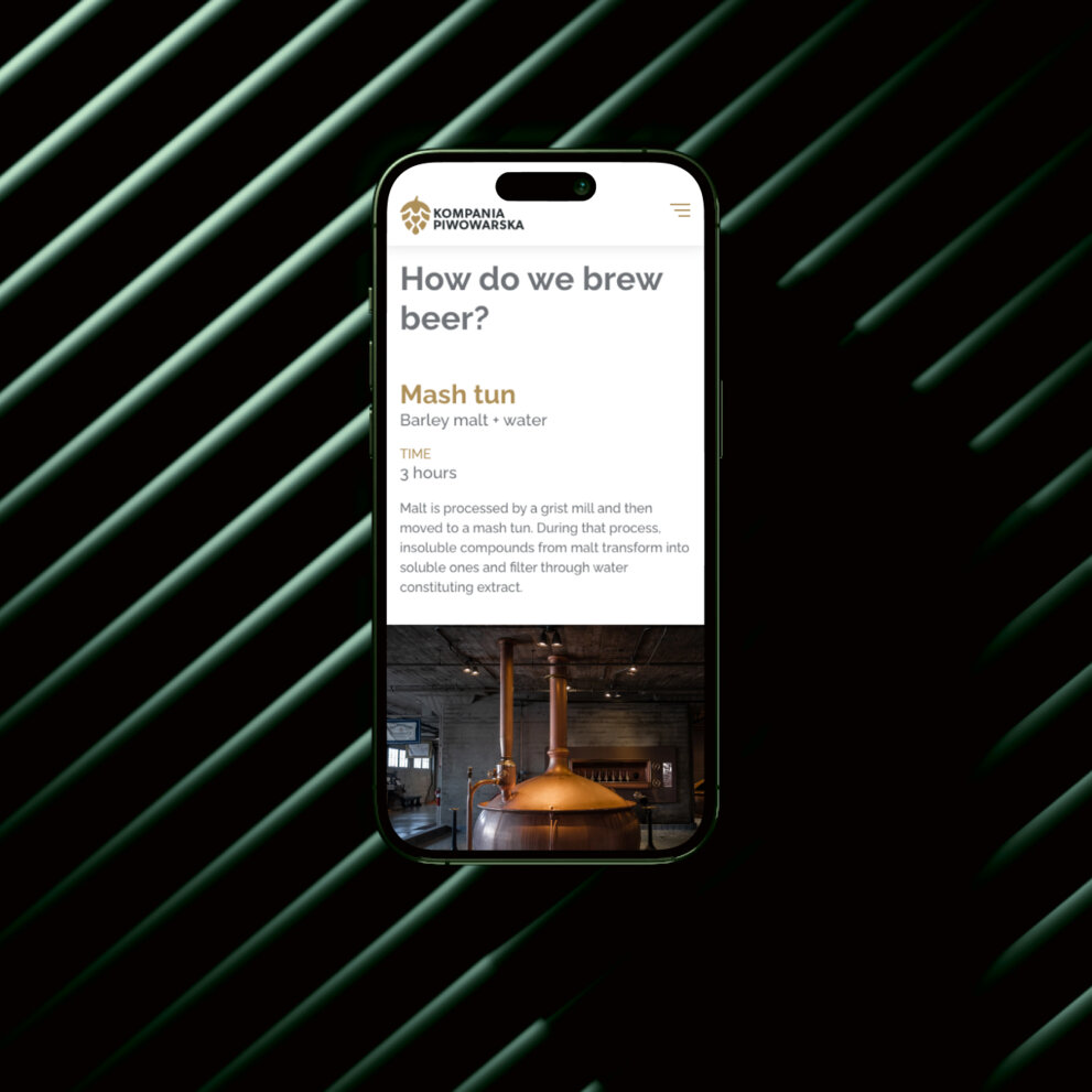
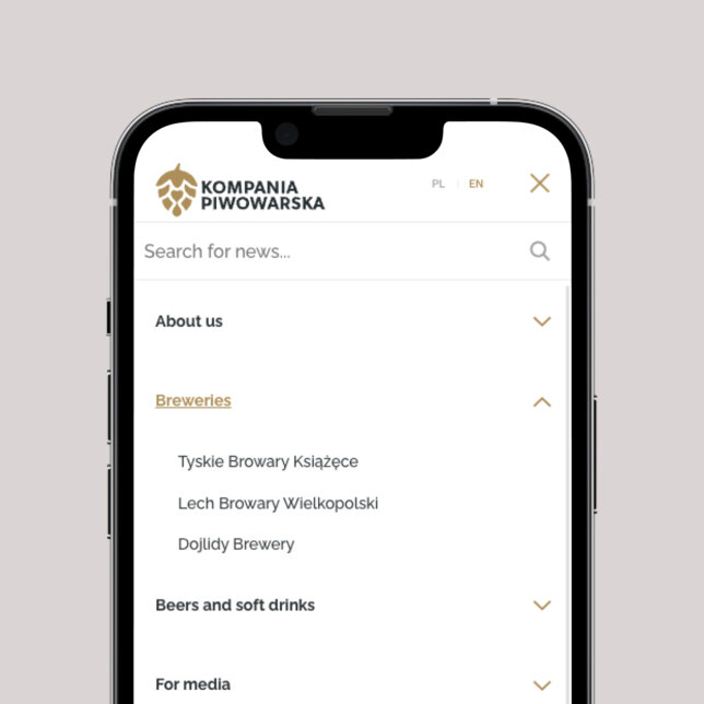
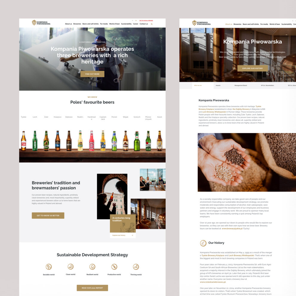
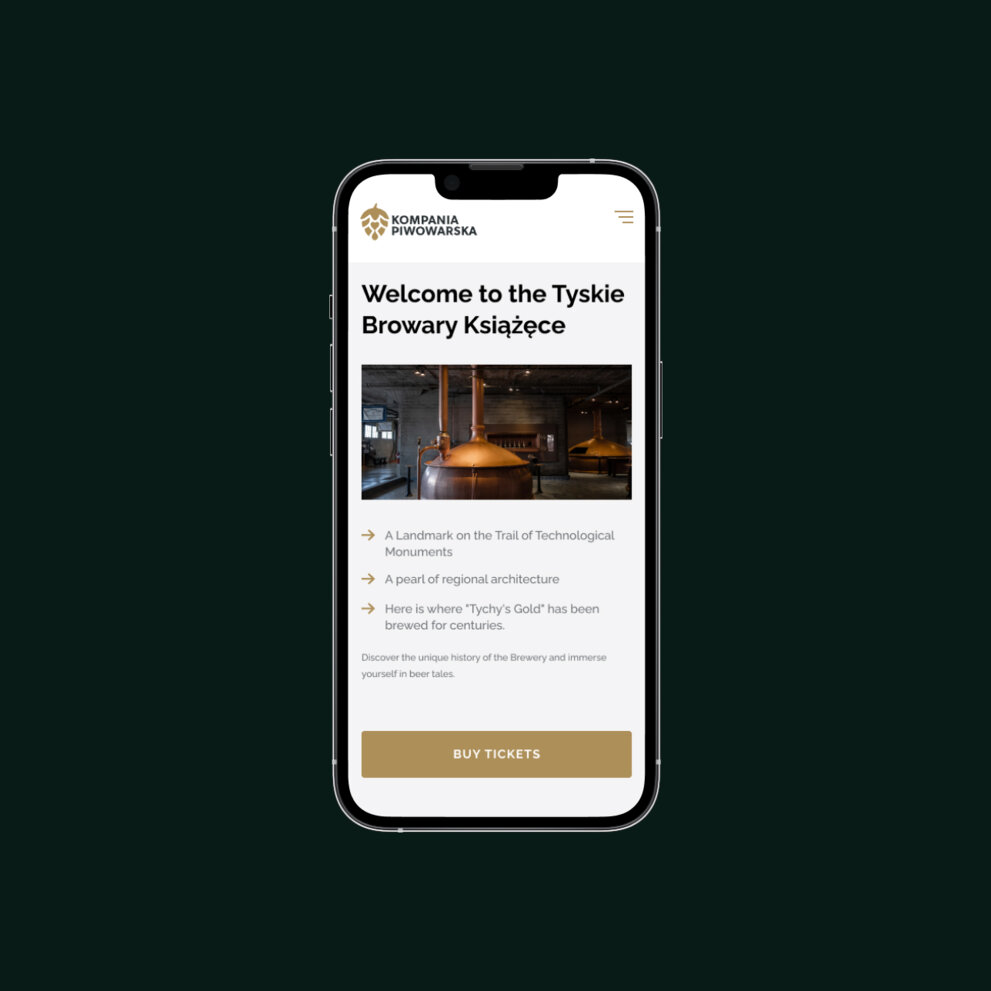
We designed the site navigation to give users a simple yet comprehensive walkthrough of KP’s products and activities. The most important information appears in the main navigation bar, grouped into a set of general headings.
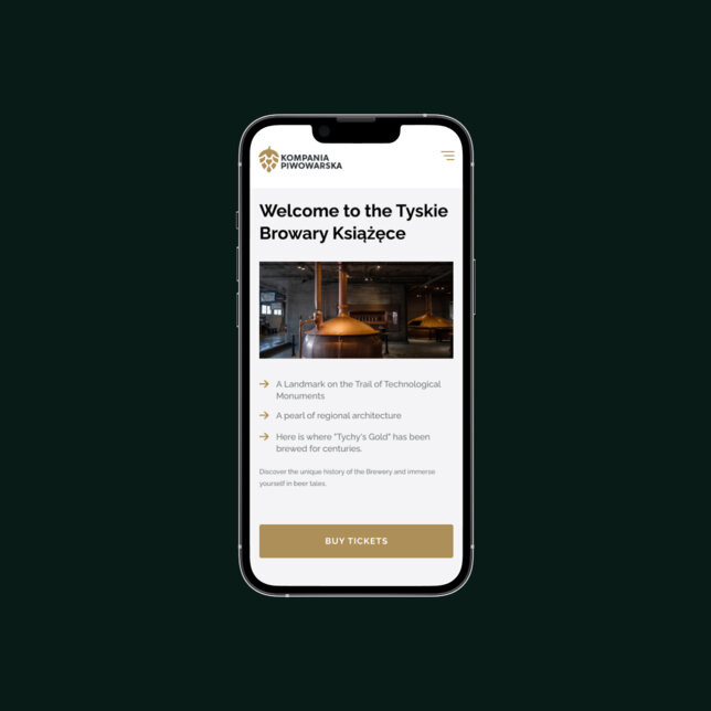
Each general heading is then broken down into several subsections, which appear when the user hovers over the main navigation (or taps in the mobile version). By organising things this way, we were able to present a large amount of content while keeping the user experience simple and accessible.
-
Attractive visuals – no beer goggles needed
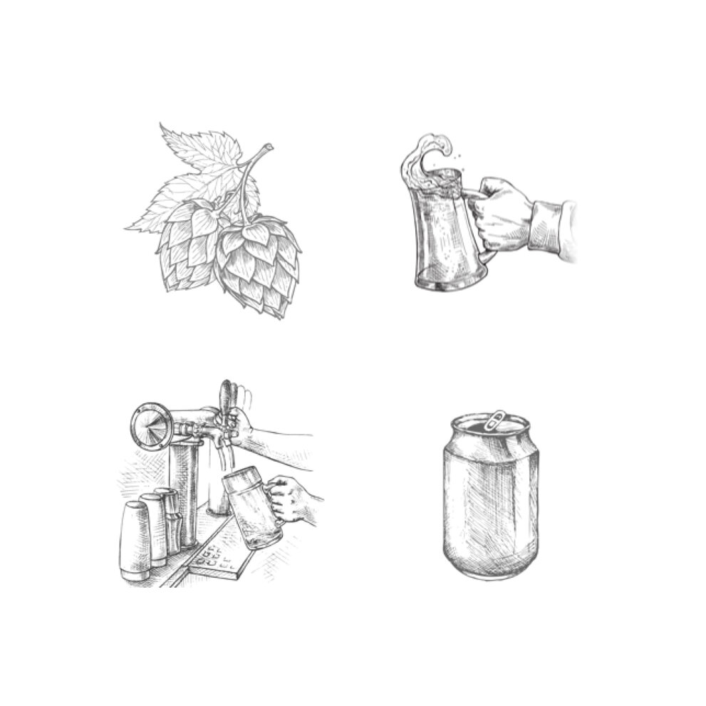
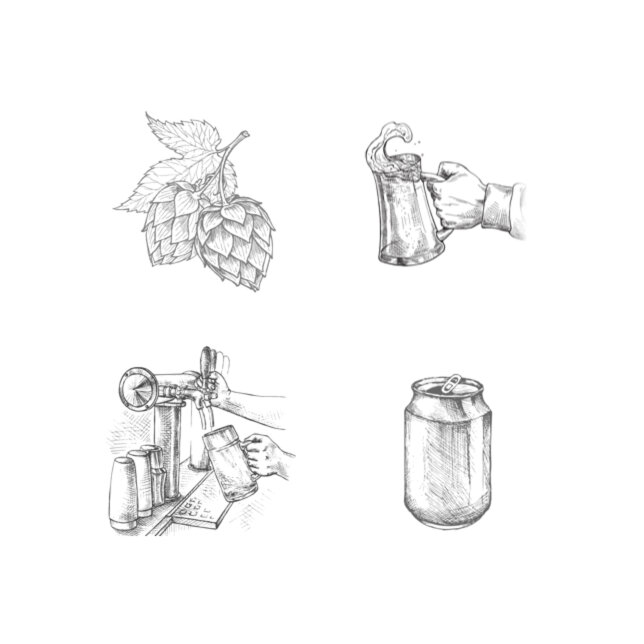
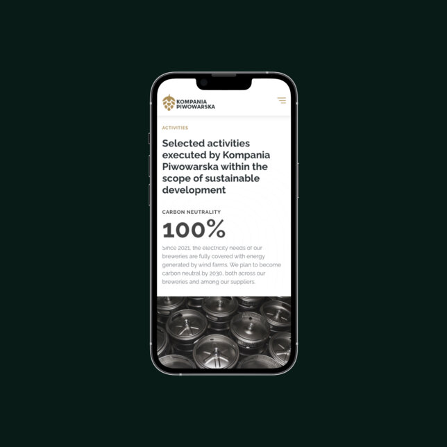
To set the new website apart, the visuals had to be elegant and engaging. We created sets of icons and animations which not only boosted the site’s aesthetic appeal, but also allowed us to present information with fewer words – thereby saving space for other content.
We worked in close collaboration with KP throughout the whole design and rebrand process.
-
Development
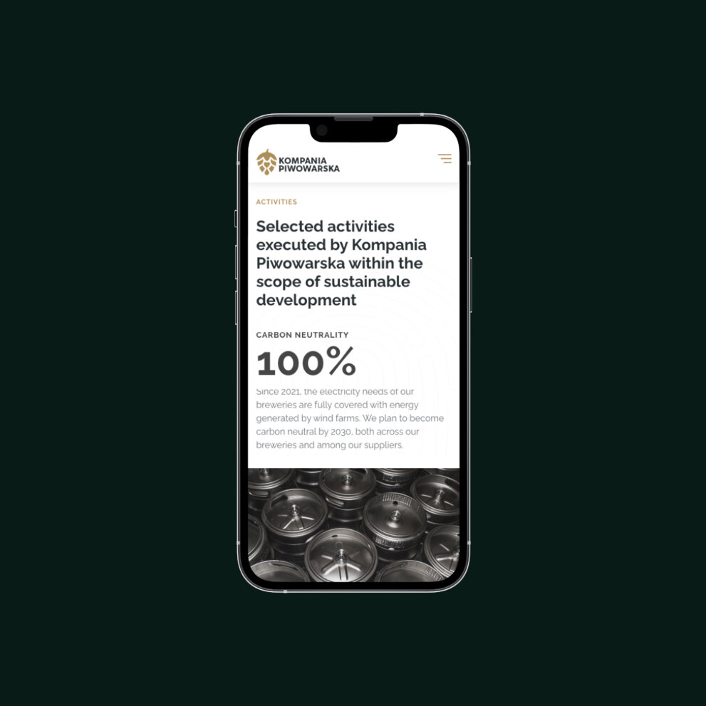
During development, we had two major requirements as we brought the designs to life: pixel-perfect quality, and the highest possible performance across all devices.
We deployed the latest front-end technology – together with a rigorous optimisation and quality-assurance process – to make sure everything was spot-on.
We also created a custom CMS, giving the client the freedom to manage and edit most of the site’s content themselves.
[ Results ]
Time for
toast!
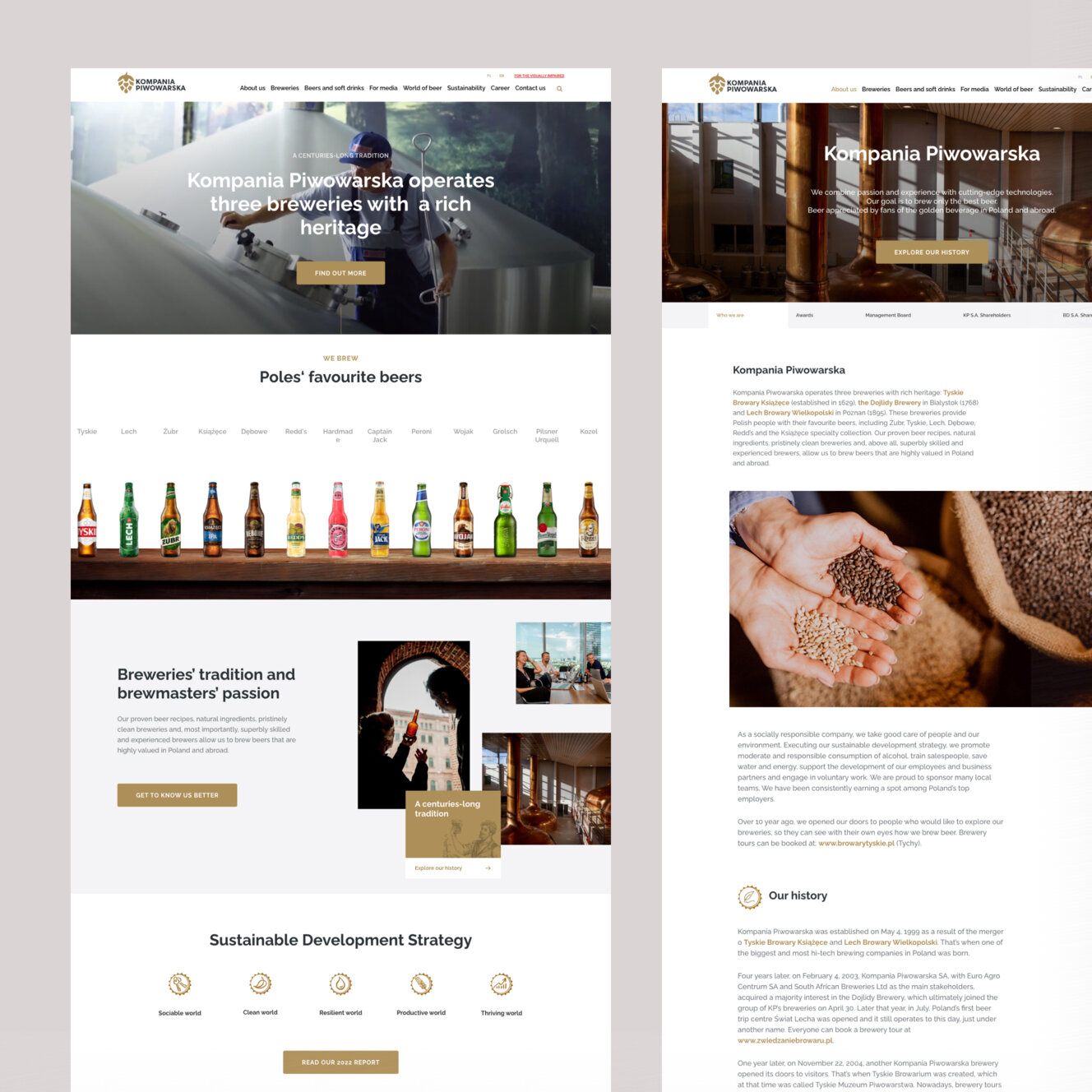
By the end of the project, we’d created over 40 new screens for desktop and mobile. Cheers to that!
“Working with Flying Bisons was a big step forward for us. We succeeded at re-designing our whole online presence – including our logo, the order process and overall customer experience.”

Joanna Kwiatkowska
Communications Manager, Kompania Piwowarska
More Case Studies
More
Case Studies







Got a high-stakes digital problem? Let's solve it.
Join our list of clients. You’ll be in good company.


