Detecting great qualities:
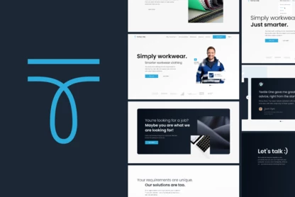
A new stunning website for
fraud prevention SaaS company.
Nethone
WEBSITE
2022
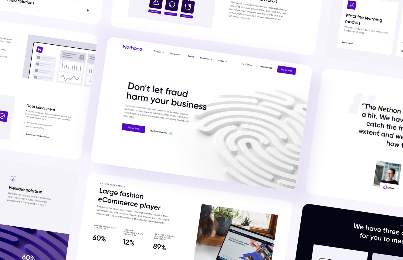
[ around the web ]
[ PROJECT SUMMARY ] Nethone combats online fraud in e-commerce, digital goods and online finance with pioneering technology. While preparing a new product offering, they faced the challenge of creating a digital touchpoint for automated sales.
Industry:
Security & Antifraud
Products:
SaaS
Market:
B2B
[ HIGHLIGHTS ]
-
R&D department developing product since 2016
-
Pioneer in new paradigm approach towards fraud
-
Leading industry in client portfolios like Blablacar, Azul, Vinted, Booksy, Ramp, ING
-
High rates of fraud detectability across the globe
Scope of work
[ challenges ]
New website
to support the transition
Nethone so far offered a service-based product sold by key accounts, and the website wasn’t an important part of their sales funnel. Yet the company planned to cross the chasm with new product offerings to support direct sales it had focused on until now and needed a new site to handle it.
As the previous website wasn’t our job, major challenge included:
Creating a webpage to cover the entire range of products, including the extended portfolio.
Abstract technical product presented in a clear and visual manner that is easy to understand.
Product-related jargon and complex wording making it hard to describe the benefits in a simple way.
A lot of information to present, including knowledge, anti-fraud content, and product information.
Nethone has had a great product and customer service sold directly by a dedicated sales team. However, now that we are launching different pricing plans, we need to enhance the self-integration service for the users.

Hubert Rachwalski
CEO Nethone

[ goals ]
Enhancing brand’s image
and users’ experience
First and foremost, our goal was changing the function of the website from a 'business card', which it had been until now, to a fully-fledged sales channel.
That’s why the main focus of a facelift of Nethone's branding was to strengthen the image of the sector leader and improve user experience across the platform, with clear and consistent customer needs-driven communication of Nethone's product offer.
Creating a clear sales funnel directing users straight to conversion points.
Explaining the benefits of products to a diverse group of users with varying levels of knowledge and expertise.
Presenting abstract and complex products in an understandable, visually appealing manner.
Creating modern and original branding appearance.
[ Direction ]
The new guiding
principles
Creating a recognisable brand
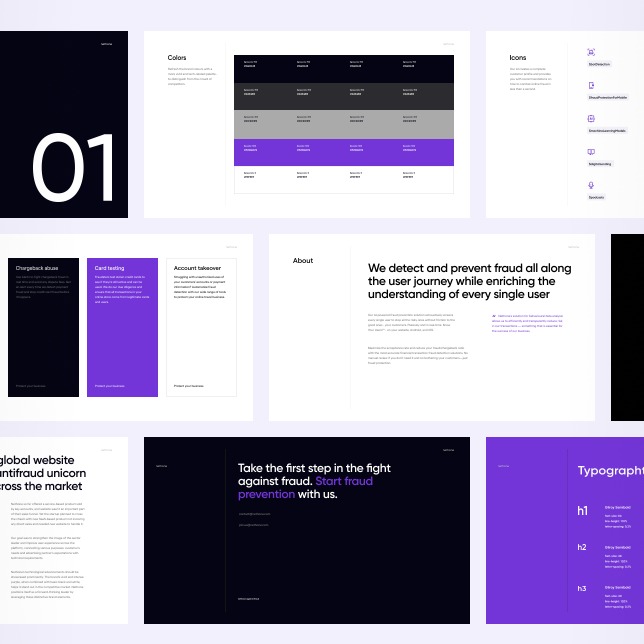
Refresh the brand colours with a more vivid and tech-related palette - to distinguish from the crowd of competitors.
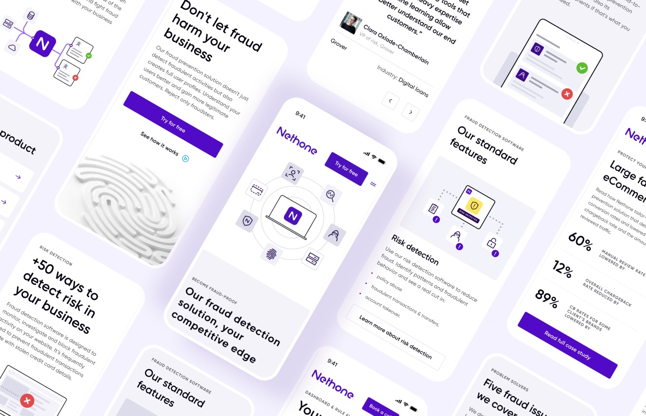
Design a new 3D animated key visual of Nethone's fingerprint that represents the brand's technical complexity and human touch.
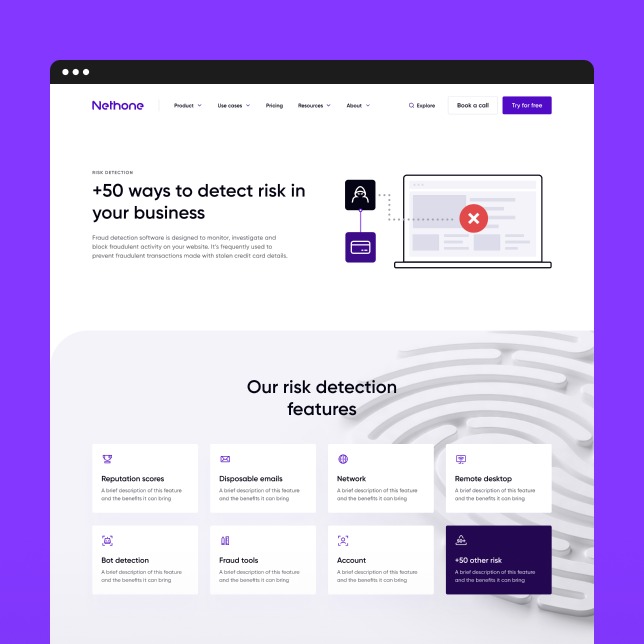
Set new icons and illustrations that represent complex and abstract features of the company's technology.
Founding brand's tone of voice
Set up brand’s archetypes to determine how it will communicate with its users.
Create more accessible and inclusive language and vocabulary to reach more business stakeholders.
A short and straightforward path to conversion
Designing the sales funnel architecture with alternative paths.
Create multiple contextual conversion points on an entire webpage.
Minimise the distractors and maximise the simplicity of the "call to action" phrases.
Gradual and comprehensive product exploration
Create product descriptions for business, fraud and technical stakeholders.
Grade the product description from general through detail and technical.
Interlink the critical terms throughout the entire website.
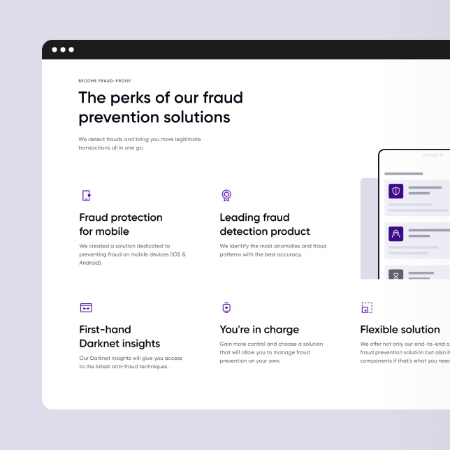
Making abstract a visual and complex a simple
Create a variety of web design sections to highlight different aspects of the product.
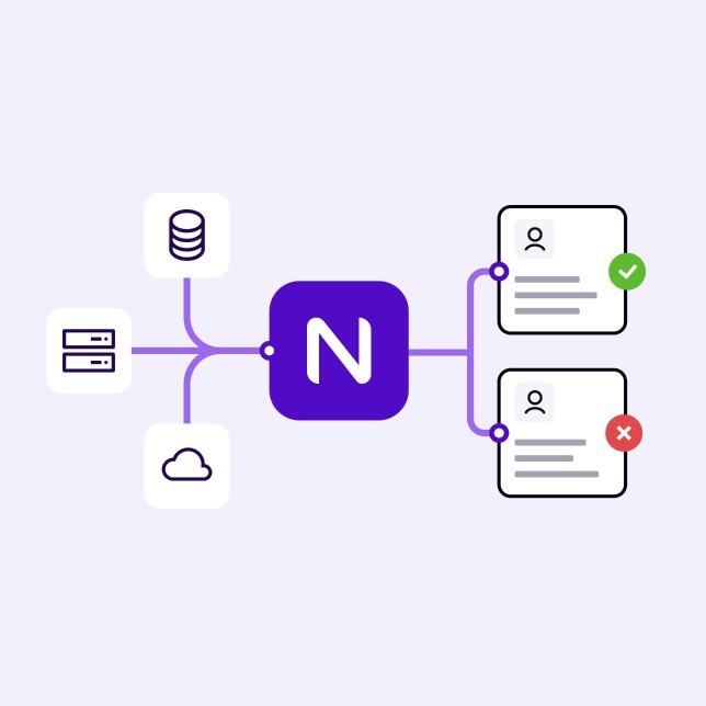
Design illustrations explaining complex technical features on simple graphs.
Inventing visual aids like icons helps to identify the key terms used in the text.
[ RESULTS ]
Branding aligned with
the superior product
advancement
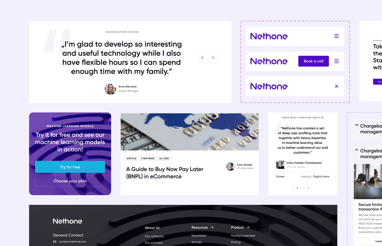
Nethone's technological advancements should be showcased prominently. The brand's vivid and intense purple, when combined with basic black and white, helps it stand out in the competitive market.
Nethone positions itself as a forward-thinking leader by leveraging these distinctive brand elements.
-
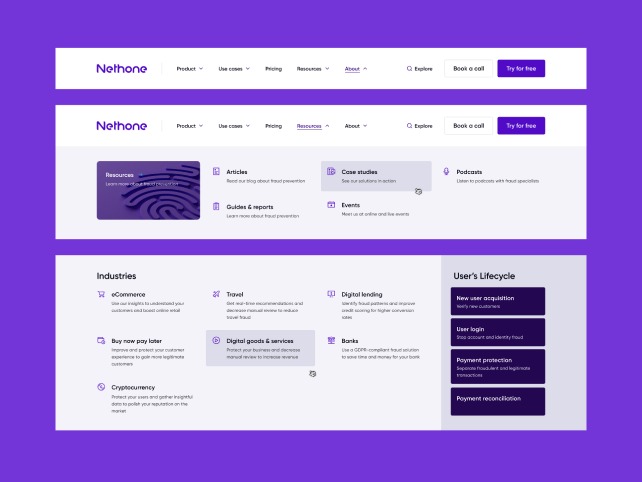
Intuitive website navigation addressing the user exploration process

During the design process, we thoroughly researched the needs of all user groups, including business managers, fraud managers, and developers, who had distinct points of view on web functionality.
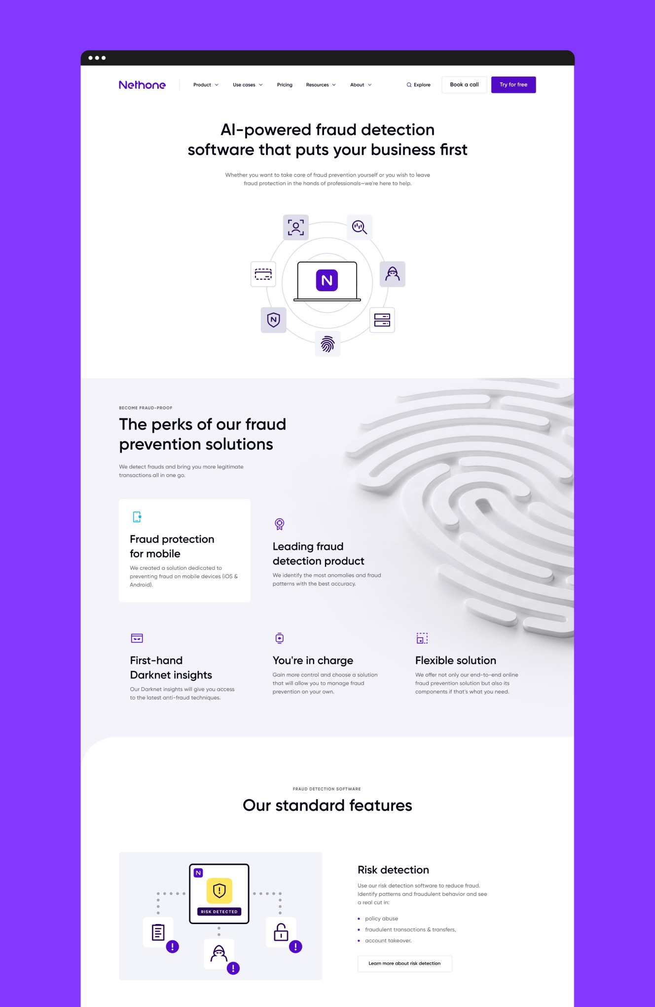
To address these differences, we designed the Top Menu architecture. With this architecture, you can start with the product overview and then navigate to specific features or use cases. Alternatively, if you are a technical expert, you can go directly to the General or Technical resources. -
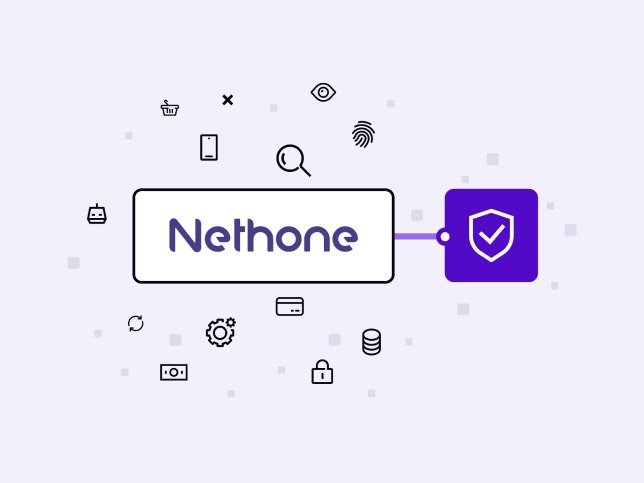
Complex technology aided with custom visual help

We designed clear and explanatory diagrams and icons to help users understand how the product works. We have created over 60 custom icons and 30 illustrations that visually explain the mechanics of Nethone's technology.
-
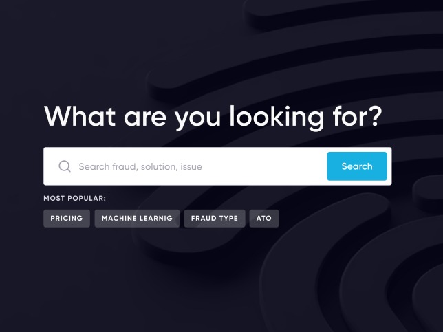
Functional Search for easier exploration

We created a practical search experience by helping users explore antifraud technologies, key terms and product features. For those who are new to the topic of online fraud, we provide information on the most common cases.
Advanced search suggestions are available for those who have a particular search subject in mind. For users who want to delve deeper into the topic, our resources search tool allows them to find the information they need in the most convenient format. -
Clear and informative pricing presentation

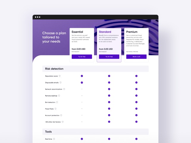
Introducing new product offering determined showing different plans, products, and features. Our pricing structure starts with a brief introduction for business stakeholders who may not be familiar with the product, making it easy to navigate between different plans and feature categories.
The pricing follows the rule of thumb that when presenting and highlighting other plan options, we lead users to the flagship one. -
Contextual conversion points

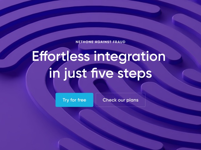
Nethone's sales strategy for entering a new market involves establishing several direct and indirect sales points. Since implementing an antifraud solution can be expensive, the procurement process tends to be lengthy. To address this, we created conversion points for different users at this stage.
In accordance with our sales funnel strategy, we added multiple sales points throughout our website, including simple CTAs, and common contact forms.
“We assisted Nethone with creating a seamless webpage that aligned with their business goals and integrated with their new sales funnel.

Bartosz Bykowski
Lead Product Strategist,
Flying Bisons
More Case Studies
More
Case Studies
Unleash Your
Digital Potential
- Today.
Join our list of clients. You’ll be in good company.


