Creating a gorgeous new global
website for the beauty industry
challenger.
Booksy
GLOBAL WEBSITE
2021

[ PROJECT SUMMARY ] Booksy, a Polish beauty scale-up, wanted to make a strong first impression as they expanded their product globally. We built them a customisable, multilingual website on Google Cloud infrastructure with advanced performance and a custom landing page generator. How's that for a makeover?
Industry:
Software
Product:
Website
Market:
Global
[ HIGHLIGHTS ]
-
Beauty and wellness scheduling platform, founded in Poland
-
Allows users to find, book and manage appointments with local providers
-
Supports everything from hair salons and barbershops to day spas and nail bars
-
13 million users – and counting
-
9 million monthly bookings
Scope of work
[ Goals ]
Build a glowing site
to match
Booksy's growing status
Create a powerful marketing tool that performs in 20+ markets
Convince different customer segments of Booksy's value
Attract new service providers to the platform
Make the website easy for our client to manage and customise
Position Booksy as the most trusted choice for appointment-based service providers
Entice the world’s best talent to come and work for the company
The only way to create meaningful value propositions and offers is to test them with your end customers, gather feedback, and iterate. It’s essential to define and understand all your customer segments before creating tailor-made value propositions for them.

Klaudia Doerffer
Head of Research, Flying Bisons

[ Challenges ]
Making it truly global
and highly flexible
The new website would need to serve over a dozen global markets. So it was crucial to make it easy to localise and personalise for specific languages and events.
For Booksy’s marketing team, the site needed to be simple to manage and flexible to their needs. And, above all, it needed to support their commercial goals by attracting and converting new customers at scale.
[ Context ]
A beautiful
success story
Booksy is an online platform that’s shaking up the beauty and wellness sector. It allows you to quickly find appointments with a wide range of service providers in your local area. And it lets you manage bookings with none of the usual faff or phone calls.
Founded in Poland as a start-up, Booksy now records over 9 million bookings a month. And it’s growing fast. As well as beauty, health and wellness, the app also covers pet services and an increasing number of other service types.

[ Research ]
Combing through Booksy’s
B2B product strategy
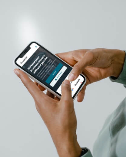
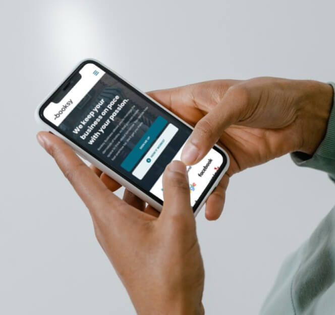
We kicked off the project by reviewing and analysing Booksy’s B2B customer segmentation, product strategy, and positioning. We also took a detailed look at their competition and how they present similar offerings.



[ Strategy ]
Crafting a compelling
B2B value proposition
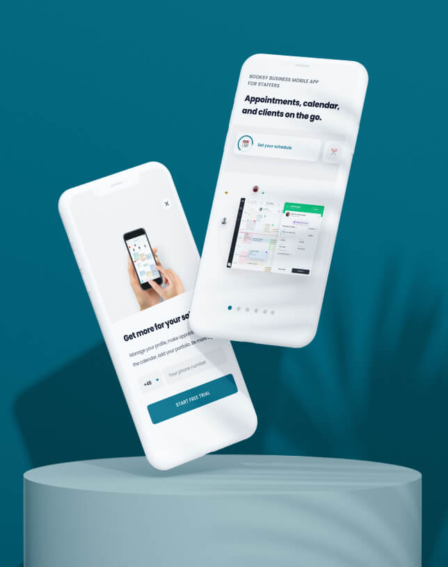
With heaps of research and insights to build on, we set about creating early-stage concepts to communicate Booksy's B2B offering. Each one clear, appealing, and aligned with the brand's positioning.
We initially focused on key messages, before getting into the nuts and bolts of the recommended information architecture for Booksy's new global business website.
[ Concept ]
Develop, test
and validate
After developing and wireframing the concept, we were ready to put it in front of users. We ran eight concept testing sessions with two different user segments: solopreneurs and business entrepreneurs in the USA (Booksy's main focus).
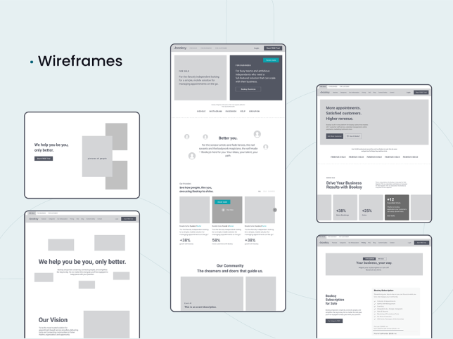
Usability testing (UT) goals:
See if choosing the right product is clear and easy for users
Gauge people's general impressions of the new website
Check the visibility of important features on the site
Verify whether the site navigation is intuitive for users
Identify the site's strong and weak points
Invite ideas for improvements or extra features to upgrade the site
[ Design ]
Alluring design
with industry-wide appeal
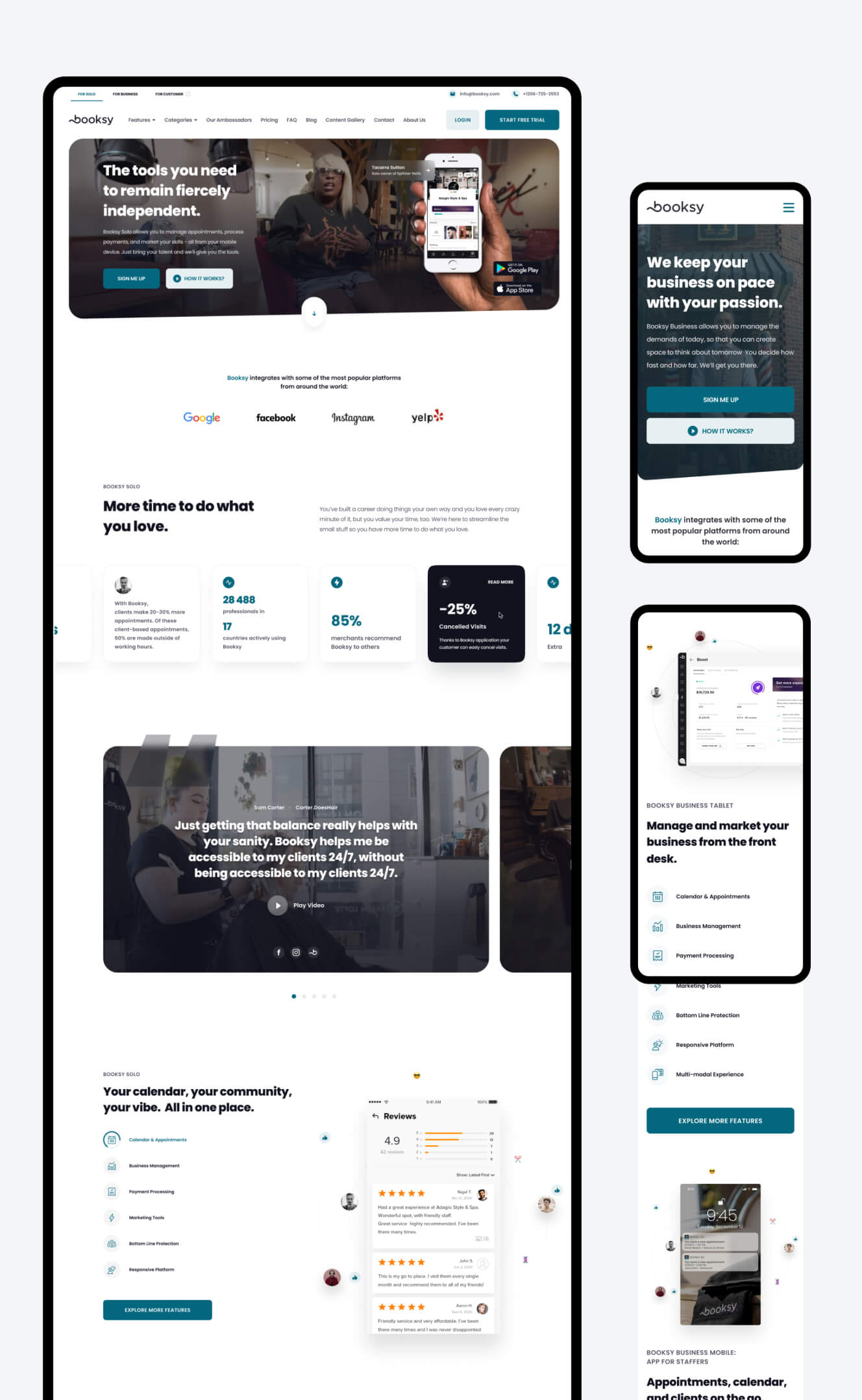
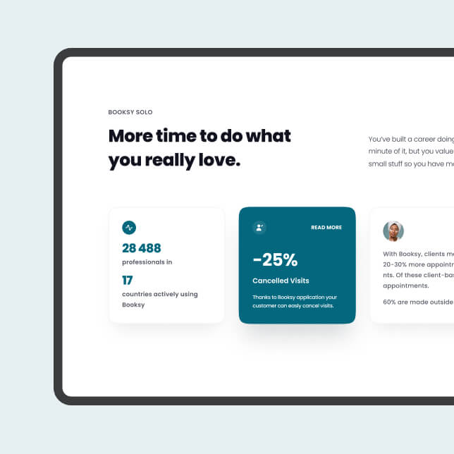
Design matters. It's not just about how it looks, but how it works too. We applied a light, fresh and modern design to elevate Booksy's brand image.
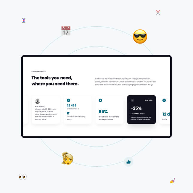
-
Powerful value proposition

Booksy have rapidly established themselves among the market leaders in their space. They know what they stand for, the value they bring, and how much their customers love them. So, where better to shout about it than the very top of their homepage?
-
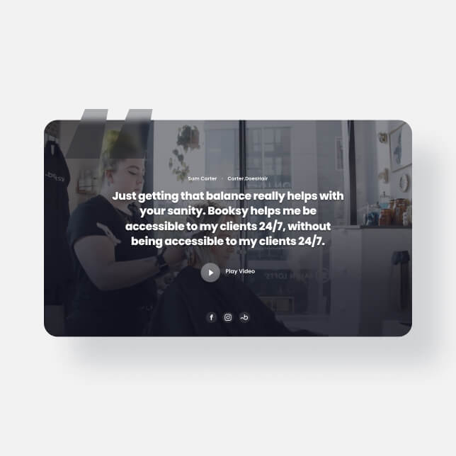
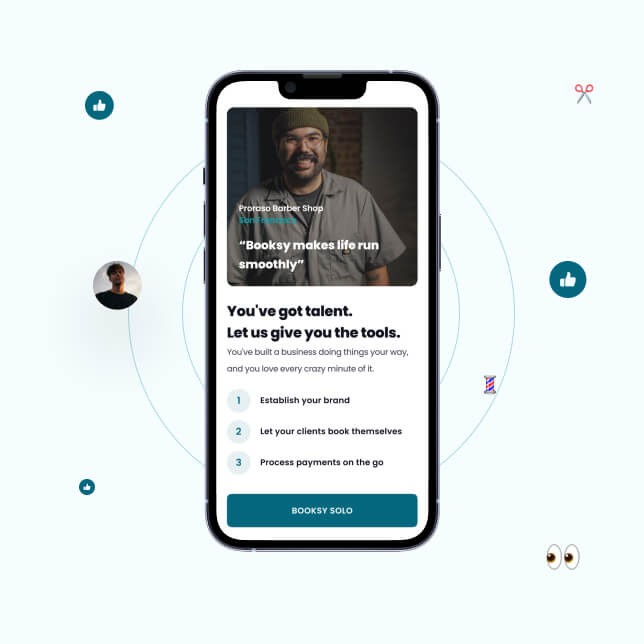
Building trust with video testimonials

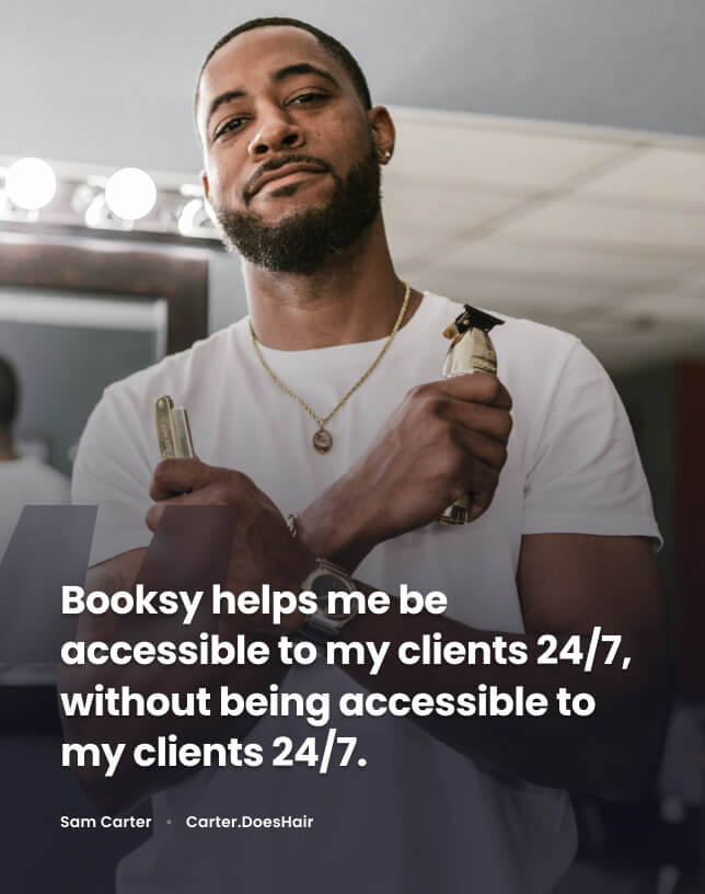
From the very start, our new website was designed to inspire all who use it. And there’s no better inspiration than seeing your future self in the story of someone a few years ahead of you in the journey. Check out the personalised stories we crafted for each market.
-
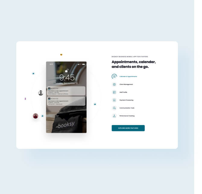
Showcasing key features

Booksy lets customers truly focus on their work. Whether you’re a solo hairdresser (Biz Lite) or the owner of a beauty salon chain (Biz Pro), the platform has you covered with a range of functions tailored to your goals.
-
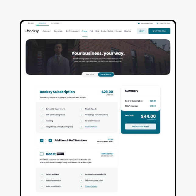
Clear, transpartent pricing

Building trust is also crucial. Booksy nurture long-term partnerships with their merchants – and it all starts with their pricing page for one-person companies and larger businesses. It’s clear and transparent, inspiring confidence in the user from the very first moment.
-
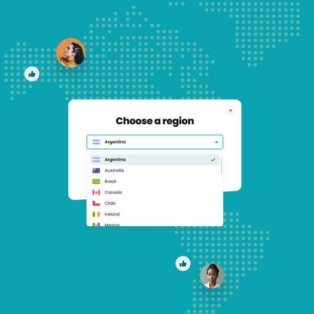
Global and multilingual website

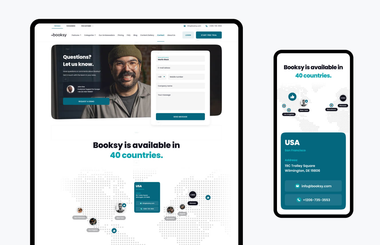
Many websites claim to be global – but ours really means it. It covers 14 markets, with scope for many more language versions to be added. And, what’s more, each localised version is led and managed by a dedicated team.
-
Personalised experience

Like a great haircut, Booksy’s website is a completely personalised experience. We helped them create dedicated pages for specific merchant sub-segments. And we built them an advanced landing-page creator, so they can easily add pages of their own in future.
-
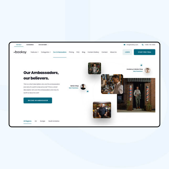
Ambassadors on a pedestal

Community is at the heart of Booksy’s offering. Their ambassadors help to promote the platform and build a global buzz around the brand.
[ TESTIMONIAL ]
“Booksy is one of the hottest Polish scale-ups around. We were excited to work on their complex project to create a high-performance website with a CMS that will enhance their sales and marketing efforts.”

Kamil Tatol
CEO & Digital Consultant, Flying Bisons
[ development ]
UI and front-end powered
by a robust design system
At Flying Bisons, we’re at our best when we’re responsible for every phase of a project. Our design and development teams worked side-by-side, under one roof, which helped reduce development time and ensure everything functioned as intended.
Fully SEO
optimised and ready to perform
As a market frontrunner with global ambitions, Booksy have extremely high standards. Not least when it comes to SEO performance. Many thousands of people search for what the platform offers – and we’ve made sure they’ll always find it.
Easy-to-use CMS lets Booksy manage the whole website. And more.
The fully customisable CMS includes a landing page creator, so Booksy’s team can easily produce content for marketing campaigns.


More Case Studies
More
Case Studies
Unleash Your
Digital Potential
- Today.
Join our list of clients. You’ll be in good company.
