


Holy cluck! How we unified
the fried chicken giant’s
European omnichannel experience.
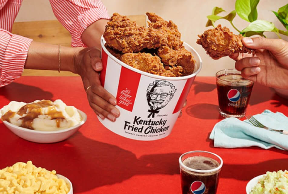
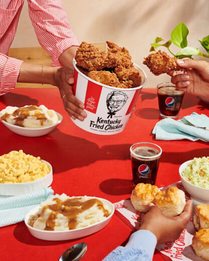
KFC
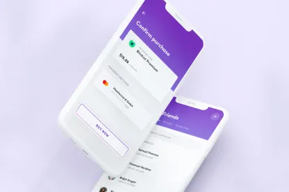
MOBILE APP
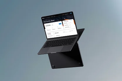
WEBSITE
KIOSKS
2018 - NOW

[ around the web ]
[ PROJECT SUMMARY ] As KFC’s strategic partner since 2017, we gleefully accepted the challenge to redesign their entire digital ecosystem. And to unify their kiosk, app and website experiences for a host of key European markets. Hungry to hear more? Let’s go.
Industry:
Food commerce
Products:
E-commerce
Market:
B2C
[ HIGHLIGHTS ]
-
World’s most popular chicken restaurant chain
-
Annual turnover of $27.9bn (2020)
-
316 restaurants in Poland (2021)
-
Franchise company, operated throughout Europe by AmRest
-
KFC was founded in 1952
Scope of work
[ Goals ]
Set the standard for
online food experiences
Make KFC’s channels more coherent
By using the same fonts and colour scheme across all channels, we would create brand consistency and help increase customer loyalty.
Improve
usability
Easy navigation and simple functionality would keep users engaged for longer, and encourage them to continue shopping.
Boost conversions
Once everything is more consistent and usable, there can be only one result: higher conversion rates across the board.
Very few companies manage to successfully implement an omnichannel experience. We’re proud to be part of that minority thanks to extremely valuable partnership with Flying Bisons. They truly helped us unleash our digital (and omnichannel) potential.

Maciej Jędrychowski
Digital & Customer Development Director, KFC
[ Challenges ]
Complex scope and
high expectations
Pushing past good
to great
KFC wanted to become the food retail industry’s undisputed leader in omnichannel experiences – so our work had to be exceptional.
Making it work across markets
Our client trusted us to redesign their ecosystem for the Czech Republic, Hungary, Poland, Croatia, and Germany.
Taming the scale and complexity
Revamping all of KFC’s channels would be no small task – and it would take every bit of our skill and experience to keep things on track.
[ Background ]
From small tweaks
to an entire makeover
Our partnership with KFC goes all the way back to 2017, when they hired us to redesign their e-commerce website for the Polish market. Conversion rates grew thanks to our work – and a long and fruitful relationship was born.
KFC’s digital style hadn’t changed since 2017. And initially, we were only able to make small modifications to their kiosk and iOS/Android apps, which had been developed by other companies.
In 2021, however, our client decided to completely overhaul their digital look. This gave us the exciting opportunity to redesign the entire KFC ecosystem – kiosk, app, and website too.
[ Work ]
Nailing the
product list
The product list is one of the most important parts of an e-commerce platform.
In KFC’s case, it’s the beating heart of the shopping experience. It needs to show a variety of products and make it as easy as possible for customers to find what they’re craving.
A good product list is all about easy exploration, simple, readable layouts and visuals, and functional UX patterns. So that’s what we sought to achieve with our solution.
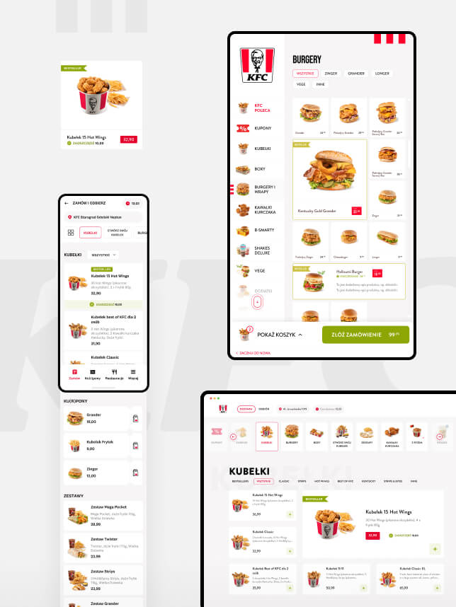
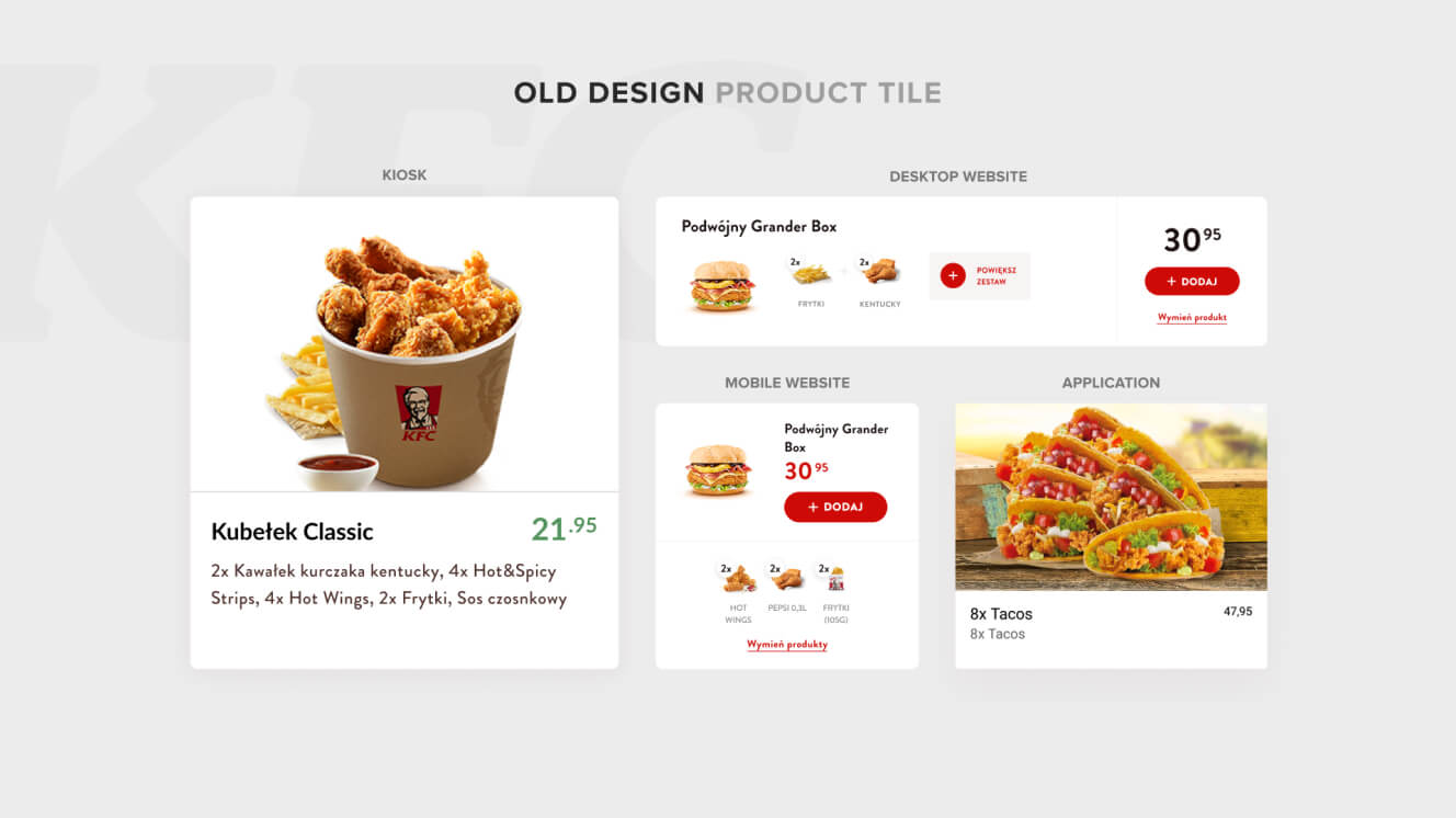
The old product lists lacked consistency – despite being the most important and frequently used screens in the ecosystem. An unruly mix of colours and fonts was used across channels. And even crucial elements such as prices, categories and products differed from kiosk to website to app.
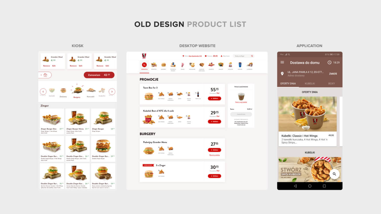
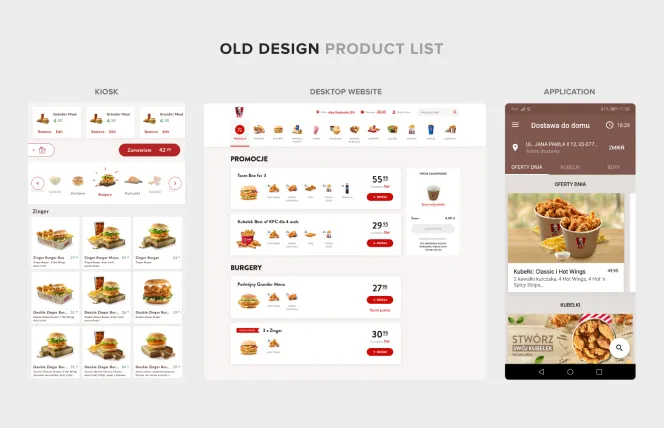
We have made the design of the product list more consistent and enhanced its usability across every brand channel and customer touchpoint. Among other things, our changes now help users change categories more easily.
-
Kiosk
The old kiosk navigation was horizontal. So – you guessed it – we made it vertical. Not just for the sake of it, but because doing so made it more user friendly. We also moved the cart to the lower part of the screen, to make it easy for everyone to order food. Regardless of their height.
-
Website
On the old website, the user’s cart was always on display – even if it was empty. We abandoned this model, so the cart now only appears when items are added to it. This frees up space to display more products and gives the customer a better view of the menu.
-
Mobile App
The new-look mobile app reflects the design of the kiosk and website – with one small difference. We moved the navigation down so that it’s now within thumb’s reach, making it easier and more comfortable to use.
-
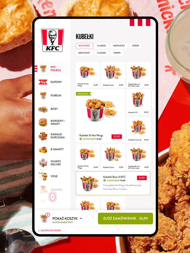
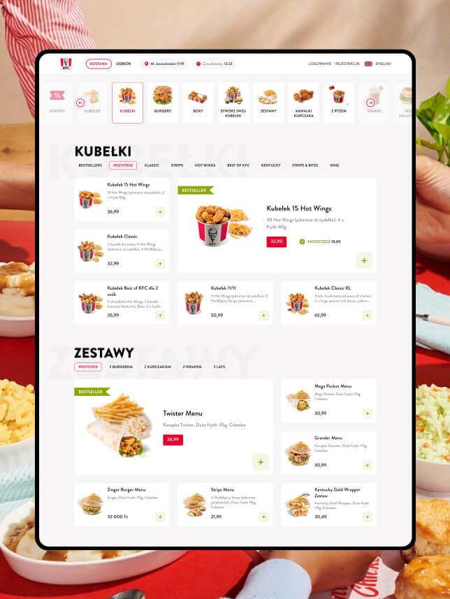
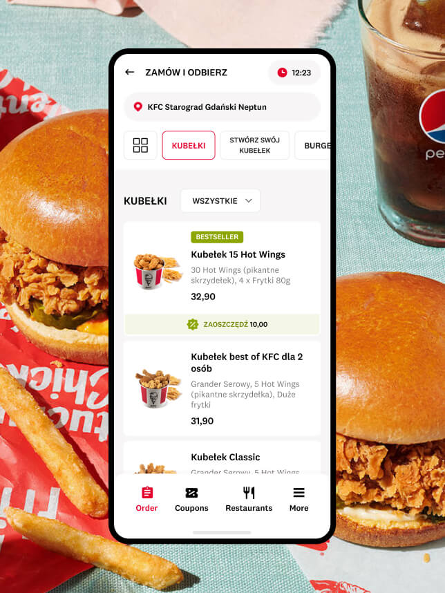
All Channels
We didn’t want customers to miss anything on KFC’s menu. So instead of making them search through the 100+ products on offer, we made it much simpler. We created subcategories to help them find what they want effortlessly – on any given channel.
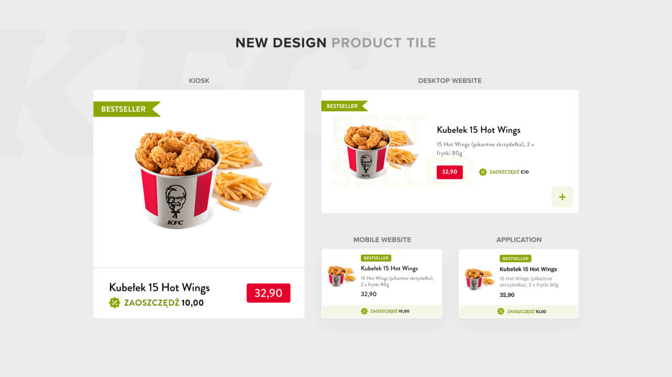
What’s more, we used tiles to highlight best-selling items on product pages, on all channels. This way, customers can find the most popular menu choices quickly and easily. With these changes in place, the design and usability were finally consistent across all channels.
Customers can now easily spot special offers presented as banners on the main page. Thanks to new categories and subcategories, they can quickly find any product. We also upgraded the way menus and boxes are displayed. Now users can read what’s included – without the distraction of pictures.
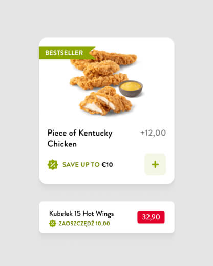
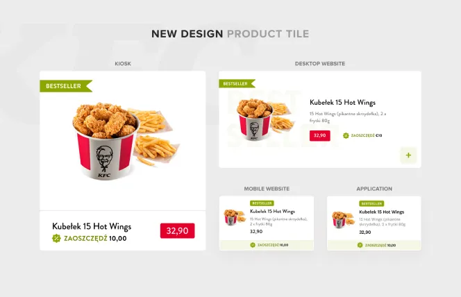
Getting product
tiles spot on
What am I going to order? What will I get? What’s the offer? How much will I pay? These are just some of the questions a product tile must answer. It’s the most fundamental UI component of an e-commerce platform. And it’s crucial to get the design just right.
Check out how we cracked the challenge for KFC.
Product tiles used to look and work differently, depending on their channel.
Now, product tiles are consistent across channels. And so is the way users interact with them. Clicking on a specific tile takes the user to a product page, where they can personalise the product or menu.
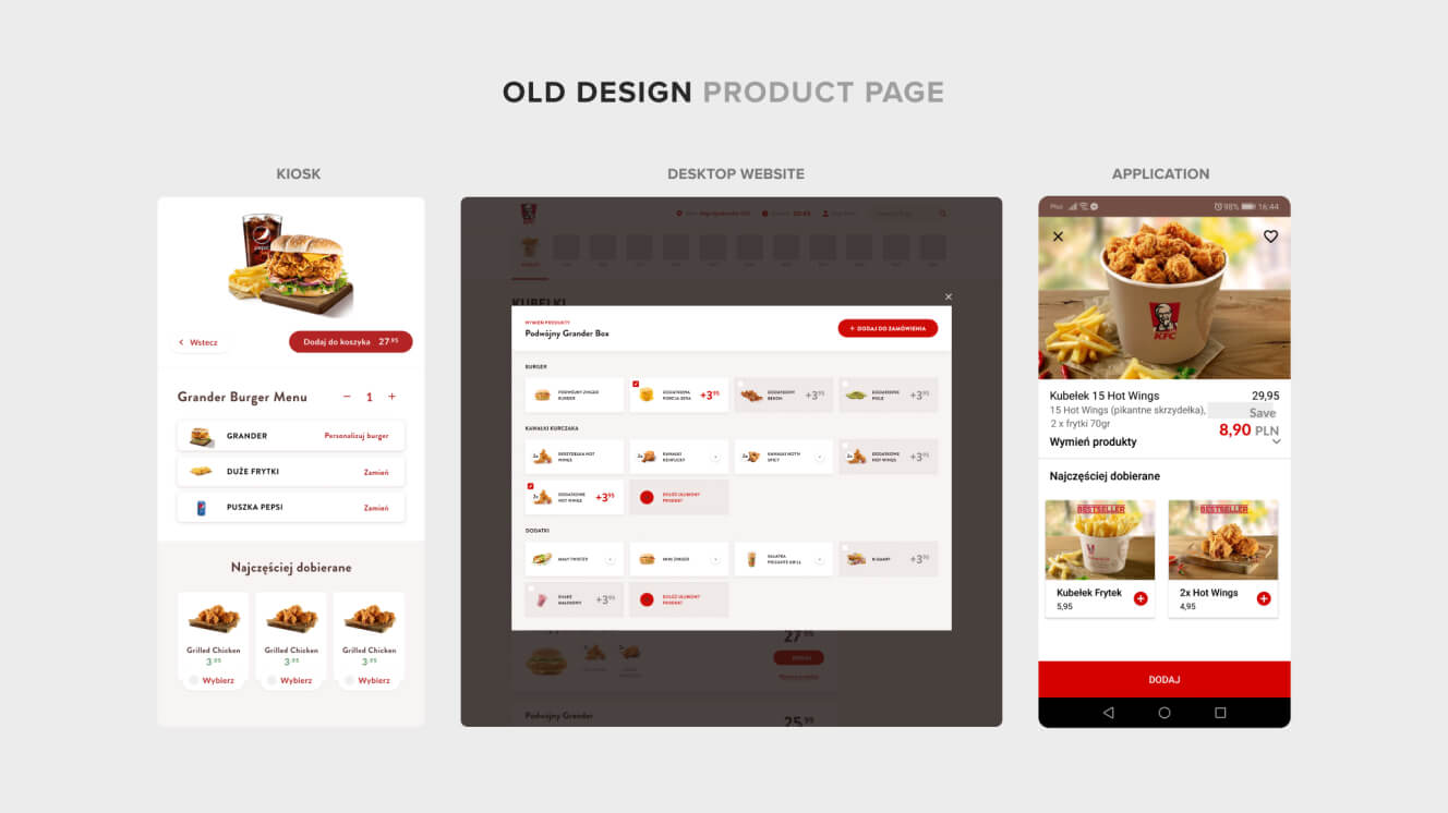
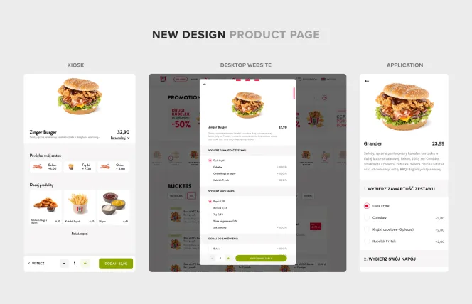
Polishing up the
product pages
Before
The old app and kiosk product pages were visually inconsistent. And the website didn’t have a product page at all. Customers could add items to their cart – but they weren’t able to personalise them.
The inconsistency between product pages on different channels is no more. We chose to use radio buttons, with users able to scroll and see which options are available. And we’re currently testing a similar approach for kiosks, to see if it has a similarly positive impact on the shopping experience.
The product personalisation experience is also improved across all channels. It now comes after an item is added to the cart.

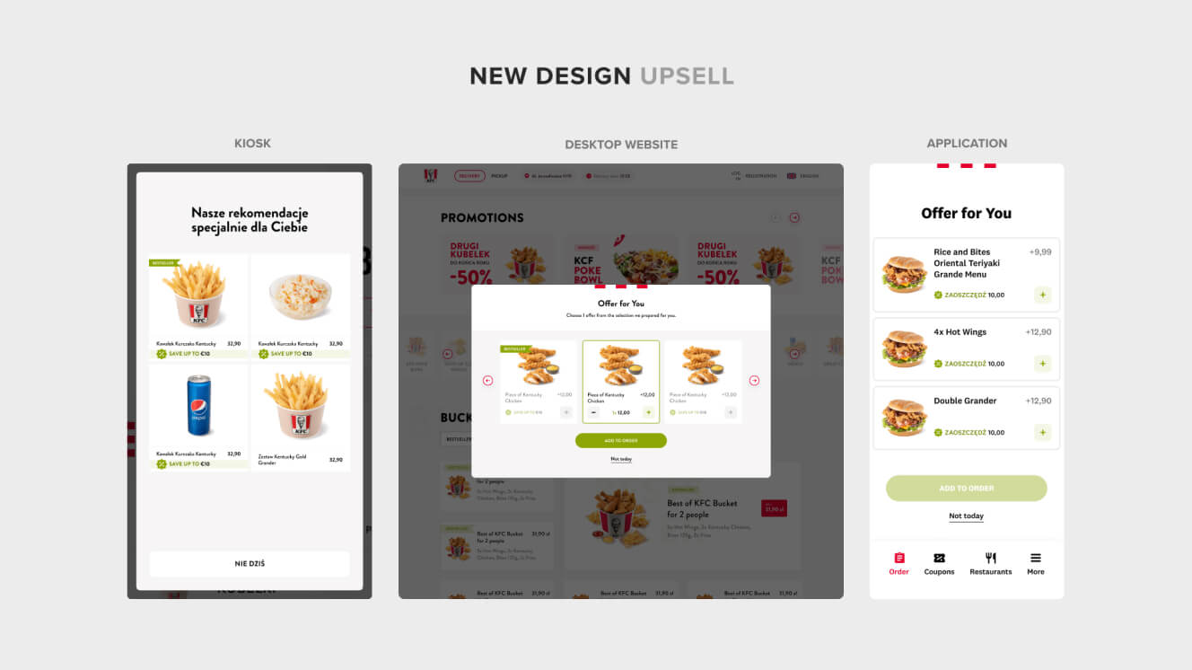
Upsells that
work for everyone
We’re a digital consulting company – so we care about our clients’ results and their users’ needs in equal measure. We redesigned KFC’s e-commerce platform with their customers’ goals firmly in mind, while also seeking to maximise conversion rates, average order values, and lifetime values.
What’s the secret sauce for successful upselling, we hear you ask? It’s looking for a win-win situation – one where both sides feel equally happy. Check out how we approached it.
Before our redesign, upsells would appear at different stages of the shopping process on each channel. For example, on the old version of the website, an upsell would pop up every time the user added something to their cart.
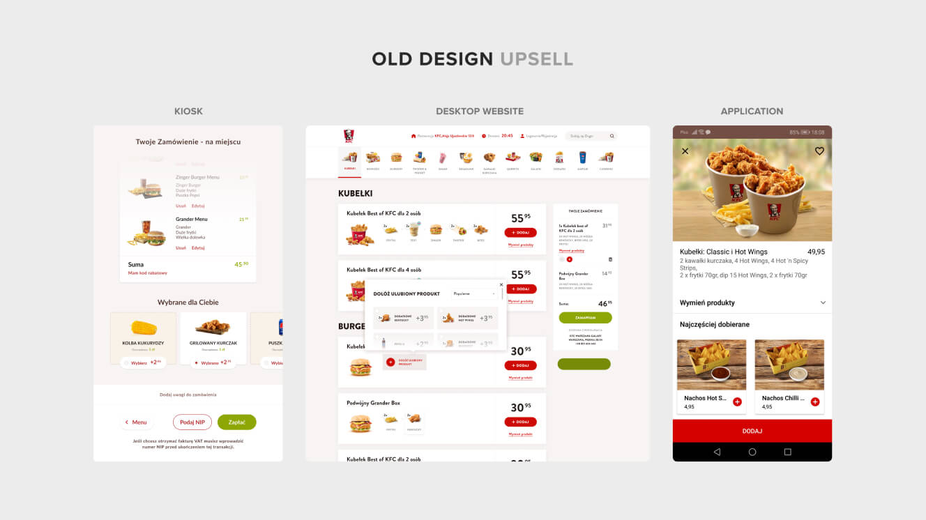
We made upsells consistent across all channels. They now appear on the product tile during checkout. We also added an upsell on channels that offer menus or boxes, so users can easily find better deals for their orders.
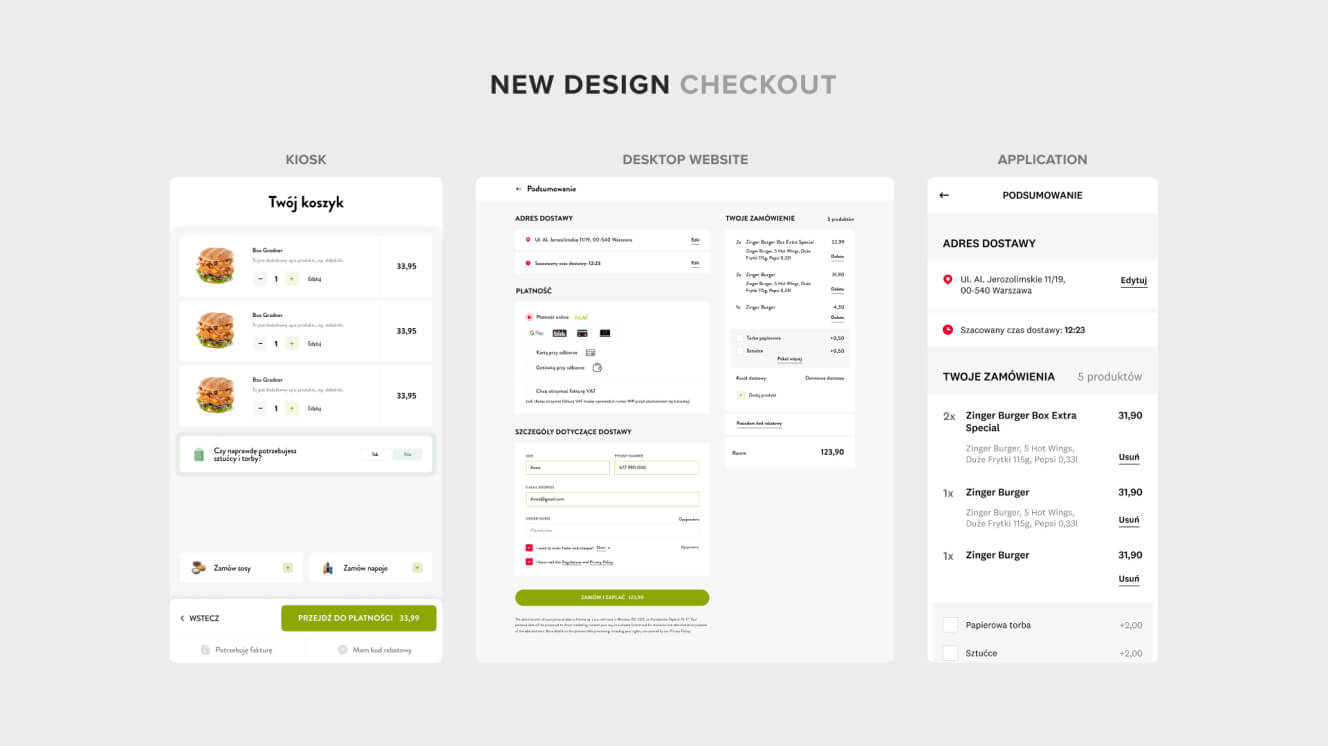
Cashing in
with better checkouts
Of all the elements in the shopping flow, the checkout has the greatest impact. Get it right and your KPIs will skyrocket. But get it wrong and you’ll be leaving money on the table. So, how can you make sure you nail it?
BeforeCan you guess the biggest problem with the old checkouts? Yep, our old friend again – inconsistency across channels. The app version, in particular, looked radically different from the others.
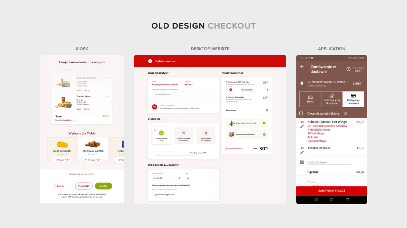
The checkout sections – and options for adding extras – are now consistent. This means users will be familiar with the buying process regardless of which channel they’re using.
As well as making things more coherent, we also improved usability. The checkout on the mobile site now shows the delivery address, which the customer can edit if needed. It also displays the estimated delivery time.
[ TESTIMONIAL ]
“We chose Flying Bisons as our strategic digital partner in 2017. It’s one of the best decisions we’ve made. In 5 years, we’ve dramatically improved the omnichannel customer experience and all KPIs.”
Maciej Jędrychowski
Digital & Customer Development Director, KFC
More Case Studies
More
Case Studies


Unleash Your
Digital Potential
- Today.
Join our list of clients. You’ll be in good company.


