


Making headlines: How we
revitalised one of Poland’s
largest online news portals.
NaTemat
WEBSITE
2022

[ around the web ]
[ PROJECT SUMMARY ] Revive naTemat’s image as an innovative, pioneering online media brand. And project their true values through a revamped website and experience for their 10 million active users.
Industry:
Media
Products:
Online media platform
Market:
Poland
[ HIGHLIGHTS ]
-
Polish-language news and current affairs website, launched in 2012
-
Pioneer in online media and native advertising
-
Around 10 million active users
-
Known for its high-quality content across a range of popular topics
Scope of work
[ Goals ]
Reignite the spark for
a true digital trailblazer
Restore naTemat’s image as industry pioneers, leaders and innovators
Reimagine the news website reading experience
Position naTemat as the top opinion-forming media portal in Poland
Improve KPIs across the platform
naTemat was a revolution when it launched. We used to innovate, make a difference and set the direction for the whole industry. Over the years, however, we’ve lost our cutting edge. We needed a partner to help us regain our pioneering image and position.

Paulina Plenkiewicz
CEO naTemat
[ Challenges ]
Balancing the commercial
with the creative
Showing the bigger picture
The existing website gave no sense of naTemat’s vision and strategy.
Keeping everyone happy
Our new version would need to balance the needs of content creators, advertisers, and site users.
Sending the right vibes
naTemat should be seen as a high-quality media portal, whereas the old website felt more like a classified ads service.
Making the brand shine through
There was no clear brand identity on the old website, which potentially limited its ability to attract and retain users.
[ context ]
Grupa naTemat: A leading
Polish media group
Founded in 2012, naTemat Group is an independent Polish publishing group. The company operates five different thematic services and brands – the most well-known of which is natemat.pl.
Following its launch, naTemat quickly established itself in the digital media landscape, forging a reputation for innovation. As time passed, however, the brand lost some of that early edge. And the natemat.pl website no longer reflected company’s true status and ambitions.
That’s where we came in. Using our trusted end-to-end process, we fully revamped the natemat.pl website in just a few short months – building on its existing strengths and creating a whole host of new ones.
[ guiding principles ]
Our foundations for
building the new platform
-
Develop a strong, recognisable brand
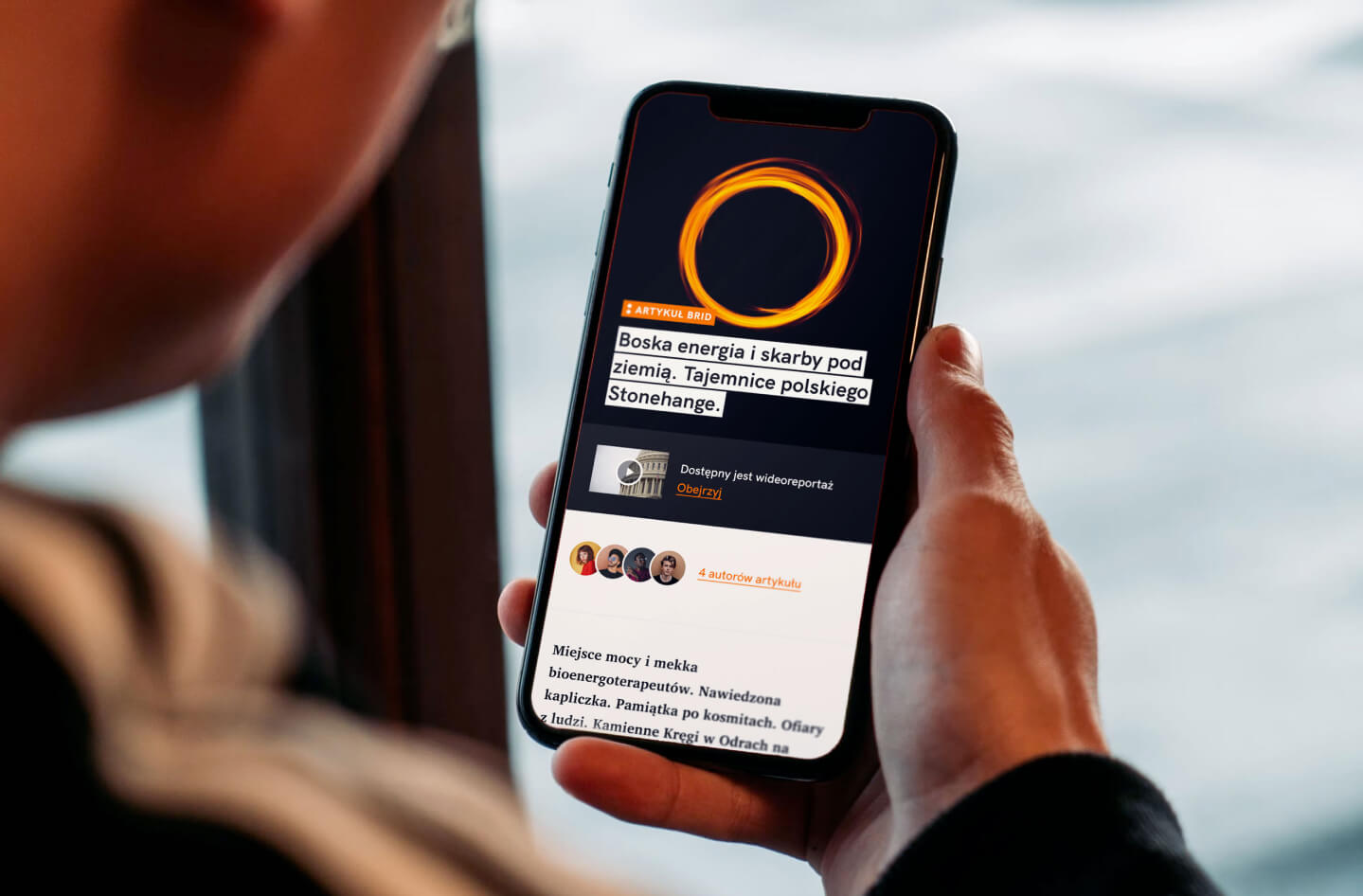
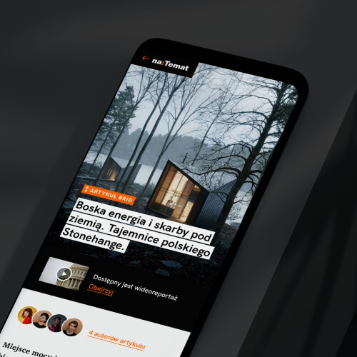
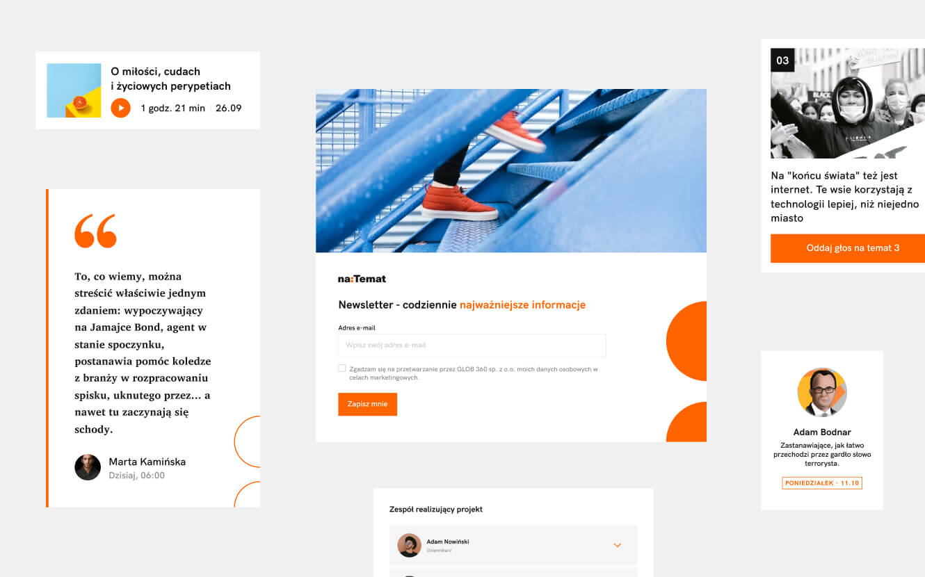
As well as creating a set of distinctive new assets for naTemat, we also needed to better showcase their existing ones. For instance, their signature orange colour and separating colon. Their original illustrations. And BRID – their innovative funding platform that lets users decide what journalists write next.
-
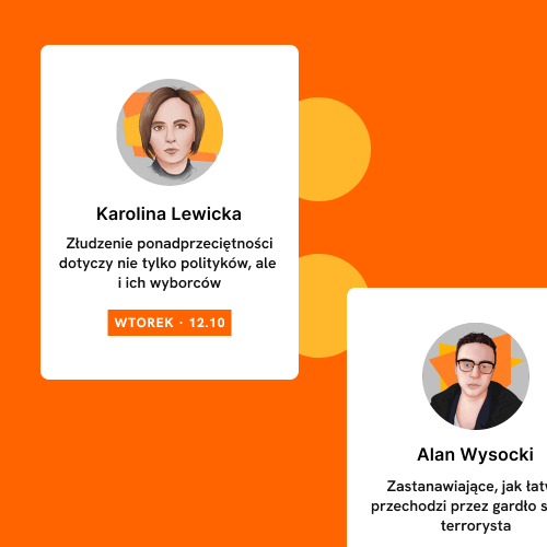
Give authors a better platform
naTemat’s journalists and content creators are central to the brand. But the old website didn’t give them the spotlight they deserved. We aimed to raise their profile by increasing their visibility in feeds and articles, and by creating dedicated subpages with bios and links to published stories.
-
Engage and educate readers
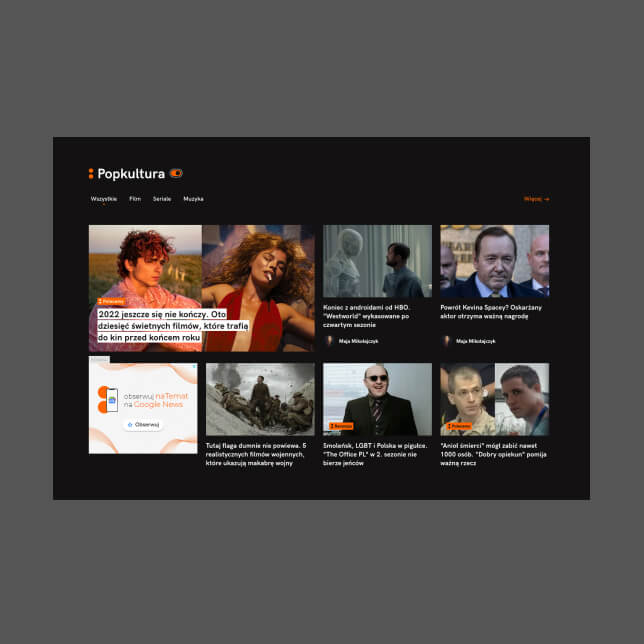
The new website needed to highlight important topics better. Related articles and resources needed to be presented more clearly, to help users deepen their knowledge of specific subjects. And surveys and quizzes had to feature more prominently, to gain insights into readers’ opinions and expectations.
-
Adapt to user preferences
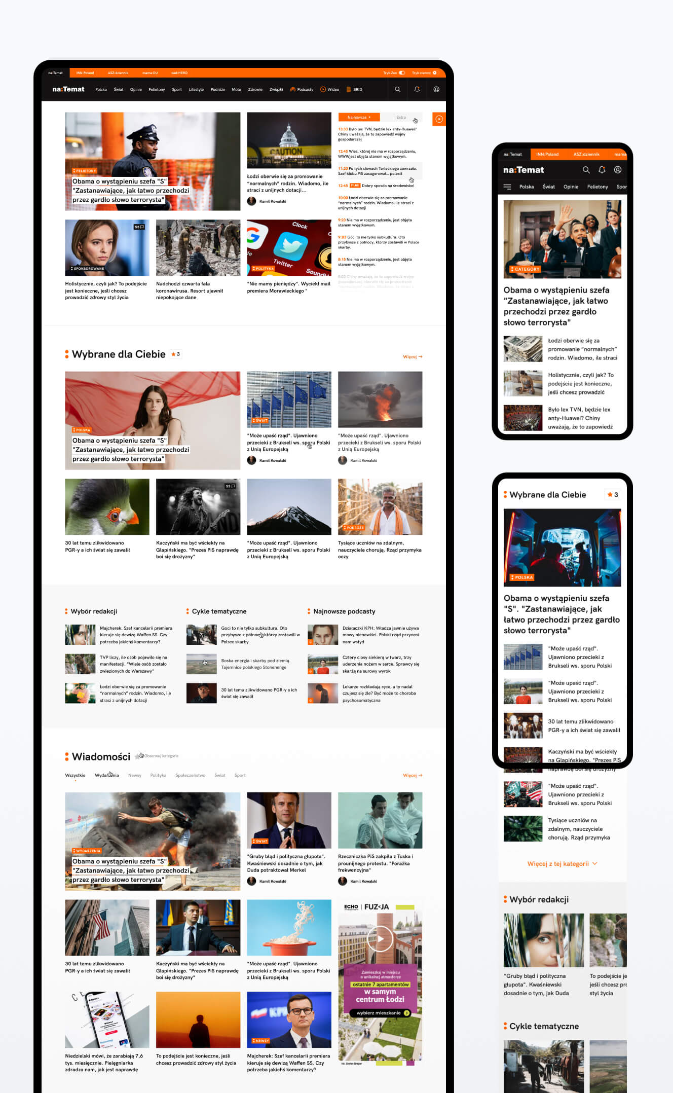
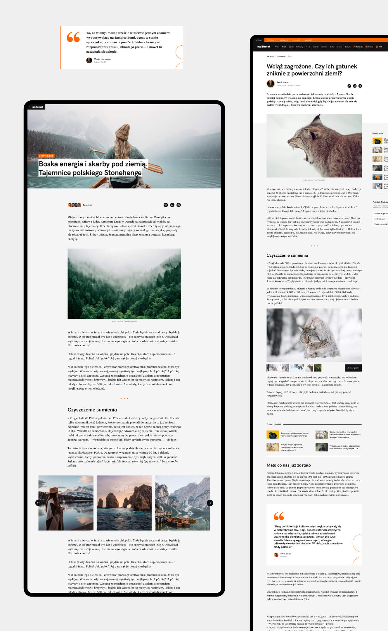
The new mobile website had to be truly mobile – and not simply a mirror image of the desktop version. The reading experience also needed an overhaul, to allow readers to curate their own feeds, follow their favourite authors, and easily view and access different categories.
-
Remove intrusive ads and visual noise
Nobody wants a feed full of adverts. First and foremost, then, the new homepage needed to be a showcase for the naTemat brand and its high-quality editorial content. Articles should be presented in a visually appealing way. And the surrounding ads should require no interaction from users.
-
Create a calming, clutter-free experience
Attracting users is one thing. Keeping them is quite another. To reduce overwhelm and friction, we needed to limit the number of categories on offer. We would give users the ability to disable and enable ads. And a dark mode would be available to limit energy consumption and improve readability in low-light environments.
-
Engage and empower users
Users want their feeds full of content that reflects their genuine interests. To enable this, we needed to give them the option to follow their favourite categories, tags and authors. The new website also needed to give people the power to suggest topics for future articles.
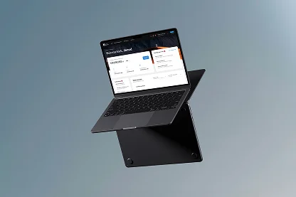
[ STRONG NATEMAT BRAND ]
Elevated Brand Identity
[ STRONG NATEMAT BRAND ]
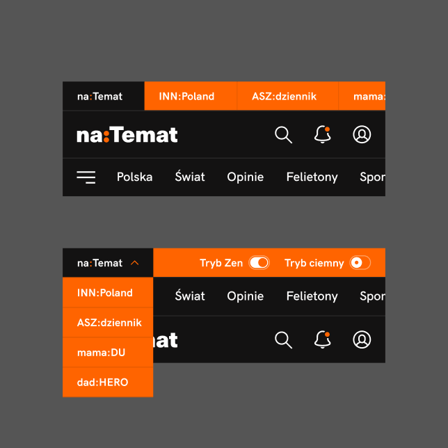
naTemat’s orange brand colour and separating colon are distinctive elements that needed greater prominence. We deployed them across the new site through section markings, underlines and links. This has given everything greater coherence and a much stronger visual identity.
[ RESULTS ]
Outstanding experiences
and freedom for 10m readers
The old website lacked a clear identity and lagged behind the latest design trends. We created a visually attractive, user-focused upgrade that better reflects naTemat’s vision and strategy. And which delivers genuinely outstanding business results.
-
A highly customisable platform
Logged-in users of the new site can choose what content they see in their home feeds, based on their personal interests. They can adjust the colour of the portal to match their preferences and lighting levels. And, best of all, they have full control over ad visibility.
-
Ads that don’t get in the way
Ads are an important revenue source for naTemat. But they should never interfere with the user’s browsing experience. We adapted the design grid for different ad formats, to keep the site uncluttered and readable. And to create a space that offers prestige and value for advertisers.
-
An elevated brand identity
naTemat’s orange brand colour and separating colon are distinctive elements that needed greater prominence. We deployed them across the new site through section markings, underlines and links. This has given everything greater coherence and a much stronger visual identity.
-
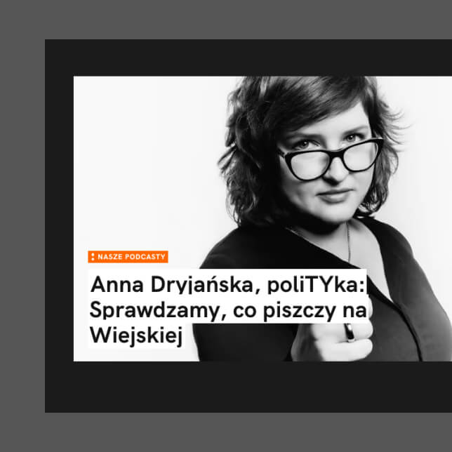
Rich interactive content
As well as written journalism, natemat.pl also provides content in audio format. This allows users to keep up with the latest news and current affairs while they’re on the move. It’s an important function for the brand, so we took care to develop and better highlight its presence for users.
-
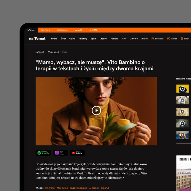
Light and dark modes
The new website allows users to choose the colour of their feed. This adds a nice touch of personalisation to the experience. And, since dark themes use less power, it also encourages people to reduce their energy consumption.
-
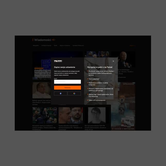
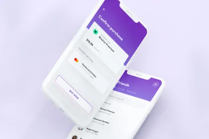
Optional subscriptions
Our involvement went far beyond the website alone. Working closely with the client, we introduced a new business model based on an optional subscription service. Less intrusive than a paywall, it allows users to upgrade their experience – while helping naTemat create even more high-quality content.
The beating heart
of the new platform
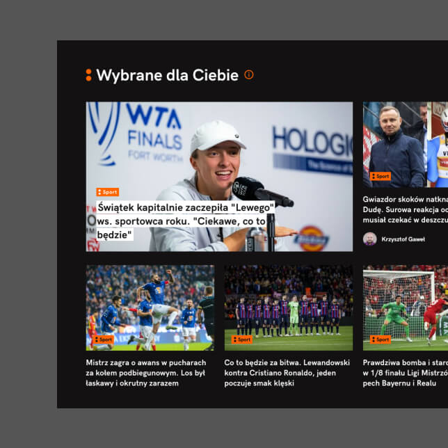
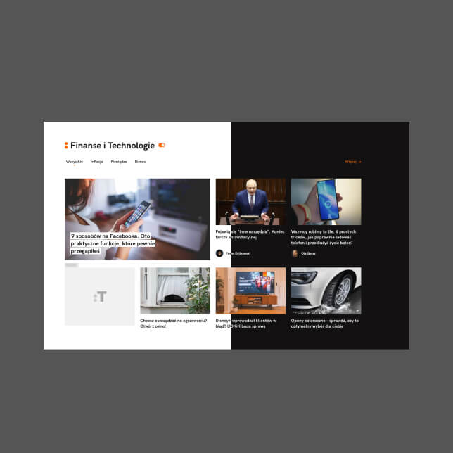
Engaging, easy-to-read articles. Working closely with naTemat, we introduced several new article formats to create a delightful reading experience for users.
Making content the star of the show
As a media company, naTemat is all about sharing relevant information at the right time, in the optimal format.
Keeping users focused, in this age of distraction, is an eternal challenge. That’s why we prioritised creating article formats that maximise reading efficiency and keep users hooked until the end.
We applied highly legible typography to make the reading experience clear, simple and consistent across all pages.
We also embraced white space, using it to carefully guide the reader’s attention and reduce the feeling of overwhelm (there is a huge amount of high-quality naTemat content on offer, after all).

[ TESTIMONIAL ]
“A huge thank-you for your gigantic contribution and commitment. For being patient with us and for trusting us. Working with you was an amazing investment.”
Paulina Plenkiewicz
CEO NATEMAT.PL
[ numbers ]
A new platform that looks
(and does) the business
+17%
Unique users
+23%
New unique users
+30%
Sessions
+29%
Page views
+11%
Sessions per user
+2,300%
uplift for Audiobrief (daily five-minute podcast)
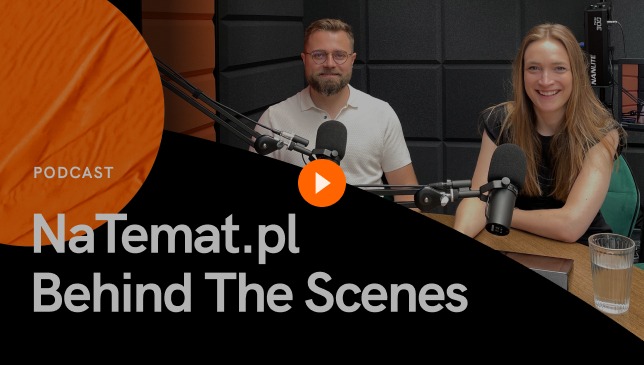
[ the making of ]
Flying Bisons & naTemat:
Behind the scenes
Watch the Flying Bisons & naTemat video podcast and gain an insider’s view of the most significant redesign in the history of naTemat.pl!
Join Damian Borecki, Strategy and Development Director of naTemat.pl, Kamil Tatol, CEO of Flying Bisons, and Klaudia Doerffer, Head of Research & Strategy at Flying Bisons. Don’t miss this exclusive opportunity to learn about the exciting changes at naTemat.pl!
More Case Studies
More
Case Studies


Unleash Your
Digital Potential
- Today.
Join our list of clients. You’ll be in good company.


