Salesforce-based
e-commerce
for undisputed food retail
leader in Poland
e-commerce
Biedronka
E-COMMERCE
2021

[ around the web ]
[ PROJECT SUMMARY ] When a well-known brand approaches you asking for the impossible, the decision needs to be realistic. So when Biedronka asked us to build one of the biggest and most complex e-commerce in just two months, we didn't hesitate. We're known for doing the impossible in just a few weeks, but even we need two months for a miracle.
Industry:
FMCG
Products:
E-commerce
Market:
Poland
[ HIGHLIGHTS ]
-
The biggest net of supermarkets in Poland, with over 3250 stores (2021)
-
Hires over 67 000 employees and, in 2022, gained over 16,7bn Euro revenue
-
The brand is part of the Jeronimo Martins group, operating in Portugal, Columbia, and Poland
-
Biedronka's website has approx 7,33m monthly visits
Scope of work
[ Goals ]
Become a leader in the
non-food e-commerce
market
Leverage position by user experience design.
Easy scaling and reliability based on the Salesforce system.
Brand unity - online/offline seamless branding.
Developers Support by creating modules for developers to streamline the coding phase.
Our goal was to have up and running e-commerce within a few months. At our scale, it’s a great challenge; that’s why we needed to partner with a company that we can trust, with a demonstrated experience in the field of e-commerce and FMCG.

Marek Złakowski
Digital & Customer Development Director, Jeronimo Martins Polska

[ challenges ]
Building the biggest
polish non-food platform
Our biggest challenge was designing a new e-commerce in just 2 months. With our experience in managing complex projects with tight deadlines, we were able to take it on, drawing inspiration from the brand's ladybug logo, which symbolizes fortune and protection.
The Research, Strategy, and Design had to be done within 2 months.
Obliged to 100% alignment with Salesforce technical specifications.
Upholding consistent branding while offering a more aesthetic look.
Our three-sided cooperation between Biedronka, Flying Bisons, and development partner (one of the biggest global consulting companies) had to be seamless.

[ Research & strategy ]
The first step - Complex
Discovery Phase
At the beginning of the project, one of the critical tasks was to determine how to navigate product categories and design particular product pages. Biedronka was planning to have various products ranging from cutlery to fridges, auto parts, underwear, and diapers.
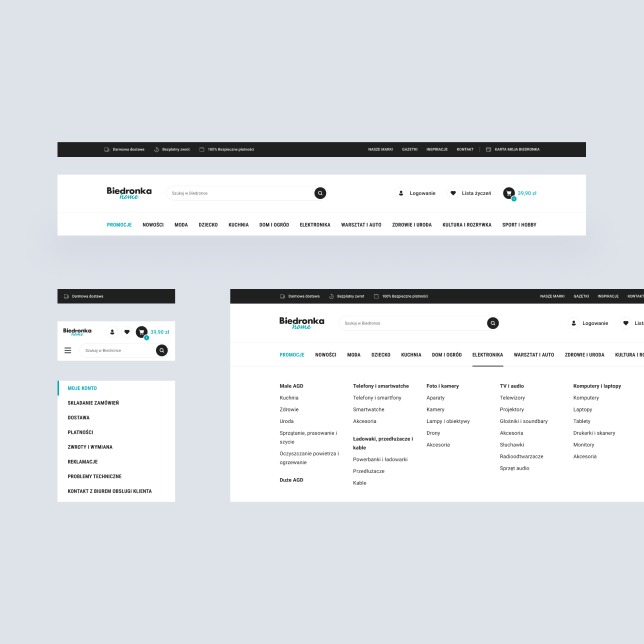
Thus we kicked off the project with a comprehensive analysis of key online competitors in the non-food market space. This part of the project focused on navigation, main product categories and product pages. The main goal was to understand how to build the category tree and adjust different products on a single product page.
Based on that analysis, we designed an architecture that enables easy navigation to the most important categories and allows the user to find the less obvious ones. We also defined labels, features and sections that the product page should include to provide distinction for all types of products.
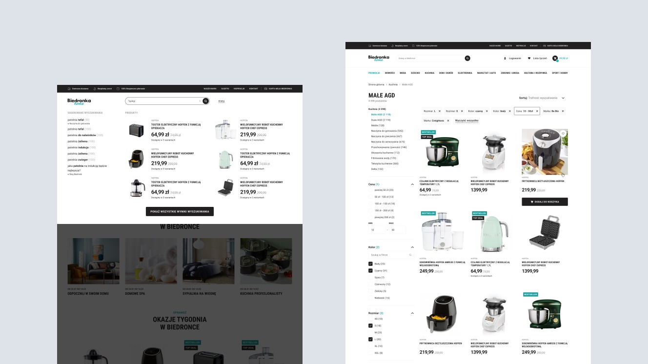
"Category taxonomy impacts how customers explore, browse and search for products. We worked with the client team and ex-Alibaba experts to find an optimal solution for Biedronka.”

Klaudia Doerffer
Head of Research & Strategy
[ Concept ]
Second step – finding
a perfect balance between
brand alignment and fresh,
new aesthetics
Finding the right UI style was one of the biggest challenges while working with big, established brands due to many constraints (i.e. colours, typography, spacing, look and feel).
Once we've defined the scope and information architecture for the e-commerce, we moved to the concept phase, where we explored different visual styles.
[ UX/UI Design ]
Final Design Solutions for
Biedronka’s e-commerce
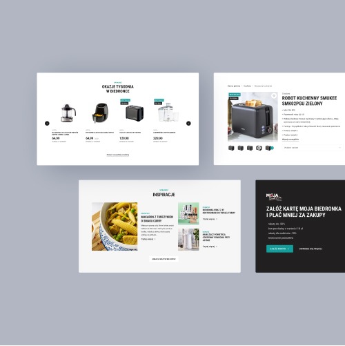
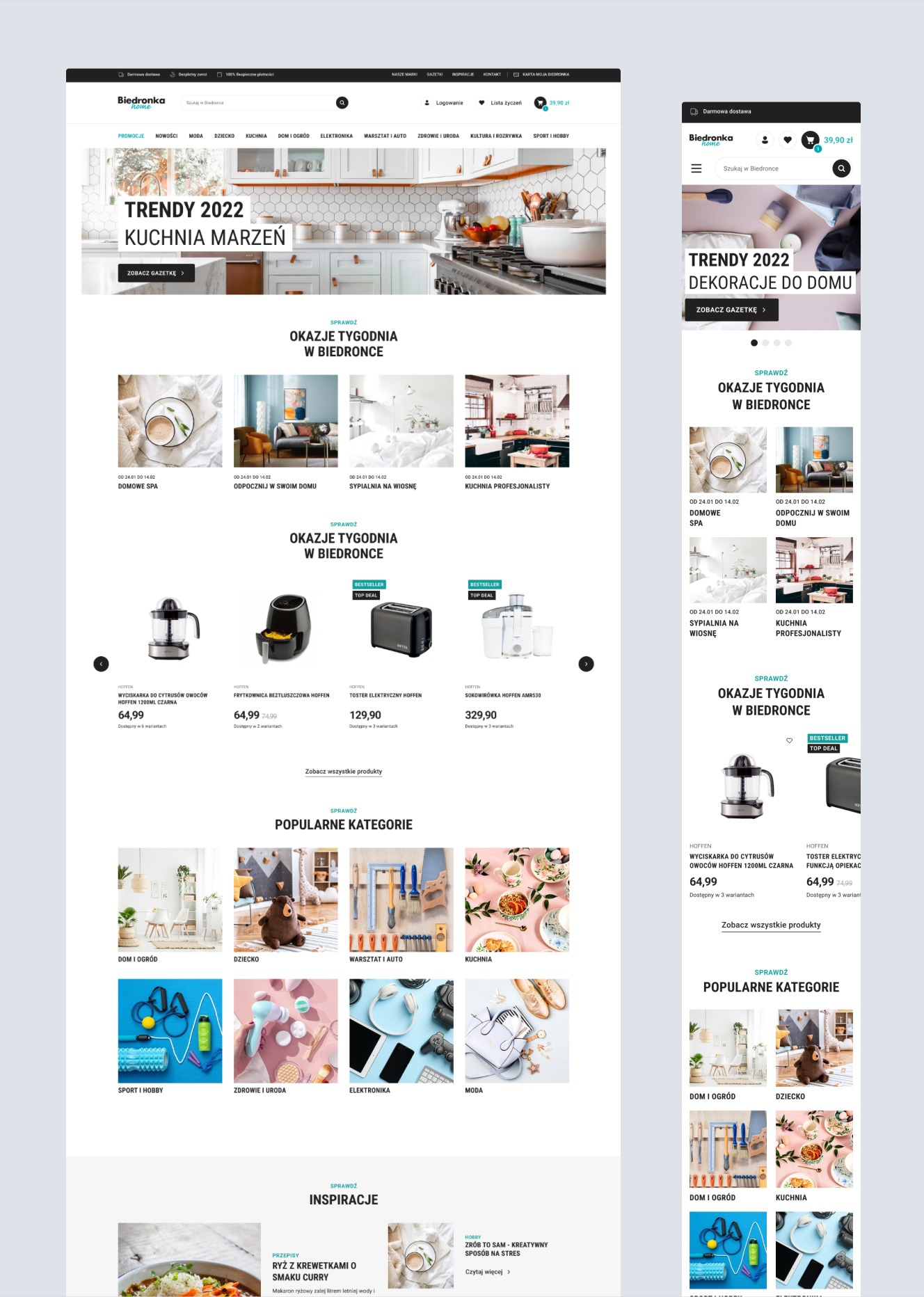
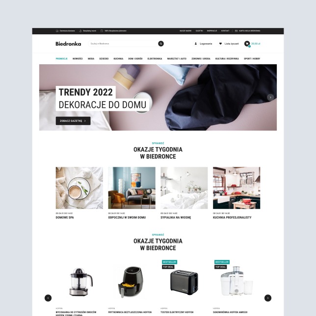
We dedicated around a month to create the final design for the e-commerce. Our design team consisted of Digital Consultants, UX Designers, UI Designers and Design System Specialists. We’ve been working on a full speed, to create dozens of screens and hundreds of components.
-
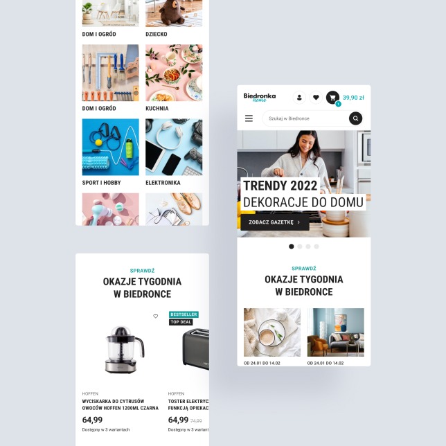
Homepage

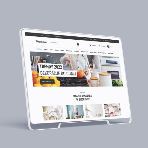
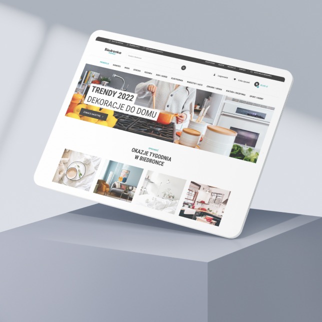
We designed the homepage to be an overview of all the essential pages and prioritise customer needs with clear and concise information. An engaging hero section with eye-catching graphics and a clear call-to-action can quickly capture customer attention and encourage exploration.
-
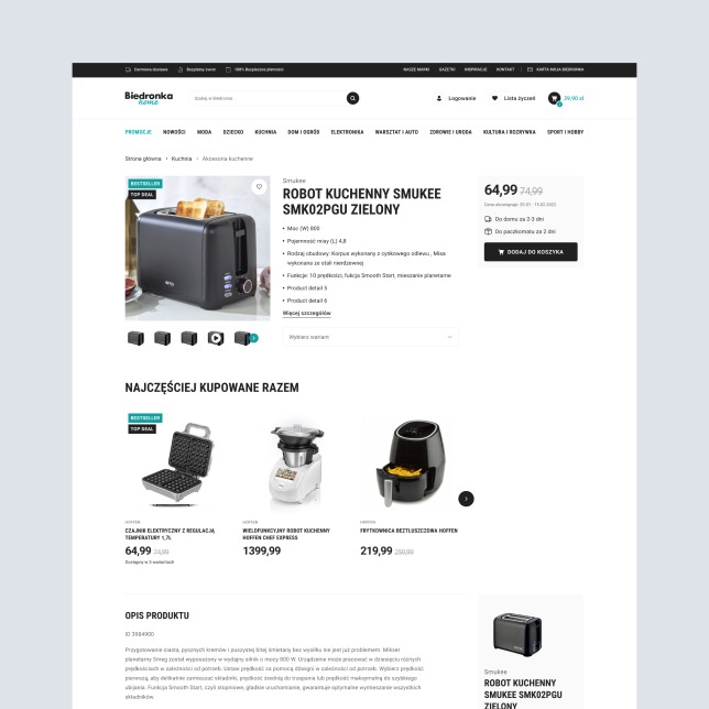
Product page

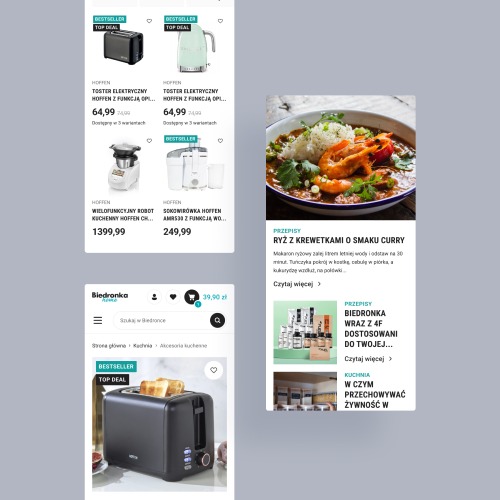
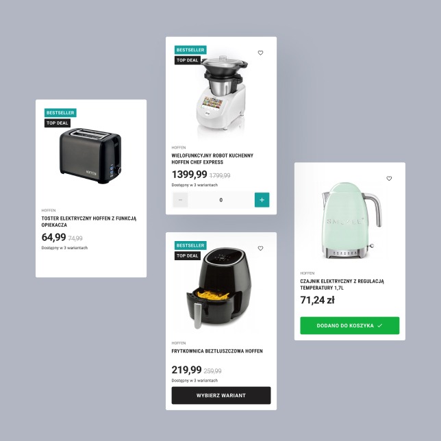
Our layout prioritises cleanliness and organisation, highlighting high-quality product images, transparent pricing and availability information. We've added customer reviews with related product sections to enhance the user experience and increase sales.
-
Responsive Web Design

Since most online traffic comes from mobile devices, we opted for Responsive Web Design on the e-commerce platform. This decision resulted in a seamless shopping experience across all devices and significantly boosted mobile conversion rates.
-
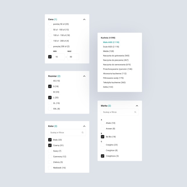
Filters

Robust filters were crucial for our e-commerce platform, given the vast inventory of products. This strong filtering system helped us stand out in a crowded marketplace, increased customer loyalty, and enabled customers to find what they were looking for quickly.
[ Design System ]
A robust design system
for streamlining
development work
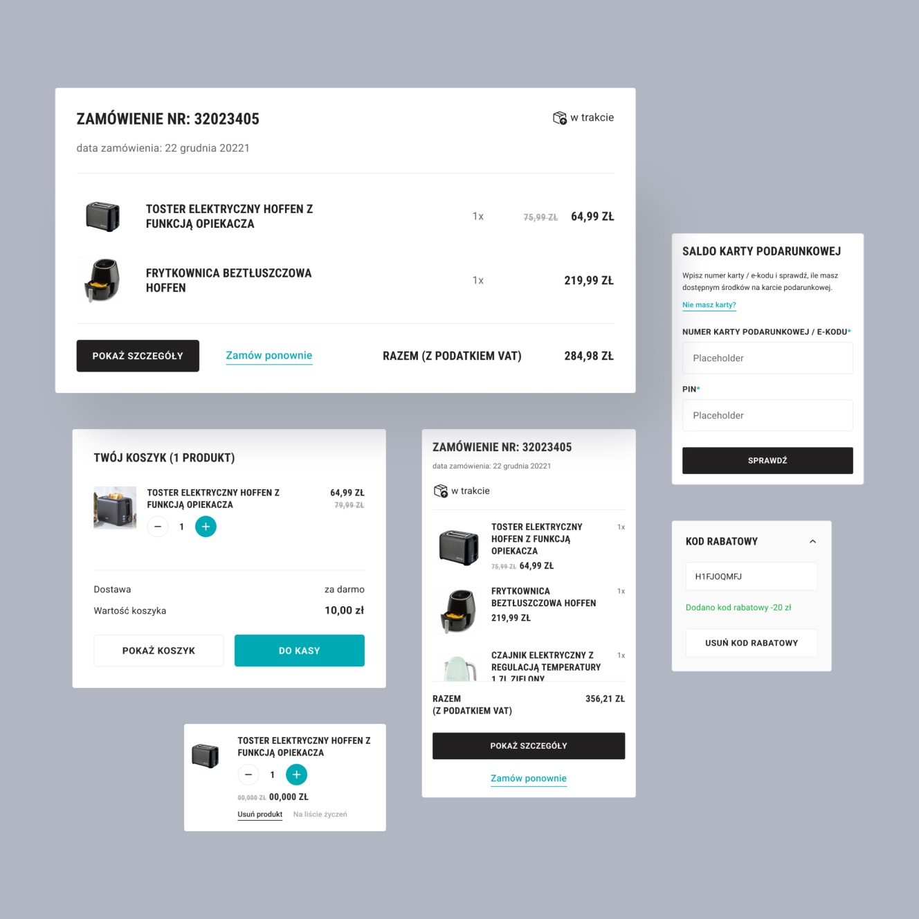
At Flying Bisons, we're highly results-oriented. While designing digital products, from the very first pixel, we think about how a developer will implement our design. To speed up development work in the next phase, we created 85 modules with many components in each section.
[ Testimonial ]
“We’re happy that we decided to create this project with Flying Bisons. Their work has been fundamental to the final success of the project.”

Marek Złakowski
Digital & Customer Development Director, Jeronimo Martins Polska
More Case Studies
More
Case Studies
Unleash Your
Digital Potential
- Today.
Join our list of clients. You’ll be in good company.
