
















Paying attention to detail with
new mobile experience for
Poland’s second-largest bank.
Pekao
MOBILE APP
2017

[ around the web ]
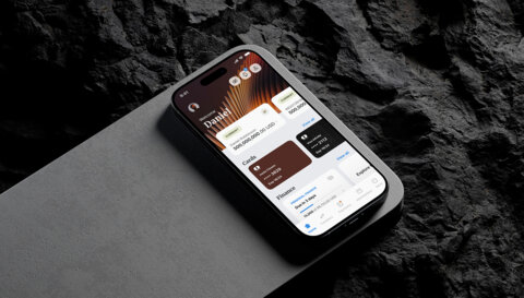
[ PROJECT SUMMARY ] Design an accessible, easy-to-use and visually appealing mobile website. And integrate it with PeoPay – Pekao’s comprehensive banking app. Time is money, so let’s get straight to the good stuff.
Industry:
Banking & Finance
Products:
Mobile
Market:
Poland
[ HIGHLIGHTS ]
-
Second-largest bank in Poland
-
Founded in Warsaw in 1929
-
Operates 713 branches and 1,592 ATMs (2021)
-
Employs almost 13,500 people
Scope of work
[ Discovery ]
Developing a common
vision with all stakeholder groups
Working alongside e-point SA – the software company that got us involved in the project – we were responsible for designing the functional concept and graphical interface for Bank Pekao’s new mobile site.

Pekao is a huge organisation – and their goals for their new mobile banking system were sizable, too. Our biggest challenge, then, was to develop a common vision for the solution that everyone could get on board with. To find the consensus we needed, we ran several dozen hours’ worth of joint workshops, research meetings and live design sessions with all stakeholders.
[ Approach ]
Maintaining
key standards
Eventually, we agreed that all key products and related actions should be accessible directly from the home page. And that full readability, transparency and intuitiveness must be maintained while working on the app architecture and design.
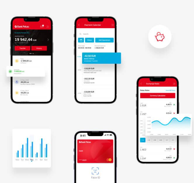
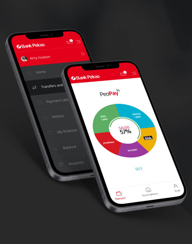
We wanted several finger movements to allow the user to control his financial and investment situation. Dashboard - as the most important point of the mobile site - allows modifications that adapt it to more advanced users with a large number of banking products. When designing the mobile version, we also faced the challenge of later integrating this solution with the PeoPay application.
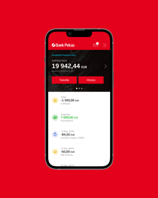
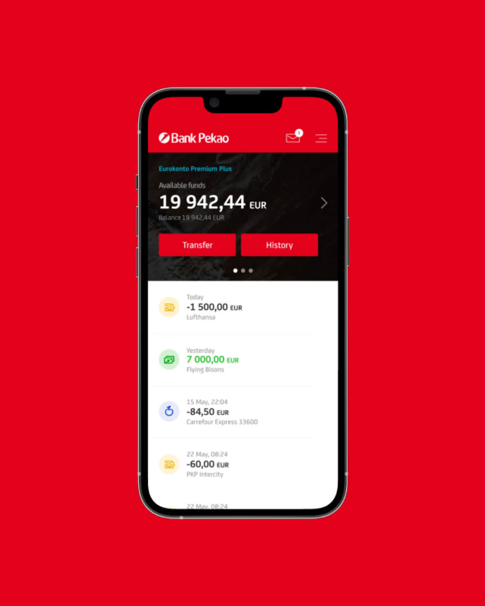


Mobile website
meet PeoPay app
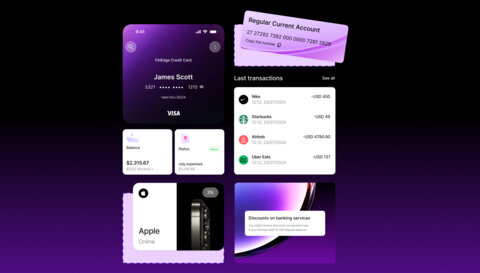
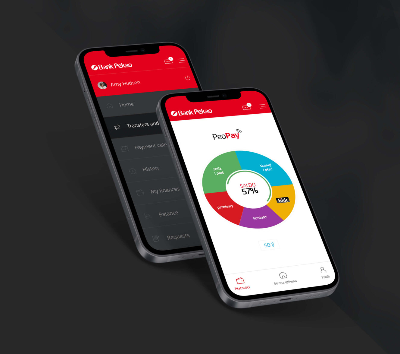
As well as the tech side of the integration, we also had to consider the issue of feature prioritisation. Namely, the challenge of maintaining the two main screens from PeoPay and the mobile transaction system. Our solution was a classic tabbed navigation, allowing users to move easily between the main functions of both systems.
The mobile website needed to integrate seamlessly with the PeoPay app, which meant there was a rigid project framework we had to stick to. The integration would involve embedding mobile web screens and linking them to PeoPay’s native features.

Pleasing.
Very pleasing.
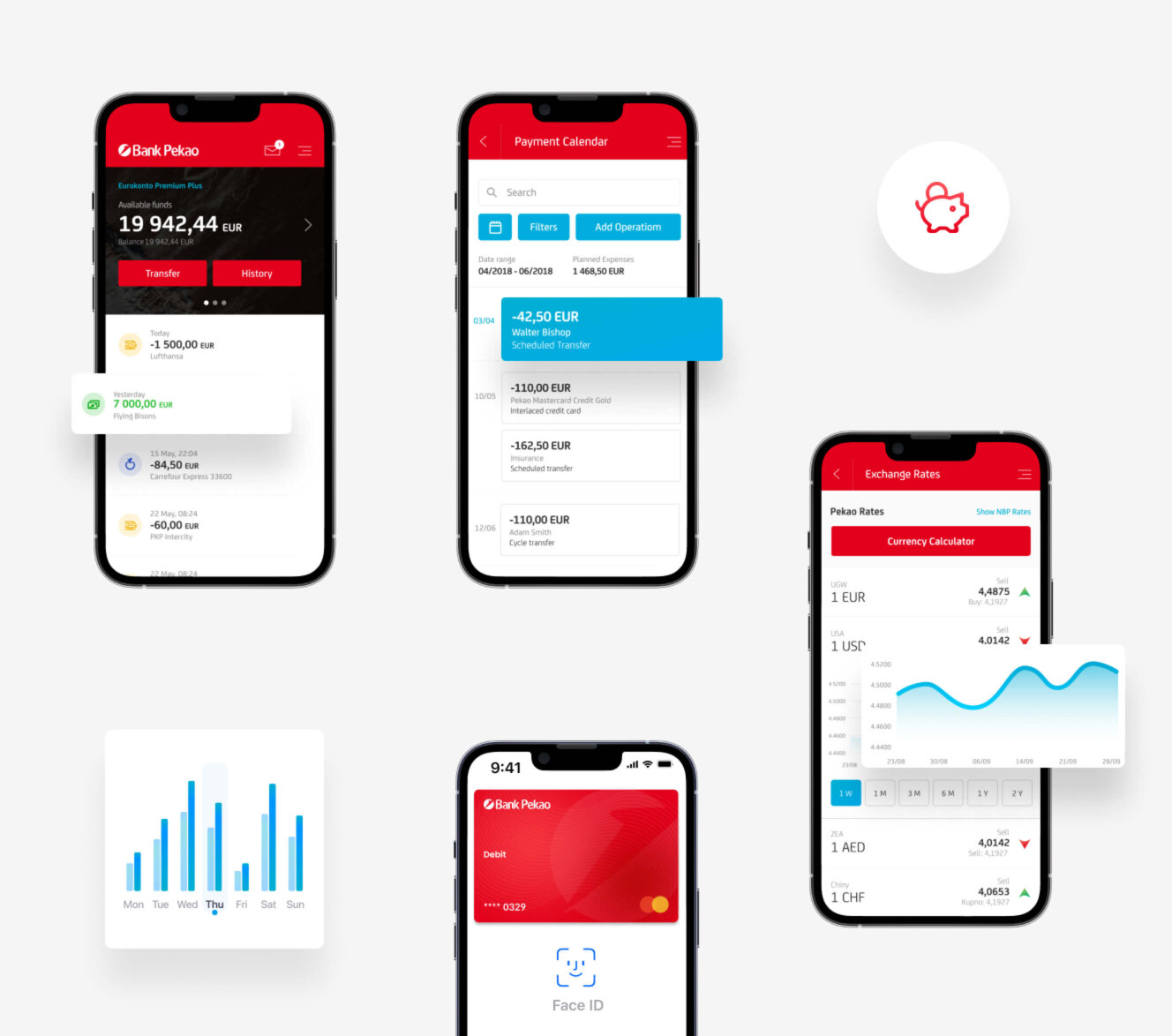
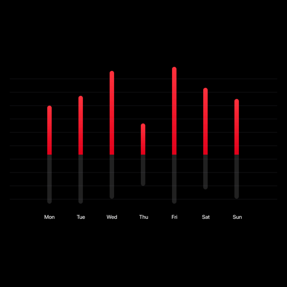
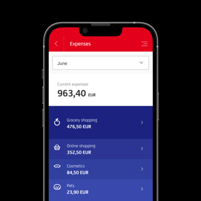
While functionality was key, we also wanted to make using the mobile app a pleasurable experience for the user. This enjoyment would flow from the simplicity of the interface and its uncluttered visual style. And also from the presence of micro-interfaces and gestures, all aimed at increasing comfort of use.
Putting it
to the test
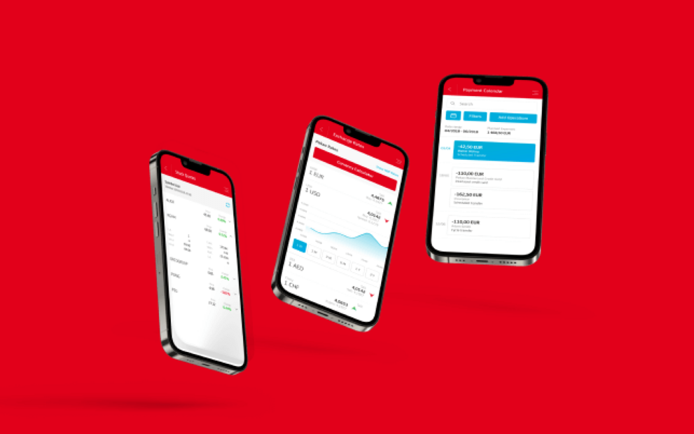
After pouring over 1,000 hours of our expertise into creating almost 500 screens, it was time for user testing. By observing people using the site during this test phase, we were able to identify areas for further improvement and confirm certain assumptions we’d made.
Among other things, we wanted to verify that users of the old Pekao system – as well as clients of other banks – would find the new interface much faster and simpler to navigate. Spoiler alert: they absolutely did. In fact, they found the prototype so impressive that they assumed it was the final product – asking questions such as “Should I use my banking details to log into this?”.


[ Results ]
The
results
Over 1000 hours of work giving almost 500 screens.
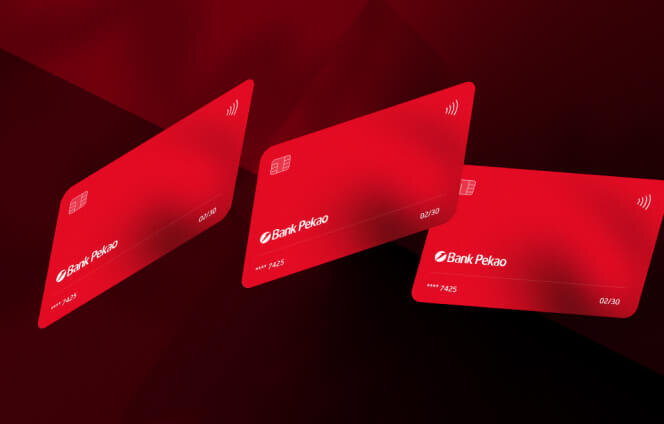
More Case Studies
More
Case Studies














Got a high-stakes digital problem? Let's solve it.
Join our list of clients. You’ll be in good company.


