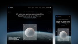
Hero Section
In the digital world, the hero section is the term used for the section at the top of a website that usually consists of an image (or video), a headline, and a call to action (CTA). It's the first thing that users see when they enter a website. It aims to catch the user's attention and immediately inform them of a website or product's key message or value proposition. The hero section dictates the user's first impression.
It's hard to imagine a website without a hero section. It grabs the user's attention with a clear message and a beautiful image or video. When visitors come across your website, the hero section tells them what you offer. And if the communication is effective, it engages them and encourages them to further exploration. A hero section sets the tone for the rest of the page, creating a consistent look and feel across the website. And finally, it promotes action – having a CTA in the hero section prompts the user to take action you suggest, be that signing up or learning more about your product.
A successful hero section starts with high-quality visuals. Well-chosen, high-quality images will grab the user's attention and help make a positive first impression. Low-quality images or videos can make it look unprofessional and discourage the users from digging deeper into your offer. That said, a hero section should be simple for users to understand it. The key message you want to convey should be short, and you should put at most two calls to action (e.g. sign up and learn more). If you put too much content or graphics in the hero section, you risk overwhelming the user, which can lead to them leaving your website. And last but definitely not least, make it responsive to different screen sizes and devices. People can visit a website on various devices, from smartphones and tablets to laptops or PCs. Make sure that your hero section adjusts to the screen and device your users are on when visiting your website.
One last piece of advice: don't make the hero section too big. It should stand out but not take up too much space. Users should be able to scroll down quickly to view the rest of what you have to offer.
The hero section is to a website, like a cover is to a book. Regardless of the saying, first impressions last long. If the hero section is where you convince your website's visitors to stay longer and turn them into customers.


