


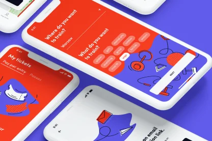
Making a splash online
for Europe's largest
tropical-themed water park.
Park of Poland
E-COMMERCE & CONTENT WEBSITE
2018 - NOW

[ around the web ]
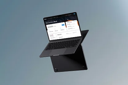
[ PROJECT SUMMARY ] Create a full digital platform for Park of Poland – complete with e-shop, accommodation booking engine, and integration with the park’s wristband and ticketing systems. Time to put on our big-bison trunks.
Industry:
Entertainment
Products:
E-commerce & Content website
Market:
Poland
[ HIGHLIGHTS ]
-
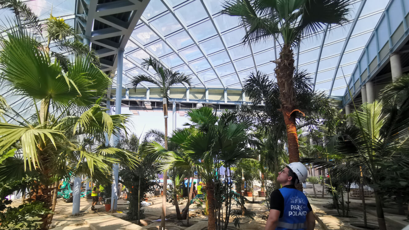
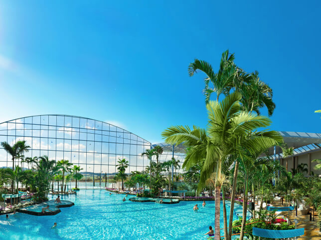
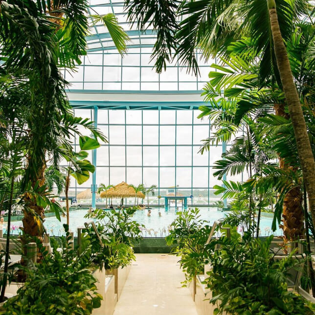
Largest tropical-themed water park in Poland and Europe
-
Designed to accommodate 8,000 visitors per day
-
Boasts 32 slides with a total length of over 3km
-
Home to the longest indoor slide in Europe (320m)
-
Features an 840m2 thermal pool, a 20,000m2 garden, and 400 palm trees
-
Oh – and did we mention the saunas and spa service?
Scope of work
[ Challenges ]
Bringing together
worlds and functionalities
Design and develop a full digital platform for the water park
Combining online and offline — and designing for something that doesn't yet exist
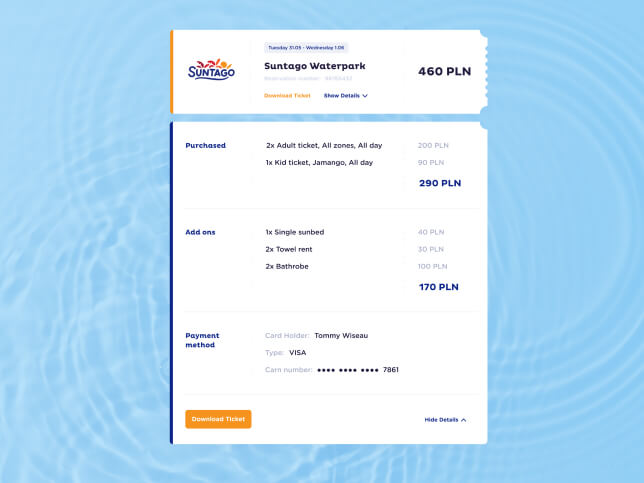
Deliver a functioning front and back-end e-shop
[ Background ]
Jump in
really deep
Our partnership with Park of Poland (PoP) started all the way back in 2017. Mamastudio – the people responsible for PoP's branding – invited us to pitch for some work creating the landing page for a new investment project near Warsaw.
This 'investment project' was, in fact, a tropical-themed water park with a budget of €350m. There were only eight of us Bisons at the time (there's almost 100 of us now), working out of our first little office on Chmielna Street in Warsaw, Poland. So we kept our expectations of success low.
But after a positive first meeting with the PoP team, we found ourselves working on the company's launch website just a few weeks later. Straight in at the deep end, and loving every minute.
By summer 2018, the design and build of parkofpoland.com was complete. The UX side of the project was straightforward. The tricky part, however, was to develop a visual style to align with the branding — made even more complicated by the lack of any existing visual content.
All we had to work with was a logotype, a handful of 3D renders of slides, and some basic technical materials. But if there's one thing we love, it's a challenge.
So, armed with these limited resources, our designers set to work preparing the entire visual language for the park.
The website did its job — and then some. It communicated information about the park in a clear and simple way, while impressing visitors with an added wow factor. And it created great awareness for PoP's offer, with the landing page attracting hundreds of thousands of unique visitors in 2018–19 alone.
The initial website project proved to be our big break. Impressed by the site's performance, PoP's team invited us to develop a full platform for their entire digital operation – powering everything from e-commerce and online accommodation bookings to the wristband and ticketing systems inside the park itself.
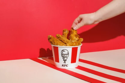
It was a huge opportunity, but one we were totally ready for. We already had lots of similar experience in our locker, working with household names such as KFC, Pekao Bank, PwC, IKEA, and Kompania Piwowarska (the biggest brewery in Poland). So our team dived head-first into the project, full of excitement for the possibilities it presented.
[ Research ]
Gaining
the big picture
The project started in late March 2019, and it absolutely had to be completed by the end of the year. The water park could not open without a fully functioning website, since so many of the offline systems depended on the digital platform. So there really was no room for delay.
Testing the watersAs always, the project kicked off with an in-depth discovery phase. But this time we took the concept of 'discovery' to a whole new level. At PoP's invitation, we travelled to Romania to visit the amazing Therme Bucharest water park.
During our time in Bucharest, we gained first-hand experience of how a large-scale water park works, and identified a number of customer experience challenges and opportunities. We returned to Poland with motivation high and our heads swimming with ideas.
From here, the process involved collaborating with a range of different stakeholders and vendors. There was the branding studio, who were also responsible for visual signage inside the park. The company in charge of delivering the accommodation engine. The people managing the ticketing and wristband systems. The bungalow operators. And, of course, the PoP team itself.
After agreeing a common vision for the project, we set about creating an initial roadmap. Our team used the business model canvas framework to gather information and cover important topics in a highly structured way. Within a few hours, the initial roadmap was finalised and accepted by everyone involved.
We decided to create proto-personas based on people likely to visit the park on weekdays. The park's main business risk is having too many customers on weekends and too few on weekdays. So gaining a deeper understanding of the needs and challenges of potential 'weekday clients' could only be beneficial.
For the proto-persona workshops – and later in creating the fully-formed personas – we mainly worked with PoP's marketing team. It was a great exercise for them, as they were in the middle of preparing the full marketing strategy for the whole park at that time. Similarly, preparing value propositions for each proto-persona was a valuable experience for us, as it gave us a lot of useful insight into specific areas of the new website.
Mapping the park experienceNext, it was time to dive deeper into the online and offline touchpoints. Together with PoP's team, we started mapping the whole park experience – an essential exercise, as it ensured nothing was left to chance or missed along the way. During this process, we realised the website would need more pages than we'd initially planned. We also managed to identify some blindspots in the real-life park experience, which probably wouldn't have been possible without that invaluable trip to Romania.
Understanding the technologyThe new platform would need to integrate with four large, independent external systems:
Ticket/wristband management
Hotel reservations
Spa and wellness bookings
Payment provider
To understand these systems – their possibilities, dependencies and limitations – we ran technology workshops with each provider. This helped us get to know their products from top to bottom, and allowed us to gauge the workload on our side while minimising the project risk.
We then held sessions with the client to establish their needs and create workflows across the systems, in harmony with their operational plan for the park. From there, we created event diagrams for each action that should take place on the platform and assigned 'actors' to every event.
Finally, we held requirements engineering workshops with stakeholders from various departments. This helped us gain a better understanding of their operational needs, and allowed us to craft them into functional and non-functional requirements for the platform to fulfil. By the end of the exercise, we had over 200 user stories to work with.
By now, we had a clear and precise understanding of what we needed to build. The next step, then, was to prepare an actionable plan that would work alongside the complex and time-sensitive process of building the water park itself.
[ Strategy ]
Swimming
in the same direction
With any project as vast as this, it's vital to have everyone on the same page. So as part of our strategy for bringing the new PoP website to life, we agreed on this set of common goals and rules:
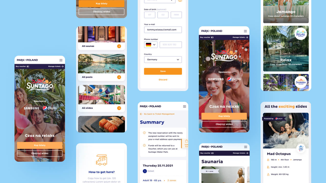
Mobile-first
We expected around 70% of traffic to come from mobile in 2020.
Prioritise accessibility
We agreed the website would have all necessary accessibility features (to be introduced in March 2020).
Unique design
The park is all about the experience, so the user interface part of the project was crucial.
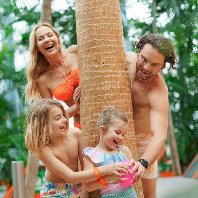
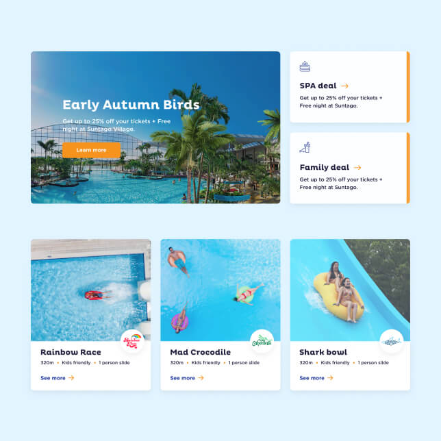
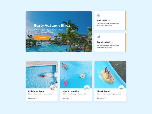
Show happy people
We agreed the website imagery would show people enjoying their time inside the park.
First-class copywriting
Great copy is central to the user experience, so we needed to make sure the right resources were assigned to it.
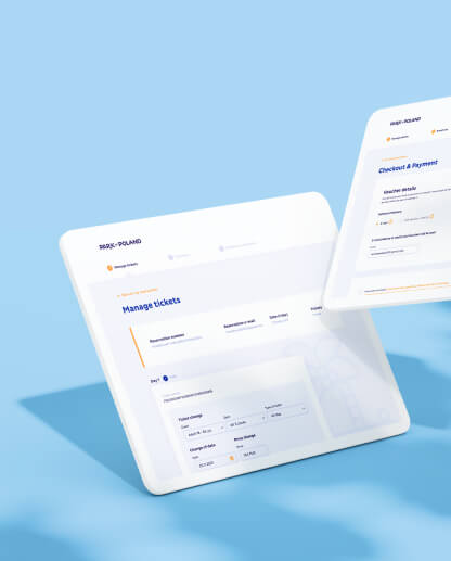
Easy checkout
Having a brilliant product is not enough. If you want to drive sales, a smooth and simple checkout process is key.
SEO
Similarly, a beautiful and finely tuned website is little use if nobody can find it online.
Security
Security checks needed at each stage of production.
[ Concept ]
Adopting
the starting position
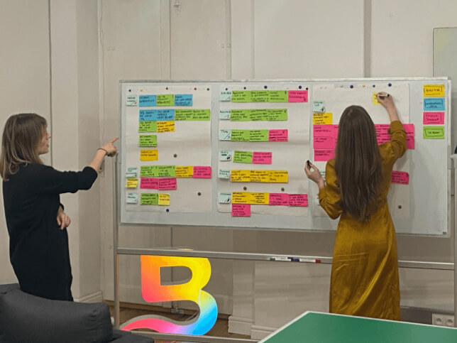
With the foundations firmly in place, our team was ready to get stuck into the concept phase. We started with the plan for the navigation, running through all the available benchmarks and preparing a set of dos and don’ts.
The next step was to go old-school and get up in front of the whiteboard. Using stickers, we prepared categorisations, grouped pages, and defined the general content of each page. With all of this in place, we were able to design a lo-fi concept for the navigation.
Up next: finalising the sitemap. We planned to create several similar modules across the website, to make it easier for the user to navigate.
The main idea behind the sitemap was to help users seamlessly explore PoP’s attractions through the website. We wanted users to be able to hop between different parts of the platform without having to think too much.
Once we had the navigation and sitemap nailed down, we were ready to start preparing a lo-fi design for the main screens and checkout processes.
-
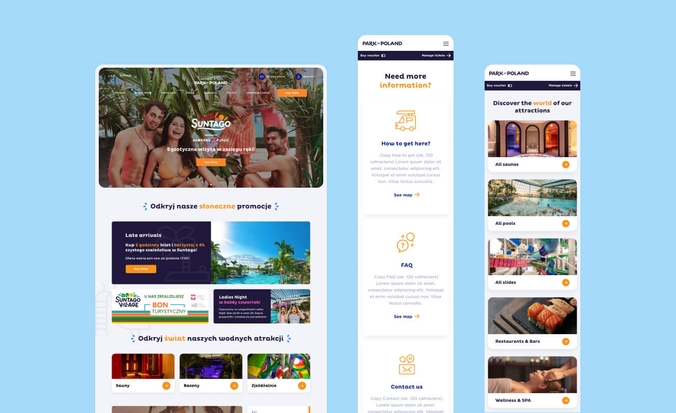
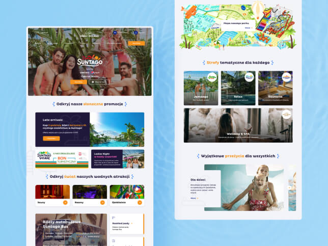
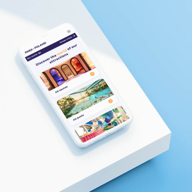
Homepage
We designed the homepage to be an overview of all the most important pages and elements on the site.
-
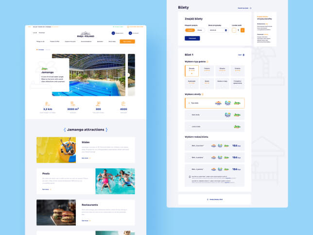
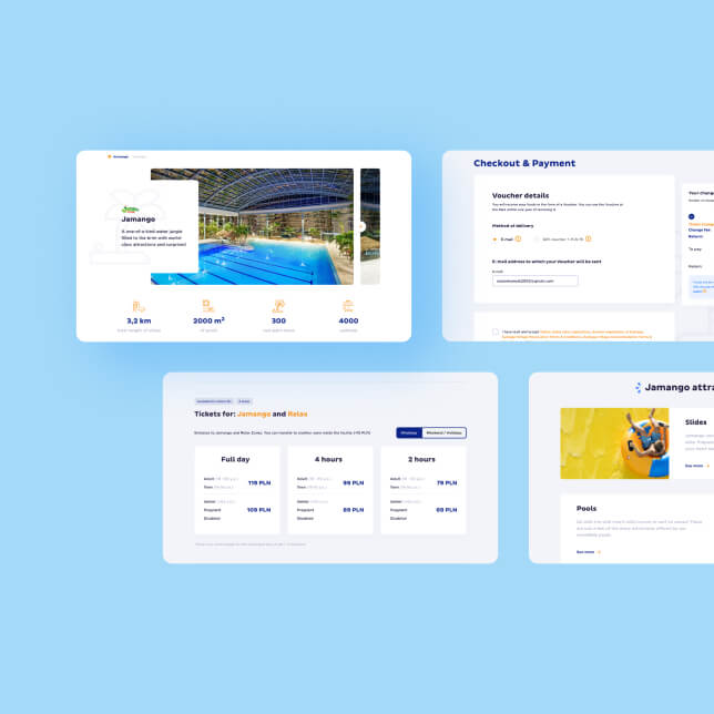
Attractions
For a seamless website experience, we applied an expanded view to read more about the attractions without opening new tabs.
-
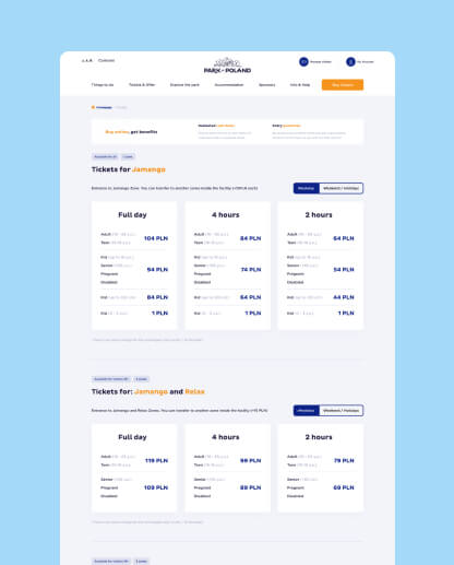
Ticket configuration
Part of our work on the design system included working with initial graphic materials from Mamastudio. Among other things, it had a set of icons that would appear on signage inside the park. Based on this, we designed over 40 more icons and signs.
-
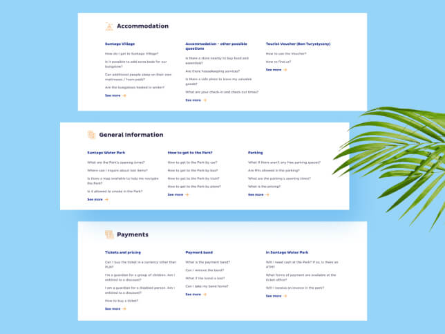
FAQ
We designed it to allow PoP to add unlimited content and questions in the future.
-
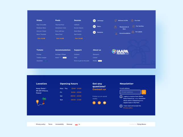
Footer
The footer has two main functions – it includes all primary information and sitemap and collects the data for SEO purposes.
[ user interface ]
Keeping it
colourful
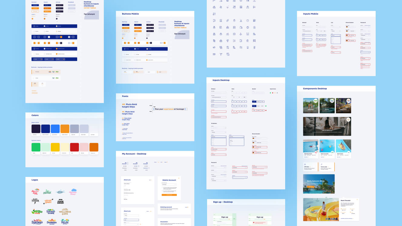
Our UI design goals were clear from the start. We wanted to create an interface that captures the fun subject of the website, while arranging elements in a simple, organised way that makes life as easy as possible for our target personas.
Our team created a colour set that combines juicy orange with two shades of navy blue from the PoP brand book, supplemented by neutral greys. The combination works brilliantly with the website's imagery, which is vibrant and colourful, and captures the exotic vibe of a tropical holiday.
We developed the style guide while we were designing the main screens. With such a large-scale project, we knew that designing and aggregating all the individual elements of the website would be key for efficiency. Five designers were working on the PoP UI at the height of the project, so there was no room for clutter or confusion.
Part of our work on the design system included working with initial graphic materials from Mamastudio. Among other things, it had a set of icons that would appear on signage inside the park. Based on this, we designed over 40 more icons and signs.
[ Analytics ]
Consistency
is the key
Once the hi-fi wireframes were approved, it was time to create an analytical plan. Our analytics and design teams sat down with the client to discuss their future needs, and agreed that both we and PoP would need to be able to analyse digital data on a daily basis.
Over the years, we've learned that the hardest part of implementing an analytical plan is developing the data layer – especially when the product is developed by an external team. In this case, luckily for us, our internal dev team was responsible for the site, and they were able to establish a seamless day-to-day cooperation with the analytics team.
The next step is to start using the data we've gathered and gradually increase automation and personalisation using the CRM.
[ TESTIMONIAL ]
“Flying Bisons do their job carefully. They discussed our needs with us during a specific workshop. They prepared strategy, timing, and scope of work in advance, which was very important for us.”
Ewa Wdowska
Marketing Director, Park Of Poland
More Case Studies
More
Case Studies


Unleash Your
Digital Potential
- Today.
Join our list of clients. You’ll be in good company.


