


Ka-ching the headlines:
Designing a unique
money-transfer experience.
BeamUp
MOBILE APP
B2C
BANKING&FINANCE
2017

[ around the web ]
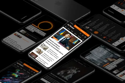
[ PROJECT SUMMARY ] Create a slick user interface and experience to make sharing money fun and simple. And blend it seamlessly with a fully functioning offers marketplace. Were we up to the task? You can bet your bottom dollar.
Industry:
Banking & Finance
Products:
Mobile app
Market:
Poland
[ HIGHLIGHTS ]
-
Peer-to-peer money transfer startup
-
Challenger to traditional banks and payment apps
-
Allows users to send, receive and split payments easily
-
Includes a marketplace of exclusive user offers
Scope of work
[ Challenges ]
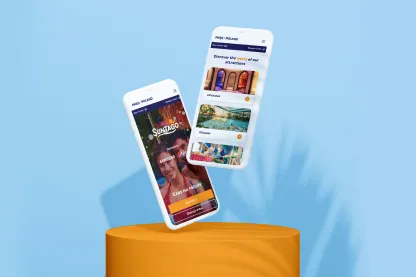
Sharing funds reimagined
Easy Cash
Create a simple, user-friendly experience across the app’s two main functions: money sharing and marketplace.
Gradually find the jackpot
Use an iterative design process to solve a complex UI challenge. A curious spirit and open mind would be needed at all times.
Banking on success
Develop an experience that drives user registrations, encourages regular transactions and generates a positive buzz.
Flying Bisons understands the client's needs and the specifics of a project in no time and helps you to achieve the goal as planned. They have the ability to keep things simple and back their rationale even when the idea is not in line with the client’s initial thoughts.

Paweł Trocki
CEO, beamup
[ Discovery ]
Balancing crucial
information appearance
The BeamUp app combines two different functions: simple payment-sharing, and a marketplace of exclusive user offers. In our discovery meeting with the client, we agreed that both functions should appear in the same interface.
This would prove to be our biggest challenge – and one we truly relished. Extensive research and iterative development would be the key to cracking it, and we approached every stage with a positive mindset and a hunger to explore original creative solutions.
[ Approach ]
Ensuring a seamless
experience across
various features
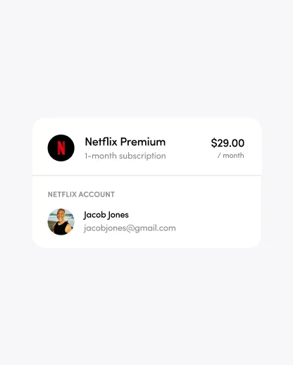
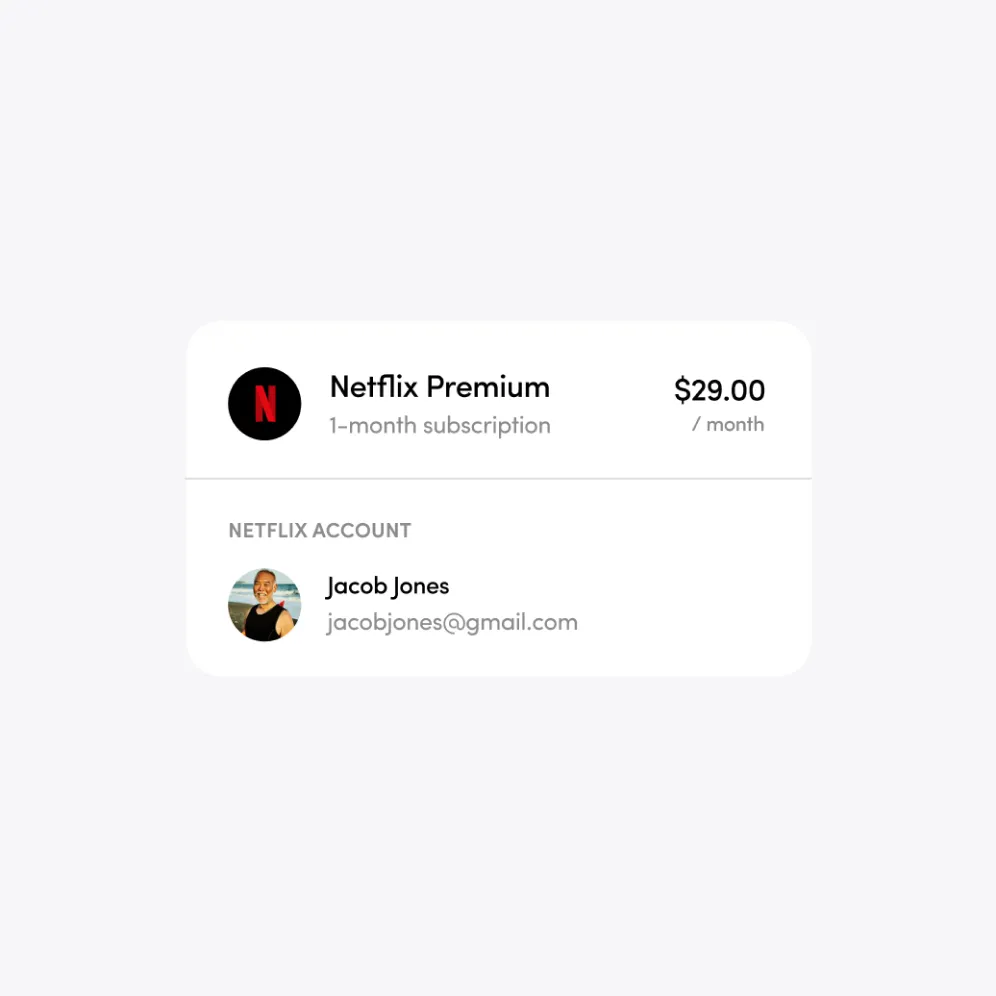
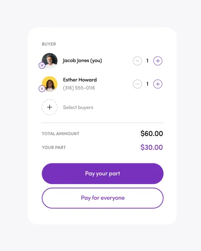
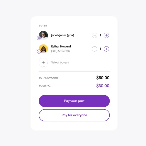
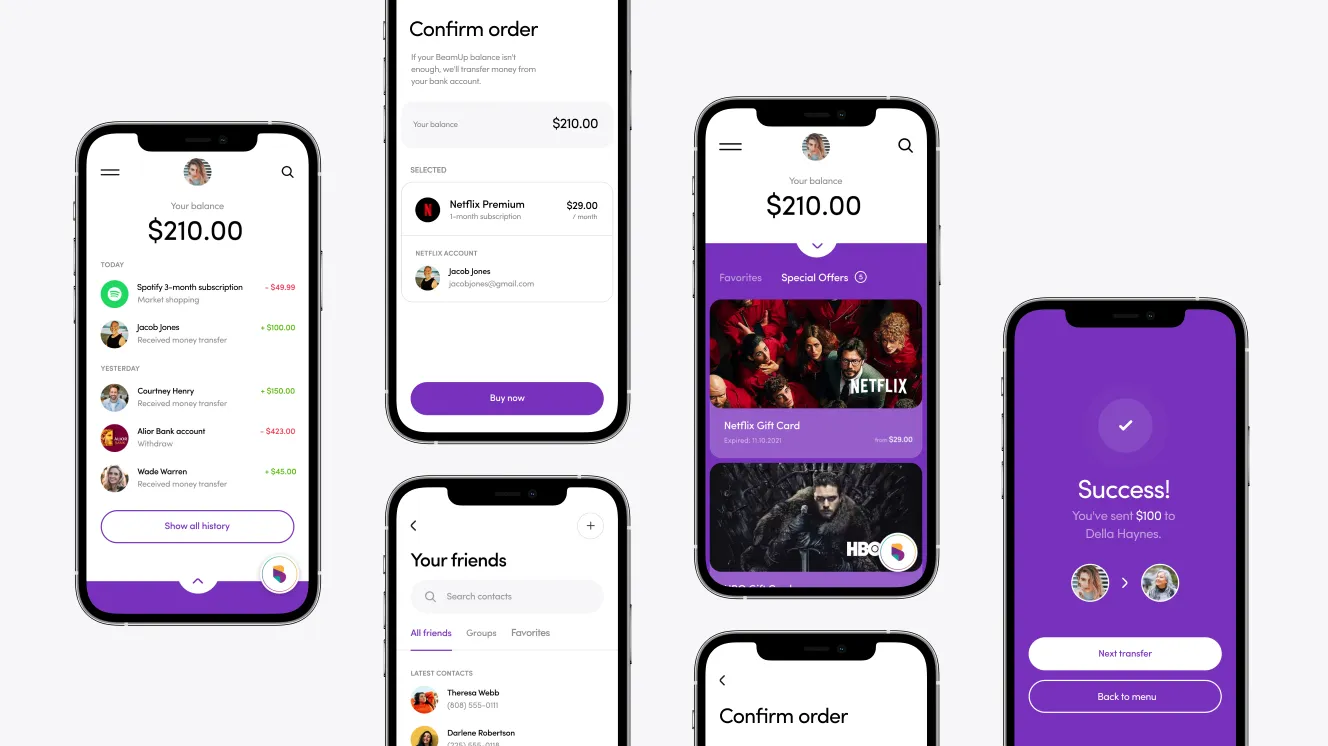
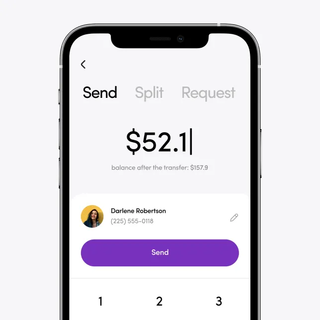
BeamUp is designed to take the stress and hassle out of splitting shared bills. It makes group activities easier to manage and pay for. And it allows users to transfer cash between different wallets in the blink of an eye.
Since speed and simplicity are so central to the product, creating a seamless user experience was an absolute must. We took great care to develop an easy in-app navigation system, as we knew this would give BeamUp a great advantage over similar tools. In the longer term, it would also encourage users to move away from traditional banking apps and other e-wallet services.

BeamUp’s marketplace – packed with entertainment offers to enjoy with friends – is what sets it apart from similar money-sharing apps.
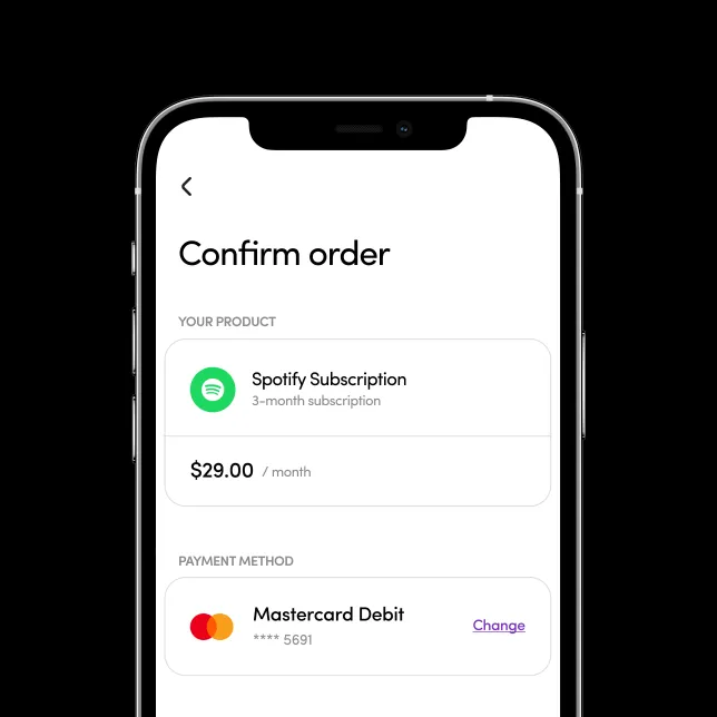
Presenting the offers in a clear, accessible way was particularly challenging. We solved it by using swipe navigation – allowing users to view content quickly and conveniently, and gain the minimum necessary information to make a decision.
Displaying two very different functions on one screen was an enriching creative challenge for our team. But after exploring a range of inventive solutions, we decided the simplest approach was best. Isn’t that always the way?
In practice, this meant splitting the screen in two. One part handles the user’s wallet and payments, while the other covers the marketplace and its sales function. Forcing people to use half a screen still felt less than ideal, though. So we went a step further, creating a fluid navigation that also allows users to switch between full screens for both functions.
The project saw us create 391 screens, which required heaps of hard work and loads of inter-team collaboration. Creating the architecture of such a wide-ranging app, while keeping the usability simple and intuitive, meant we needed several designers working on the brief at the same time.
Our weekly status updates with the client proved invaluable in that sense. They helped us keep everything organised and on track, while giving everyone a clear overview of how the app’s development was taking shape.
When your app promises a simple payment experience, it has to be able to deliver. Its success depends on it. With that in mind, we took a lot of time and care to streamline the navigation and provide quick and easy access to payment functions.
Nobody’s better placed to identify a poorly designed user experience than the users themselves. So, as part of the project flow implementation, we carried out detailed usability testing. Thanks to this, we were able to spot a number of shortcomings and eliminate them early in the information architecture design process.
The final phase of the research cycle came just before the finished app was released. Tests were based on a high-level, hi-fidelity prototype, which reproduced the full user experience and featured all the graphics, animations and interactions of the final product. Our main goal here was to verify the functionality of the app and confirm that everything was error free.
BeamUp launched successfully on the App Store and Google Play – but our work didn’t end there. Assuming a consultancy role, we continued to hold weekly status updates with the client, presenting our observations and offering expert advice.
We also identified and planned new functions for the ongoing evolution of the app. And we added extra screens and processes in line with BeamUp’s long-term development plans, ensuring everything was consistent with the app’s existing visual style.

[ Results ]
Sharing money
made easy and fun
Just three months after BeamUp launched, the app already had over 50,000 registered users. More than 200,000 transactions had been completed. And users were vocal in their praise, with many positive ratings and comments received. Kerching!
More Case Studies
More
Case Studies


Unleash Your
Digital Potential
- Today.
Join our list of clients. You’ll be in good company.


