

















Bridge between two worlds:
Preparing the way for
omnichannel transformation.
Carrefour Poland
Mobile App 2025
[ around the web ]
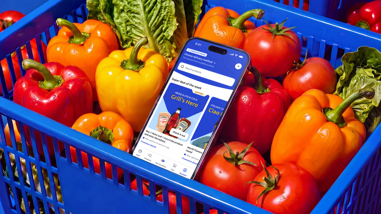
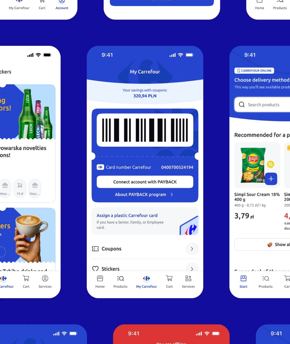
[ PROJECT SUMMARY ] Carrefour Poland challenged us to transform its loyalty app into a complete omnichannel platform. We designed a new e-commerce module and redesigned the existing app, bringing online shopping and in-store services together for more than 1.5 million active users.
Industry:
Retail & FMCG
Products:
Mobile App
Market:
Poland
[ HIGHLIGHTS ]
-
Operating in Poland since 1997 with nearly 800 stores across 6 formats
-
Serving 5 million customers weekly nationwide
-
10,000+ employees across retail operations
-
1.5 million active loyalty app users across all demographics
-
3,400+ suppliers


Scope of work
[ Project context ]
Poland's grocery retail
market is changing
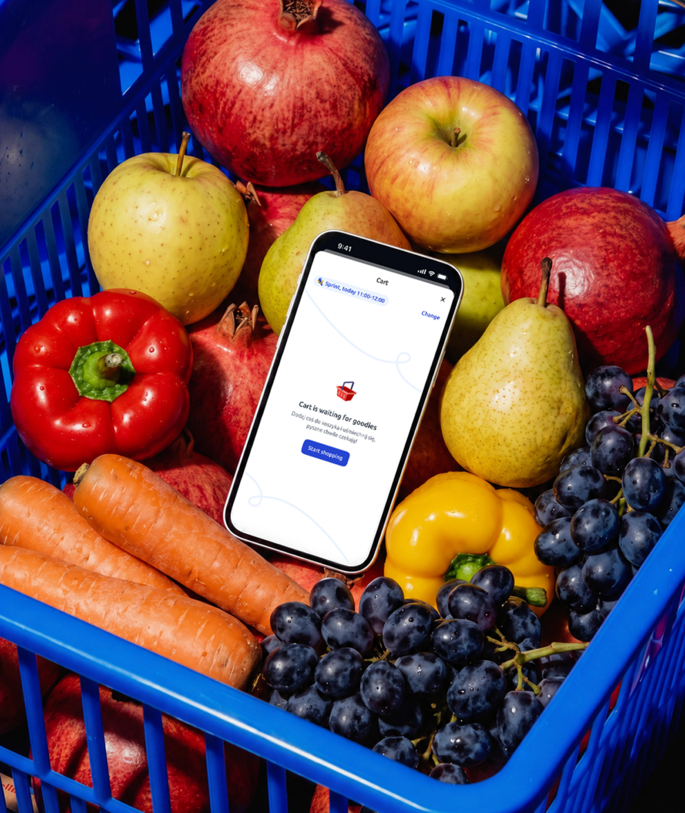
Most grocery apps in Poland supported either shopping in-store or ordering online. Carrefour wanted both experiences in one place.
There was no close local benchmark, and the existing product already served one million active users. We could not treat the project as a clean rebuild. Every decision had to respect the habits people had already formed.
Organisational and technical complexity
Several parts of the business were involved, including loyalty, e-commerce, technology, legal, operations and finance. Each team had different priorities and measures of success.
Our role went beyond design. We helped the teams align, resolve trade-offs and make decisions together.
The product itself was equally complex. Thousands of products, several fulfilment methods and multiple backend systems were closely connected. Every design decision had ripple effects across the entire system. And one more thing: that clock was ticking. Timeline pressure shaped every decision.


[ Goals ]
One app. Every aisle.
Every shopper.
Built to connect online and in-store shopping while remaining easy to use for every Carrefour customer.
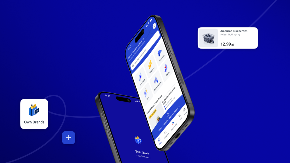
Unite loyalty and e-commerce in one app
Merge loyalty, browsing, checkout and in-store shopping into one native app – closing the gap competitors leave open with separate loyalty or delivery apps.
Grow Carrefour’s direct channel
Encourage customers to shop directly with Carrefour instead of relying on third-party delivery platforms. Grow the e-commerce audience without weakening the existing loyalty experience.
Design for a very broad audience
Make the app easy to use for customers with different needs, ages and levels of digital confidence. Accessible tap targets, strong contrast, clear hierarchy and plain language were treated as basic requirements.
Build foundations for future growth
Create an architecture capable of supporting thousands of products, several fulfilment methods and new services added over time.




[ Challenges ]
Steering a large
organisation towards omnichannel
-
Supporting six delivery methods
The platform supported six fulfilment methods: courier delivery for non-food products, sprint delivery for food excluding frozen items, Carrefour delivery using refrigerated vehicles, external partners such as Bolt, store pickup and trunk pickup.
Each method had its own product restrictions, geographic coverage and delivery windows. The selected method affected product availability from the beginning of the shopping journey.
-
Building on top of a million habits
People already relied on the app in their daily routines. We introduced a product catalogue, basket, checkout, payments and order tracking, with zero downtime and full backward compatibility.
The new experience had to feel valuable enough to justify changing a product people already knew, without disrupting the habits they had already built around it.
-
Merging loyalty and e-commerce
The app combines two functions that typically exist separately. In-store customers shouldn't feel overwhelmed by e-commerce, while e-commerce remains visible for interested users.
Rebuilding the loyalty layer couldn't be reduced to monetising existing users. Without understanding their habits, relationships, and what kept them in the app, the redesign would have driven them away.
-
Multi-stakeholder coordination
Loyalty, e-commerce, technology, legal, operations and finance all had different priorities. We facilitated collaboration between these teams and helped them make decisions that worked across the whole service.
-
Regulatory compliance
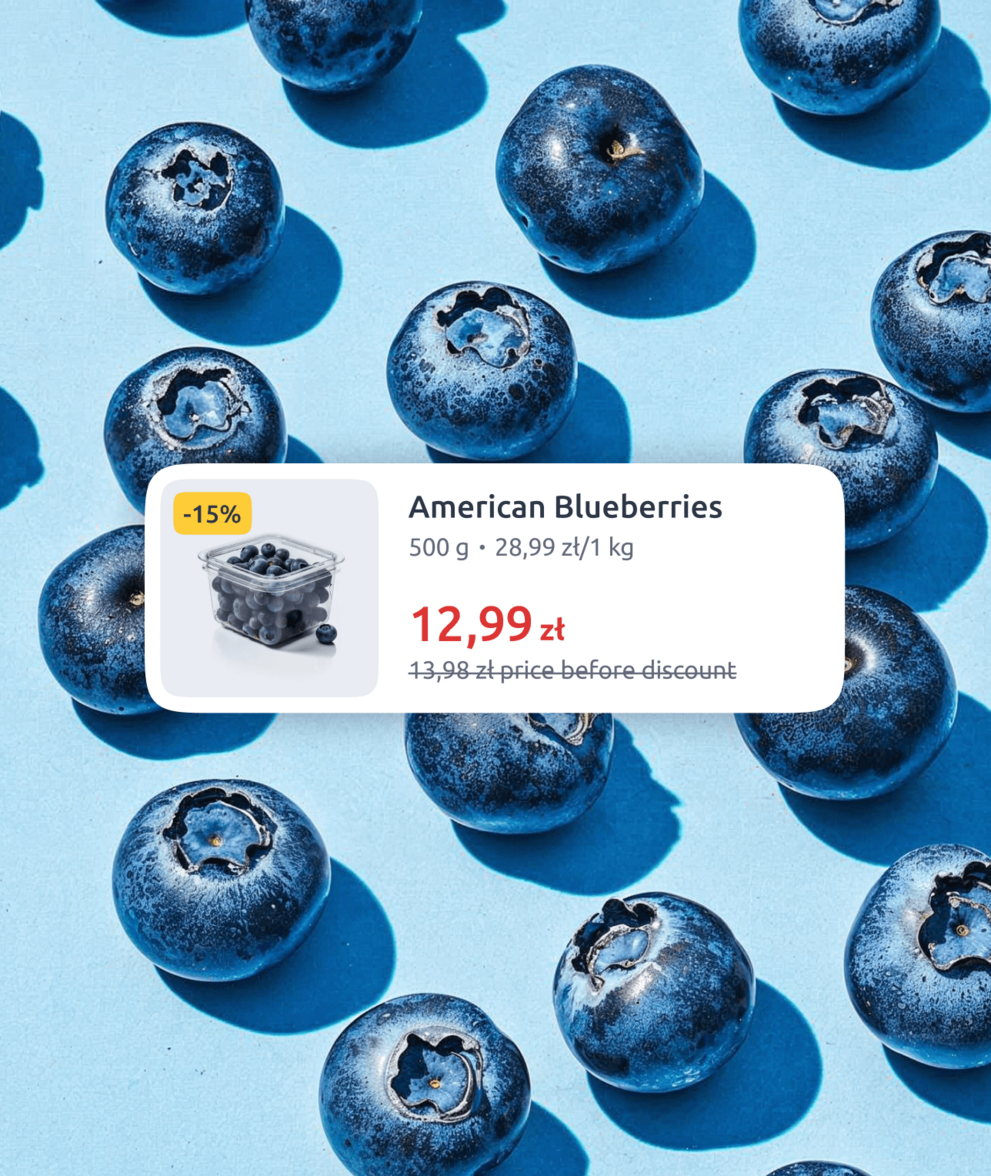
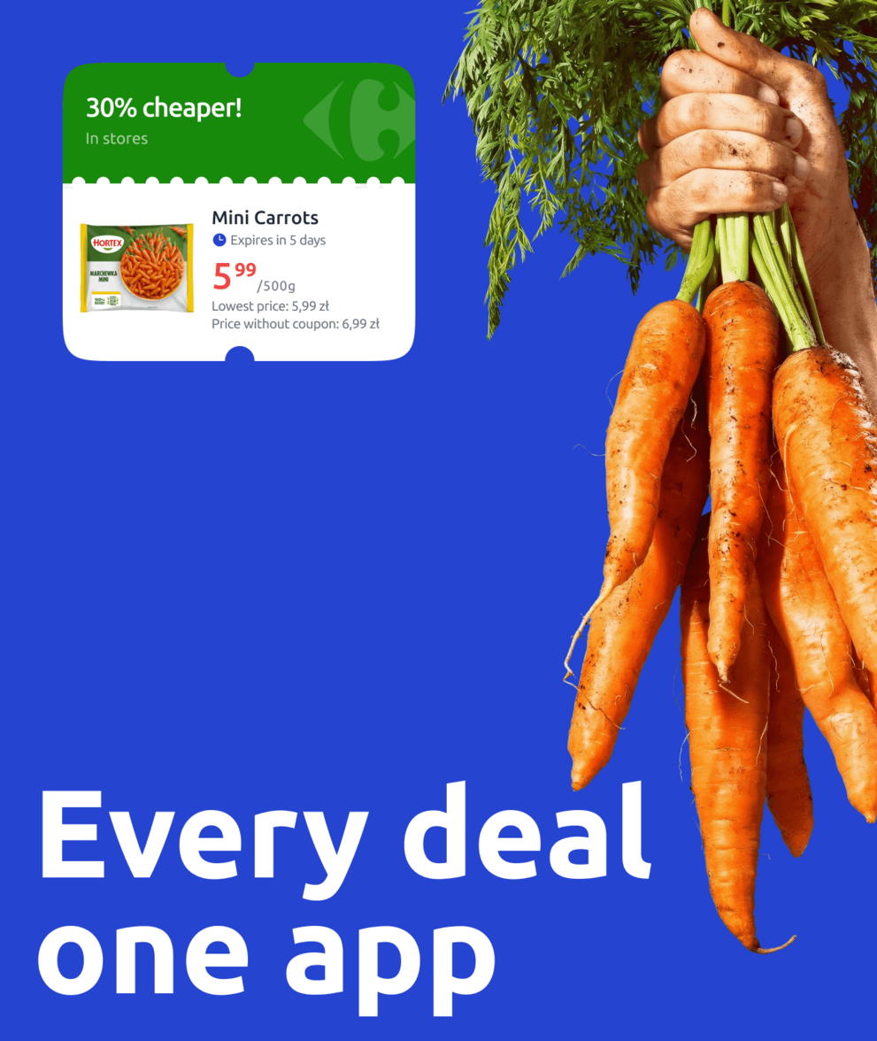
The experience had to include the requirements of the EU Omnibus Directive: price history, transparent promotion rules and clear information about product availability.
-
Partner coordination and design system
Carrefour did not have a comprehensive design system capable of supporting the new e-commerce experience.
We established the missing foundations, expanded the component library and documented standards while working with development partners and multiple vendors. We also moved banner production workflows into Figma.

[ Design Insight ]
“When a product is an ecosystem of services, you cannot design one flow in isolation. Every decision affects several user and business needs. We had to make those trade-offs clearly and quickly under a fixed deadline.”

Michał Proniewicz
UX Director


[ UX Research ]
Users wanted one experience, not two apps living side by side
We conducted 12 in-depth interviews with young adults, busy professionals, parents managing family logistics and older customers with established loyalty habits.
The main insight was simple: people did not want loyalty and e-commerce to merely coexist. They expected both parts of the app to work as one service.
Before designing anything new, we mapped the entire existing app across iOS and Android. We also analysed the most important journeys on Carrefour.pl.
This gave us a complete view of the existing experience. From there, we could design the e-commerce module, improve the loyalty experience and connect both parts through a shared architecture.
[ Tone of Voice ]
Informal, but still professional
We developed a tone of voice serving all age groups, striking a balance between generations. Among many values and traits we explored, four became our pillars: Honest, Close, Competent, and Friendly. The overarching principle: Informal but professional.
We also created a content design system covering onboarding, error messages, legal content, product information and recurring interface messages. Plain language helped keep communication clear and consistent across the entire app.
One lesson became especially important: copy that feels clever the first time can become irritating after repeated exposure.
For recurring messages, clarity and restraint mattered more than personality. Important information also had to remain easy to notice instead of disappearing among unnecessary jokes and decorative copy.

[ UX Design ]
Our UX methodology
Six delivery methods, each with its own product rules, shaped the catalogue architecture from the very first screen. Every design decision had to account for that from day one.
Map the current state and benchmark solutions
We mapped the existing mobile app, its in-store services and the most important customer journeys on Carrefour.pl. We also conducted desk research and compared solutions from Poland and international markets. This helped us understand existing behaviours and identify which website features needed to be adapted for mobile.
Collaborate to understand constraints
We worked closely with Carrefour’s teams to understand how each module worked, what the existing systems allowed and which business assumptions had to be considered.
This gave us a realistic view of the product environment before major design decisions were made.
Propose a scalable architecture
We proposed an architecture to support future scalability. This new structure enabled the app to be extended with additional features, such as the e-commerce module, while maintaining a clear, manageable system for both current and future development needs.
Iterate from wireframes to UI
We followed an iterative design approach. First, we created initial UX wireframes, which were discussed and refined together with the client. These wireframes were then developed into final UI designs, using a pre-established design system to ensure consistency and efficiency across the app.


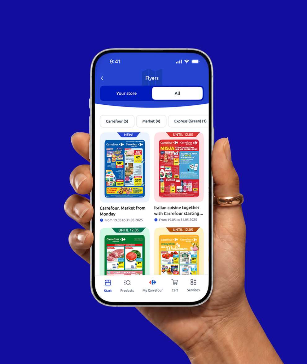
Designing the e-commerce module
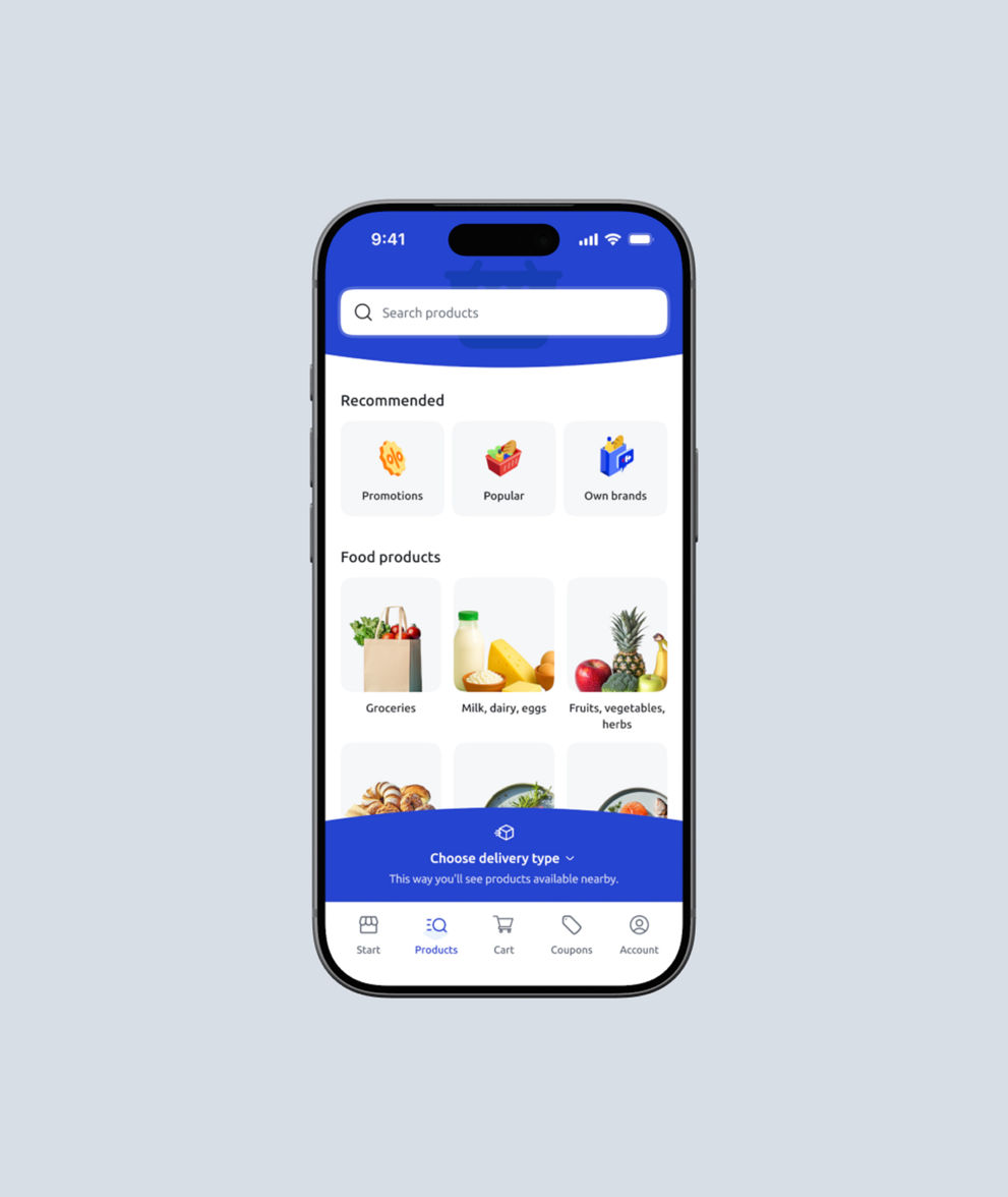
We designed the complete e-commerce experience from the ground up.
This included the product catalogue, browsing, search, basket, checkout, payments, order management and delivery tracking.
The catalogue architecture came first because fulfilment methods, location and product restrictions all affected what customers could buy.
Redesigning the app and connecting both worlds
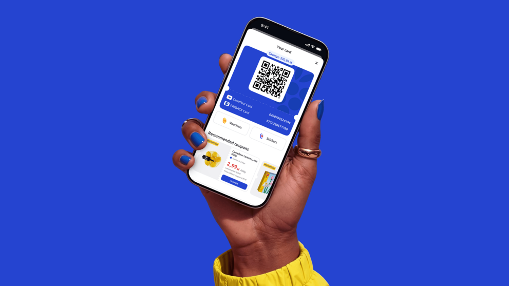
The central UX challenge was supporting two very different intentions within one app.
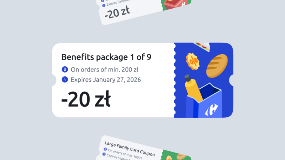
- Loyalty customers wanted quick access to their card, coupons and points.
- E-commerce customers needed to browse products, manage a basket and complete an order.
Before deciding how to connect these experiences, we needed to understand what loyalty actually meant in this context. It was not limited to collecting points and redeeming coupons. It also included:
- Personalised communication based on behaviour and purchase history
- Reasons to return between shopping trips
- Challenges, rewards and milestones
- Points, tiers and badges
- A relationship with the customer outside the moment of purchase
Without understanding these routines, we risked turning a familiar product into an obstacle. The research directly influenced how we structured navigation, the dashboard and access to key functions.
Key UX decisions
- Create clear entry points for loyalty and e-commerce in the main navigation
- Define understandable experiences for logged-in users and guests
- Structure the dashboard around customer priorities rather than a list of features
- Remove duplicate paths and unnecessary actions
- Reveal complexity gradually on smaller screens




[ UI Design ]
Designing for everyone,
excluding no one
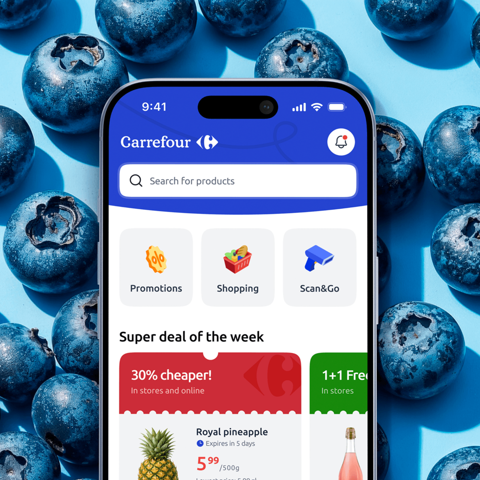
We created a visual language rooted in Carrefour’s existing brand. The signature blue anchors the interface, making the app immediately recognisable and connecting it with the wider Carrefour ecosystem.
The design needed to feel current without following short-lived trends. It also had to remain simple without feeling basic, and friendly without becoming childish.
Key design principles:
- High contrast for readability in various lighting conditions
- Clear visual hierarchy using size and weight, not just colour
- Generous white space prevents overwhelm
- Familiar UI patterns over novel interactions
- Consistent placement of key functions
Built to scale
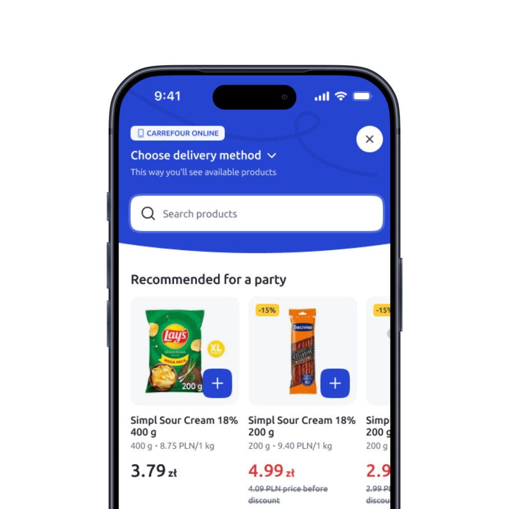
We expanded the design system with dozens of components required for e-commerce, including product tiles, basket modules, checkout flows, delivery selectors and promotion cards.
Each component was documented across relevant states, including default, active, disabled, error, success and loading.
This gave both design and development teams a shared foundation for building new features consistently.


[ Analytics ]
Building measurement
alongside the product
Analytics maturity varied across teams: different interpretations, limited unified metrics, and no shared source of truth to build on. So we built the measurement layer alongside the product itself, from day one rather than after launch.
User behavior tracking, conversion funnels, feature usage monitoring, performance metrics, and A/B testing capability: foundations designed to mature as the platform scales.
We paired this with intensive qualitative research, including 12 in-depth interviews, platform-specific usability testing, and comprehensive screen mapping, turning missing data into direct user insight.
[ Results ]
One app for loyalty
and e-commerce
The project gave Carrefour a single platform for its digital customer relationship, covering online ordering, in-store shopping and loyalty.


-
First to unite loyalty and commerce

Carrefour became the first grocery retailer in Poland to combine loyalty and a complete, native e-commerce journey – full product range, basket, checkout, payments and order tracking – in a single app, spanning six fulfilment methods. Where other Polish players connect their loyalty apps to separate shopping services, Carrefour built one experience.
-
Own the customer journey

Partners such as Bolt provide last-mile logistics, while the checkout, customer relationship and data remain in Carrefour's owned channel.
-
Accessible to everyone
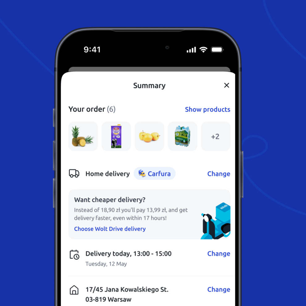
Designed for users aged 18 to 60+ years. Contemporary interface balanced with intuitive navigation. Plain language implementation ensures comprehension across all demographics.
-
Built to scale for thousands of SKUs
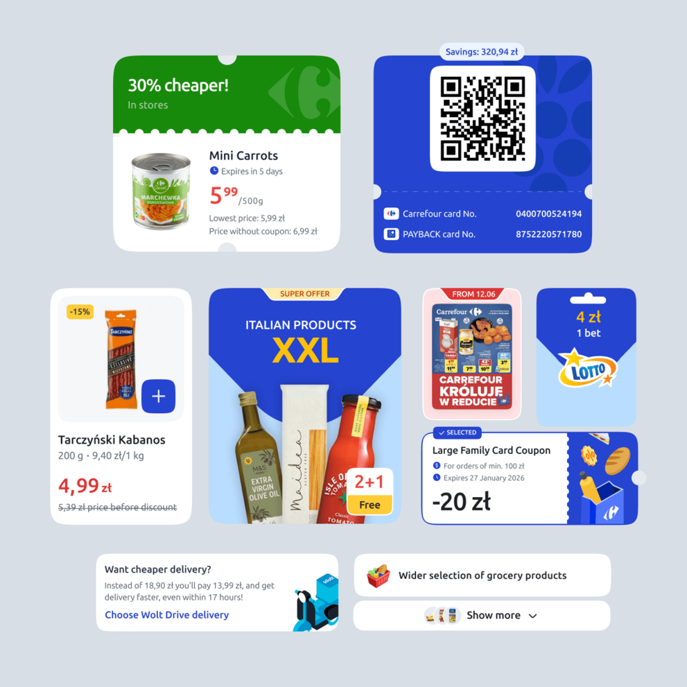
A design system built to support thousands of SKUs, multiple delivery methods and product configurations that multiply by the month. The same foundations that support today's catalogue are built to carry the next one, without a rebuild.
[ Testimonial ]
“We didn’t trade loyalty for e-commerce. Loyalty was the launchpad: a million people who already trusted the app became the first audience for the new store.”

Robert Stupak
Chief Marketing & Digital Officer, Carrefour Polska
More Case Studies
More
Case Studies



















Got a high-stakes digital problem? Let's solve it.
Join our list of clients. You’ll be in good company.


