Natalia Gordon
-
Aug 05, 2024
-
9 min read
When it comes to a digital product, every interaction matters as it contributes to user experience. And even though we’d all like to avoid any issues that may come our users’ way, it’s simply impossible. As we said, something always goes wrong, and that’s why error messages are so important – they are an essential touchpoint that can impact user satisfaction and trust.
A UX writer’s job is to craft an error message that reassures the user and guides them towards a solution. If properly written, this message can be yet another way to express the brand’s tone of voice and highlight the user-centric approach (you might remember that from our article on microcopy).
What is an error message?
First things first: what exactly is an error message? It’s a short communication alert that informs the user about issues in their actions. The main goal is to tell the user something went wrong, explain why, and instruct them how to fix it.
We can identify four types of error messages:
- System errors happen when the software comes across an issue it can’t solve (e.g., a hardware issue or a bug).
- Validation errors are triggered by the user. They appear when the user enters an input that doesn’t meet the required criteria (e.g., invalid email address or leaving a field blank).
- Network errors occur when there are connectivity issues (e.g., a lost internet connection or an unreachable server).
- Application-specific errors are unique to the particular digital product. They show up when something goes wrong with a specific functionality.
Key principles of effective error messaging
A good error message is clear, compassionate, and actionable.
Clarity and simplicity
Clarity and simplicity are essential in UX writing. An error message is frustrating and stops whatever action the user is trying to take, so it’s important not to overwhelm them or confuse them further. The content should be concise and informative – in other words, easily understood.
Politeness and positivity
When something goes wrong, users often feel discouraged and disappointed. A little empathy in an error message can go a long way, and offering polite reassurance can make all the difference. That’s why it’s crucial to acknowledge users’ negative emotions and say something positive that will make them feel valued when encountering an error.
Actionability
An error message is not complete without giving a user a way out. Information on what happened isn’t enough – we need to tell them how they can resolve the issue or, at the very least, where they can get more help. Actionable instructions empower users and allow them to address and solve problems, which reduces their frustration.
Error message structure
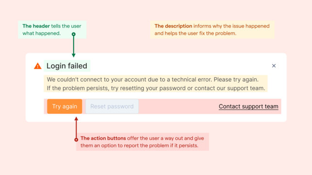
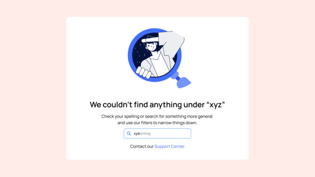
An error message can appear as a modal or a page, but it always consists of the same elements: a header, description, and action buttons (or links). Each should correspond to the user’s questions at that moment: what happened? Why? And what can I do to fix this?
The header should tell the user what happened.
The description should provide reassurance, inform why the issue happened, and help the user fix the problem.
The action buttons should be the user’s way out: help solve the issue with a click (e.g. refresh the page, try again) and give them an option to report the problem if it persists.

Best practices for writing error messages
A good error message offers the user information on what went wrong and instructs them on how to solve their issue. This means that even though they are most likely annoyed and frustrated, they are not left alone with a problem they can’t solve. This strengthens their trust in a product and, by extension, the brand. In other words, the best practices for writing error messages involve incorporating key principles into content. So, without further ado:
Be specific and relevant
Error messages need to refer to the particular error. A generic text won’t cut it. A simple “Something went wrong” isn’t enough – the user still has no clue what the problem is, let alone how to fix it. Only precise information will allow the users to understand what happened. And once they do, they will feel assured that the offered solution is the right one to follow.

Be friendly and reassuring
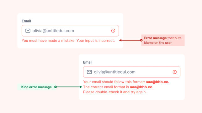
An error message is not a place to point fingers or assign blame. Instead, be empathetic and supportive so that the user doesn’t feel abandoned but rather understood and willing to trust that you can solve this issue together.

Be consistent
Error messages should look similar across the product so the user can easily recognise them. They should also sound like the rest of your product. There may not be a lot of space in an error message, but it is the perfect spot for flashing out your brand’s tone of voice. It reminds the user that they know who they’re dealing with, and a well-written error message can strengthen their connection to the brand.
What to avoid
We’ve covered what to do – but what should we avoid?
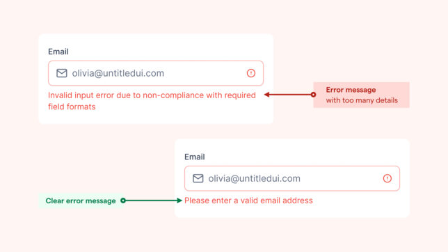
Too many technical details
Most users don’t know the technical jargon, so giving them too many technical details won’t help their situation. In fact, they may confuse them, which is why it’s best to offer straightforward guidance. Tell them what they need to know to solve their problem – no more, no less.
In action:

Neglecting mobile users
At this point in time, it is more than likely that your users will be navigating the digital product on their mobile devices. This means you can’t just think about desktop users but also those who use their tablets or mobile phones to access your product. You can take care of them with responsive web design (we covered the topic of responsive web design in Digital 101 and we talked a little about it in our article on inclusive design), ensuring that the error messages are readable and actionable regardless of the user’s device.
Summary
Error messages appear when something interrupts a performed action, so they should guide the user and help them solve the problem. Even though every issue can cause frustration, accurate information can decrease that and enhance user experience despite difficulties. And if an error message is vague and doesn’t offer help, the user may very well abandon the process, unsatisfied with the experience.
Write error messages for the user, not the product.If you have to remember only one thing from this post, let it be this: write error messages for the user, not the product. Put yourself in the user’s shoes, ask yourself what you need, and write down any questions you might have about the situation.
User experience is all about empathy. Use yours and craft a compassionate, clear error message that offers the user a solution.


