Natalia Kamieńska
-
May 08, 2023
-
4 min read
Little words, short sentences, a label on a button… Oh, the microcopy. Seems simple at first, complicated once you get to know it, but when you finally crack it – what a rush. Let’s get friendly with microcopy!
What is microcopy?
What is microcopy? Or better yet: what is microcopy in UX?
Microcopy is the cornerstone of UX writing. It’s the term used for tiny text elements found throughout a digital product or interface, e.g. buttons, labels, and messages. Microcopy should be (as the name suggests) concise, clear, and informative, and it aims to make navigating the product easy for the user.
There are various types of microcopy:
- Onboarding copy: the copy that user sees when they sign up or log into a digital product, e.g. how-to instructions, tips for beginners, and prompts to finish specific tasks;
- Error messages: the copy that alerts the users when something went wrong and tells them how to fix it,
- Captions: the copy under visual content that either describes what’s on the image or video, guides the user on how to use it, or provides extra information or an explanation to help the user understand it;
- Notifications: the copy that notifies the users of new information or gives them an update on the digital product;
- Calls to action: the copy that encourages the user to take a specific action, e.g. buttons or links.
The beginnings of microcopy
Microcopy’s history began with the very first days of computers. Back then, computer interfaces used to be pretty much exclusively text-based, with users typing in commands to interact with them. Users needed instructions on how to use computers, and microcopy came to life, guiding users on how to enter commands or giving them a message that a task was finished.
In the 80s and 90s, the graphical user interfaces came (GUIs, and yes, they’re the mighty ancestors of the current user interfaces). They had buttons and other elements that required text for the user to be able to navigate the product. Since the components needed labels, microcopy has been essential; no interface was complete without it.
Technology has advanced and developed into a crucial part of society’s everyday life as we know it. Nowadays, every digital product and every interface needs microcopy to be useful. Harvey S. Firestone once said:
— Harvey S. Firestone
And this became true for every digital product: microcopy contributes to usability, accessibility, and user experience. Now, UX design, UX writing, and UI design are the three musketeers you need to get you the digital product success you dream of. You can read more about each in our articles on UX design, UI design, the differences between UX and UI design, and UX writing.
Why does microcopy matter?
— Neil Blumenthal
We couldn’t agree more with Neil because that’s precisely why microcopy matters. It may be just small bits of text, but it guides the users through a digital experience and helps them accomplish their goals.
In UX design, microcopy can make all the difference. Buttons, links, notifications, error messages, calls to action – get it wrong, and you have an unusable product. Get it right, and users not only achieve their goals but also feel satisfied with the product’s user experience. That’s because microcopy is also one of the keys to making products accessible and confusion-free. The brevity and clarity of the messaging will make your product accessible to all and keep your users on track instead of being confused when they use it.
Yet, microcopy is not just dry words on a button; they can be like poetry, and if you let it, it will help you express the brand’s soul through an established tone of voice. There are plenty of digital touchpoints, each as important as the other, and microcopy can strengthen the brand’s image and build a greater connection and trust between the users and the brand.
Microcopy in UX
Throughout a digital product, microcopy repeatedly appears as:
- placeholder texts in form fields (e.g. “Enter your name here”),
- button labels (e.g. “Comment” or “Save”),
- confirmation messages (e.g. “Your changes have been saved”),
- error messages (e.g. “Incorrect password”),
- empty state messages when there’s no content to show (e.g. “No new messages”),
- tooltips when a user hovers over an icon and a message appears (e.g. more information appears when hovering over an “i” icon),
- call to action buttons (e.g. “Sign up now”),
- loading messages (e.g. “Please wait while it’s downloading”),
- progress indicators (e.g. “You’re halfway there!”).
As you can microcopy is almost everywhere; it directs the interaction between the user and the digital product, giving the users instructions, suggestions, feedback, and needed information.
Where is microcopy used?
As mentioned throughout the article, microcopy is used in all digital products. You’ll find it on:
- a website,
- a mobile app,
- a software application,
- an e-commerce platform,
- Internet of Things device.
Examples of good microcopy
Slack – search placeholder

Slack’s known for its great copy. Its search placeholder text is consistent with the company’s tone of voice: witty yet empathetic. When we talk, sometimes something goes in one ear and out the other. Slack’s aware of that and uses it to its advantage to create a relatable search message.
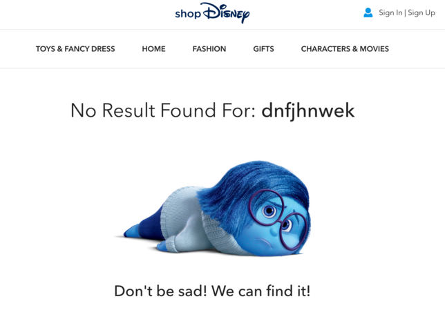
Disney – error message

Disney’s shop error message is not ideal as it doesn’t guide the user towards a solution, but it definitely speaks to the company’s personality. Using a famous character from “Inside Out” makes the error message unique and turns it into an inside joke with the user who’s familiar with their stories.
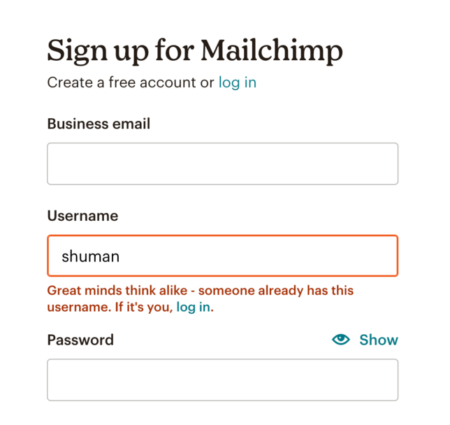
Mailchimp – error message

When a new user wants to create an account on Mailchimp and comes up with a username that’s already in use, Mailchimp offers this brilliant little message. It gives the user a compliment, making them feel better about the error (”Great minds think alike”) while remaining informative and telling them that someone is already using the name they chose. The message also takes care of the additional scenario where it’s possible that a person already has the account and only accidentally tries to create an account again.
Features of the best microcopy
Best microcopy comes from best practices and three principles: brevity, clarity, and conciseness. That’s why the most effective microcopy usually has the following features:
Clarity
Microcopy has to be easy to understand to avoid confusion. That’s why it shouldn’t include industry jargon, technical terms, or unnecessary words. The goal is for the user to understand what they can do or expect from a product.
Brevity
Brevity and conciseness are crucial. You don’t have a lot of space, and the one you do, you want to use in full.
Context relevance
A great microcopy is relevant to both the task the user is performing as well as their context. Microcopy should serve as guidelines for what the user does and match their goals and needs.
Positive tone
Microcopy should encourage the user to take action, and a positive, supportive tone will make the audience feel better about their interaction with the product.
Consistency
We’ve repeatedly said that consistency is key across all our UX design articles. The best microcopy should also be consistent in its voice, tone, and style, leading to better brand recognition and a pleasant customer experience.
User-centredness
Microcopy is part of UX writing, and UX writing is part of UX design. And at the centre of UX design is the user. That’s why the finest pieces of microcopy are written from the user’s perspective – they’re centred around the user and what they need.
Tips for writing good microcopy
Good, effective microcopy has all the features mentioned above: clarity, brevity, context relevance, positive tone, consistency, and, above all, is centred around the user and their needs. But let us give you some more tips on writing microcopy that is helpful and yet charming.
1. Understand your audience
First and foremost – understand your audience! Effective copy springs from empathy and the research data collected about the users (we talked about the importance of research in our article "What is UX research – a guide for UX researchers"). Take your time to truly get the users’ needs, goals, and pain points. Then, use all you’ve learnt as an inspiration for the microcopy.
2. Keep it simple
We’ve covered that brevity and clarity above all. Simple texts are easy to understand, so write in short sentences, and avoid jargon or complex words.
3. Use an active voice
Active voice is clear and direct and keeps the users engaged. For example, “You have changed your password” makes the user feel more in control than “Your password has been changed”.
4. Write for the user, not the product
Microcopy serves the user and helps them through, for example, a purchase process. So remember: microcopy is supposed to help the user navigate your product. Only by trying to make the process easier will you increase conversion rates.
5. Give it personality
Microcopy isn’t just about functionality; be creative and let the brand’s voice speak through it. You can sprinkle just enough humour or wit to make the user experience more memorable.
6. Test and iterate
Like any other part of UX design or UX writing, microcopy should be tested to see if it works for your target audience. Conduct user research and alter it according to feedback to ensure your writing is user-friendly.
The future of microcopy
As technology evolves, UX design will change (Łukasz talked about its future in the article "What is the future of UX design?"). The emerging trends will impact UX writing and, therefore, also microcopy. There are several potential directions that the future can go:
Personalisation
Microcopy will most likely need to be personalised to the individual users. Microcopy may no longer be a one-size-fits-all but rather become dependent on the customer's preferences using the product. This is where AIs and machine learning algorithms can be particularly useful by generating microcopy customised to the user.
Multimodal interfaces
Another direction that microcopy can go is flexibility and adjustability to various forms of interactions. Voice assistants and other multimodal interfaces are more and more common, so microcopy will have to adjust and become optimised for spoken or gesture-based interactions (or review other ways in which an interface can give feedback when you can’t use visual cues).
Emotion and tone
Microcopy may also need to become more sensitive in terms of the user’s emotion and tone. AIs and natural language processing technologies may come into play to perform sentiment analysis and provide feedback tailored to the user’s emotional state.
Accessibility
Accessibility will finally and without a doubt become a standard for every digital product. Microcopy will need to adapt and help users with visual and cognitive impairments use different technologies as well as become part of assistive technologies. If you want to read more on accessibility in digital products, take a look at our article about WCAG.
Summary
Microcopy may not seem attention-worthy from the get-go – but it is a crucial part of how users and interfaces of digital products communicate. That's why the right microcopy can boost user satisfaction. The right choice of words in the right place allows a product to work and function as it should. Poor microcopy will have the opposite effect, and instead of gain, you'll be met with loss, for example, in conversion.
At Flying Bisons, we, the content team, like to think of ourselves as word magicians and for us, no spell's too small to care about. So if you need someone who can bring out your unique brand voice even in small writing pieces, we promise to approach your product with care. Don't hesitate to contact us – we're waiting to bring your idea to life!


