Kseniia Sokolova
-
Jan 09, 2024
-
5 min read
Why is inclusive design important?
Why is this a big deal, you ask? Let's break it down.
Including everyone
An accessible website means that every visitor gets the same information. It's like making sure there's room for everyone at the table. For us, this means reaching a broader audience, leading to more users, more clients, and a greater use of the services. This is a win-win.
Making things easier
When we design websites with accessibility in mind, it doesn't just help people with disabilities — it makes things easier for everyone. Think about all those times when you would read captions in a noisy place, adjust your screen's brightness in dimly lit rooms, or use a keyboard when your mouse shows no signs of life. Web accessibility means making sure everyone can enjoy the party.
Following the law
There are legislative acts prescribing services (including digital products) to follow basic accessibility standards. Not doing so can cause trouble, such as losing money or facing legal issues. The number of lawsuits filed against companies with non-accessible websites rises each year. Soon, starting in 2025, the European Accessibility Act, a crucial part of accessibility legislation, will extend its scope to encompass the entire private sector (you can learn more about different legislations worldwide from our report in our article on WCAG). Meeting web content accessibility guidelines is no longer just a recommendation; it's your pathway to a secure future.
Saving money
An accessible website makes for a wise financial decision. It attracts more users and ranks higher on search engines like Google. Think about it: businesses with inaccessible websites face a total loss of $6.9 billion annually compared to their competitors with accessible sites. Not to mention that it's cheaper to build an accessible website from the beginning than to redo it later.
Most importantly, doing the right thing
Web accessibility isn't just a tech thing; it's the right thing. It helps people with disabilities to participate in everything online. It's not about following the rules; it's about doing what's fair and right. Around 1 in 6 people worldwide, roughly 1.3 billion individuals, face significant disabilities (World Health Organization, 2023). This means that 15% of all users may experience various disabilities, including visual, auditory, physical, speech, cognitive, neurological, and more.
That's why understanding the demographics of users who need website accessibility features is crucial for crafting a truly inclusive digital experience that complies with all essential accessibility standards, such as WCAG (Web Content Accessibility Guidelines).
So, what does inclusive design mean?
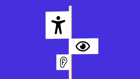
Let's examine the user needs that inclusive design should focus on.
Visual support
Individuals with low vision need image text descriptions and often opt for keyboard navigation instead of a mouse.
Hearing assistance
Deaf or hard-of-hearing users benefit from text captions on videos and audio content. It emphasizes the value of including features like captions to enhance content comprehension. At the same time, autoplay functions can pose challenges and, as a result, need thoughtful consideration.
Motor assistance
Users with motor impairments, such as Parkinson's disease, cerebral palsy, or Down syndrome, may rely on alternative keyboards, eye control, and specialised hardware for web navigation and typing. A website needs a logically structured information architecture to increase the engagement of this user segment.
Cognitive support
Individuals with cognitive impairments (for example, dyslexia or dementia) benefit from accessible web features such as plain language and consistent navigation. These elements contribute to a user-friendly experience, promoting ease of comprehension and interaction.
Unlocking accessibility through practice: inclusive design examples from Flying Bisons
Let’s delve into the essence of inclusive web development with examples from our projects.
Responsive and flexible layouts
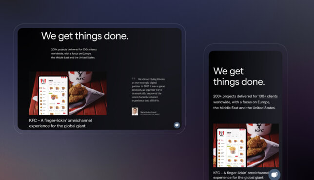
We develop responsive layouts that adapt to different screen sizes and devices. It's crucial to ensure that a platform's content is accessible on both desktop and mobile devices, accommodating users with limited access to larger screens. Structuring files adaptively ensures that the intended information and structure remain intact even if page styling is removed.
Pictures that speak: offering text alternatives
Every non-text element – images, videos, or audio content – should have a text alternative. Giving your pictures a voice ensures that individuals with visual impairments can understand and engage with your content using screen readers.
Utilising alt texts for images is a common practice, especially in SEO, and we recommend including alt text for every non-decorative image so that everyone can access it. The best approach is to include accurate and detailed descriptions. However, when it comes to decorative images, the alt attribute should be blank to signal to screen readers that the image is non-essential.

Enhancing visibility
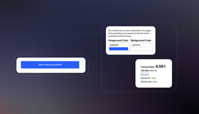
Colour contrast helps make content readable for individuals with visual impairments, particularly those with colour blindness. For example, it can be an online form with a high colour contrast between text and background, making it easier for low-vision users to fill it in.
Video vibes: subtitles, captions, and transcripts
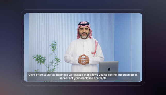
Each audio content needs a complete transcript, and every video content needs the synchronised captions feature. These measures enhance accessibility for users with limited hearing capabilities.
Navigation clarity
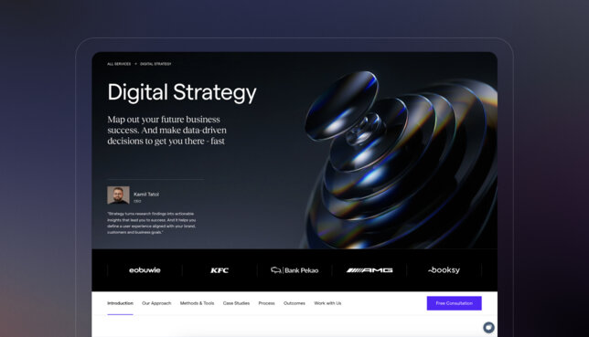
We facilitate user navigation by ensuring a clear page title, meaningful links, a keyboard focus indicator, and proper headings. These elements guide users to their location on the site and help them identify clickable links. Think of positioning navigation above the fold – typically in the page's header and footer, using breadcrumbs, section navigation, etc. It’s also crucial to use descriptive labels and well-organised menus, ensuring that users with cognitive or visual impairments can easily navigate and find content.
Size matters: flexible font sizes and styles
Users should be able to customise font sizes and styles according to their preferences. For example, we can incorporate a feature in websites that allow users, especially those with visual impairments, to adjust the text for optimal reading comfort.
Keyboard functionality
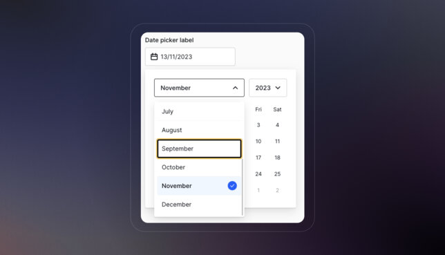
All features on the website should be accessible using the keyboard alone, allowing users to navigate and interact seamlessly with a digital product. Keyboard functionality is especially crucial for users with mobility impairments and those who don't rely on a mouse or touchpad for navigation.
Form friendliness: labels for fields and buttons
Our advice? Use the full potential of a website's forms, whether it's a contact form, feedback form, or expressions of interest. The key? Clear and concise labels on every field and button. It's a simple yet impactful practice; users know exactly what information each field asks for, fostering a seamless and inclusive interaction.
Readable text content
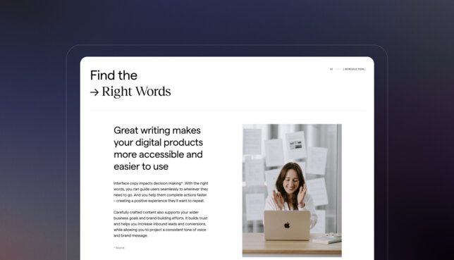
Our team crafts readable and understandable content for a diverse audience. We avoid highly technical jargon and regional slang so that everyone can understand what we want to convey, including, for example, people who are learning the site's native language.
Useful error messages
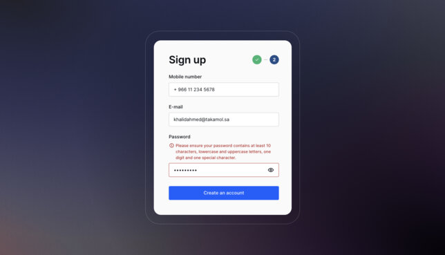
When an error occurs, the user needs a clear and helpful message to guide them on fixing their mistakes. Clear communication enhances user experience and encourages corrective action.
Parsed code harmony
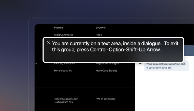
Achieving inclusive design demands a code that seamlessly integrates with assistive technologies. Crafting meticulous HTML with proper start and end tags while steering clear of duplicate IDs and attributes amplifies the interpretability of content for assistive tools.
Continuous testing and refinement
A smart strategy means consistently testing the application to foster continuous enhancements. Regular accessibility audits and usability tests are pivotal in pinpointing and resolving any obstacles encountered by users with disabilities. When these practices are seamlessly integrated into the development process, developers can craft digital experiences that embrace inclusivity. We ensure that technology is accessible and beneficial to all users, regardless of their abilities or disabilities.
Summary
Web accessibility is more than just a set of rules or a checkbox on the development team's checklist. At its core, it is a philosophy that reshapes the very essence of how we conceive and craft digital spaces. It forces us to step into the shoes of diverse users and understand that accessibility is not an afterthought but rather the heartbeat of digital architecture. Only then we can create a digital world that everyone can benefit from and where everyone is invited and included.


