Kamil Tatol
-
Apr 17, 2023
-
5 min read
Let your business be in charge of its online introduction. A corporate website will tell your potential clients and stakeholders what you offer, how, and why. And we’re here to spill the beans on how you can get the most out of it.
What is a corporate website?
A corporate website is both a company’s online business card and a billboard. Instead of handing out a piece of paper to potential clients or stakeholders, you send them a link. Instead of seeing you somewhere on a billboard while coming home from work, they can find you when they search for specific products or services your company offers.
Let’s make it more precise: a corporate website is a page where a business can show its products or services, offer information about the company, and engage with customers and stakeholders. In the vast world of the Internet, a corporate website represents the business and tells its visitors about its history, mission and values, team members, products or services, and provides contact information.
A corporate website usually consists of several pages:
- A homepage,
- An “About us” page,
- A product/service listing page,
- A blog or news page,
- A contact information page.
It also can but doesn’t necessarily need to include a page where a customer can purchase something from the offer. The web design should match the company’s branding to ensure consistency across all digital touchpoints.
Why having a corporate website is so important?
They say that if you’re not on the Internet, you don’t exist, and that’s true for most businesses. If a potential customer is looking for a product or a service you’re offering, they’re most likely going to go on Google and search there. If they hear of your company, the first thing they will do is check your website. The corporate website may then be a customer’s first impression of your company.
So, a corporate website is your company’s digital storefront where clients and customers learn more about your business and offer. This is also where they can engage with the company, so it is crucial that their experience is positive.
When the user experience is positive, so the corporate website is well-designed and user-friendly, the company’s credibility and legitimacy grow. The business looks even more reliable if it has client testimonials and case studies, as well as the company’s history and mission.
However, a corporate website doesn’t just inform potential clients about the company. It can become another marketing tool that widens your audience and attracts more potential clients.
A corporate website can also make your business operations faster and much easier to manage. Potential clients can use the website to submit their inquiries, schedule meetings, or simply use it for buying your products or services. This could save both time and resources for your team, so they can concentrate on other important aspects of the business.
Simply put, we live in times when being accessible online is essential to a successful business. That should answer the question you may be asking yourself: “Will a website help my business?”.
Benefits of having a corporate website
Accessibility
A corporate website means customers can access your business 24/7 from anywhere worldwide (even though you may just work the standard 9 to 5!). This means that your customer base can grow wider. You can read more about digital accessibility in our article on WCAG.
Professionalism
The design of your website should be clean, simple, and in line with your brand identity. If the site is user-friendly and aesthetically pleasing, the customers will think of the business as a part of a professional and credible brand. On the Internet, you can’t just be an expert at what you do – your website has to also look the part to achieve the desired effect. A corporate website can improve sales and strengthen customer loyalty.
Marketing tool
As mentioned, a corporate website also makes for an effective marketing tool that reaches a larger audience and promotes the business online. Your website can bring new leads and turn them into paying customers by utilising search engine optimisation, content marketing, and social media integration.
Cost-effectiveness
A corporate website is a more cost-effective way to promote your company than traditional forms of advertising. Your website can reach a larger, global audience with little expense compared to, for example, print or TV ads.
Customer engagement
A corporate website improves customer engagement because it’s another channel through which customers can communicate with your company. On a website, visitors can interact with your business, and you can effectively build strong relationships with your customers thanks to surveys, contact forms, chatbots, or various forms of customer service.
Competitive advantage
We live in a digital age, and a corporate website is necessary to stay relevant and competitive in the market. If other businesses from your industry don’t have a corporate website, then you can use your online presence to reach more people and boost your market share.
Elements that every corporate website homepage should have
As specialists in the field, we can tell you that just having a website is not enough. So what makes a good corporate website? What grabs the visitors’ attention and makes them stay longer? It’s the design and content and how they connect. We broke it down into several essential elements that every corporate website is expected to have.
Headlines
A corporate website needs a great headline that conveys the most important information: the value proposition of your business. A headline emphasises the main perks of your offer and grabs the visitors’ attention while remaining short and easy to understand.
Calls-to-action (CTAs)
A call-to-action is a short text on buttons or links that encourage visitors to perform a certain action. It can be scheduling a consulting meeting, signing up for the newsletter, or buying a specific product. CTAs should be strategically placed on the homepage and stand out from the rest of the content.
Navigation
Visitors will need the navigation to be able to use your website. That’s why it should be easy and intuitive to use – the customers should have no problems finding what they’re looking for. On a website, the navigation takes the form of a menu and a search bar. It should be visible not only on the homepage but also on other pages that make up your site.
Content offer
A content offer refers to a valuable piece of content you give your visitors in exchange for their contact information. What it is depends on you and your business, but usually, it’s a digital product such as an ebook, guide, or even a webinar. A content offer on your homepage will produce more leads and grow your email list.
Images and graphics
Words are important (which we thoroughly covered in the article on UX writing), but so are the images and graphics. Eye-catching, high-quality images can make visitors stop scrolling and check out your unique offering.
Social proof
Social proof – testimonials, customer reviews, and case studies – will convince the visitors of your company’s credibility. It takes little to no effort to make the customers view you as a reliable and credible expert in your field. For people visiting your site and considering your product or services, social proof builds trust – it convinces them that you’re not a nobody and that spending money on what you’re offering is a good investment.
“About us” section
The “About us” section tells the visitors the background information: more about your company, its history, values, and mission. This is your brand’s identity time to shine; a strong brand identity can create a real connection with visitors.
All these elements should find their place in the corporate website’s layout to capture the visitors’ focus and let them know more about your business, which is what a corporate website is for.
Best corporate website examples
Panattoni
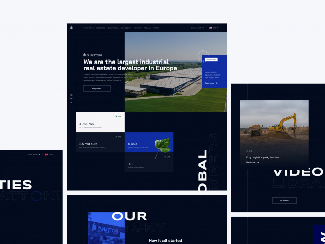
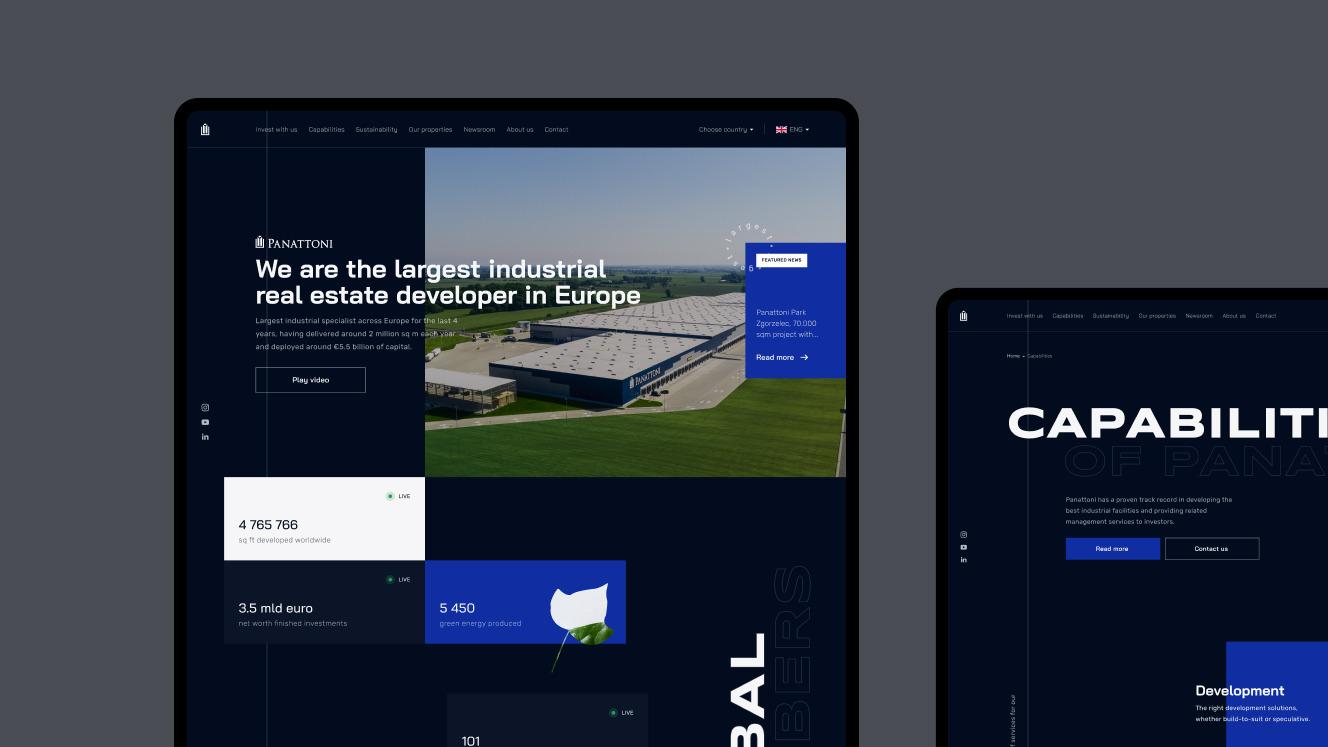
Panattoni Europe is the largest real estate developer in Europe. We designed a beautiful global corporate website for Panattoni and local, corporate pages for their European and Indian markets. Each local page is easy to customise so it can fit different markets. We wanted to give this page a fresh look that’s both unique and maintains a corporate style to differentiate Panattoni from their competitors on the market (we also talked more in detail about Panattoni's UI design in the article about UI design).
Polpharma
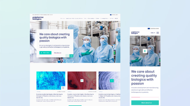
Polpharma Biologics is Poland’s largest and most famous biotechnology company. We redesigned their corporate website and transformed their visual identity into a new, refreshed look of the page. The page is a crucial touchpoint for Polpharma’s marketing goals, so the website is easy to navigate, allowing users to explore the complex world of biosimilars.
Kompania Piwowarska
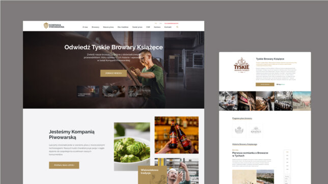
Kompania Piwowarska is one of the biggest Polish brewery groups with many notable brands such as Tyskie, Żubr, Lech, and Książęce. We let our creativity lead us on this project and we came up with a wonderful icon and animation set for the website. The page now has a contemporary look with intuitive navigation and custom illustrations.
Best practices for corporate website design
Clean design
A modern corporate website should have a clean look: a consistent colour palette, style, typography, and simple layout. It’s best to go towards a minimalistic or classic professional design. Too many decorative elements or content components (e.g. animations or videos) and you may overwhelm the users instead of enticing them to learn more about your business.
Easy to navigate
We can’t stress this enough: the website should be easy to navigate. If visitors can easily find what they’re looking for and the essential information is on display, then their user experience is positive. However, if there’s clutter and no clear hierarchy of pages and content, they can get lost and leave with a negative experience of interacting with your brand.
Mobile optimisation
These days everyone should optimise their websites for mobile. Most websites gain a significant amount of traffic from mobile users, so a corporate website should have a responsive design that adjusts to whatever device a visitor uses. And it shouldn’t just look good, but it should function well too.
Consistent branding
If your business is new, the homepage can establish your branding – brand identity, strategy, and the general vision for the brand. If you’ve already been on the market for a while, then it is crucial to match it to your already existing marketing efforts. Consistent branding – the same colour palette, typography, and logo – distinguishes the brand from others and build trust in the visitors. Consider consistency as a strategy to make your brand seem reliable and trustworthy; if you present the brand consistently across all touchpoints, the visitors can easily see what your brand is about (and if you're wondering what's the difference between branding and marketing, don't worry – we discussed the differences in the article "Branding vs Marketing: What's the difference?").
Clear calls-to-action
As mentioned earlier, a company’s homepage should have calls-to-actions, and above all, they should be clear. Any buttons or links you want the people to click on should stand out visually but also be easy to understand. Customers who want to add a product to their order shouldn’t have to wonder whether they’re clicking the right thing. It should be obvious. That’s why they’re usually written in an action-oriented language (e.g. “Buy now”). If you encourage visitors to take action, they’ll likely take it (and improve your conversion rate in the process!).
High-quality images and content
When using images or videos on your page, you should ensure they’re high-quality and relevant to your brand. The same goes for content – the texts on the website should be well-written, error-free, and easy to read (you can read more about website content in the article on UX writing).
We highly recommend following these best practices as they will ensure that your corporate website is not only stunning but also useful for visitors. We also have a few words of caution: a graphic builder may be tempting, but you shouldn’t underestimate the power of user experience and professional designers. The mind-blowing effect you’re looking for in your project can only come from a professional digital consulting agency, and that’s exactly what Flying Bisons is.
Summary
You can engage with your potential customers through many channels, but none is quite as powerful as a corporate website. It’s your company’s piece on the Internet where you can tell and show your potential clients why you’re the one they should choose.
A well-designed corporate website with a seamless user experience can distinguish you on the market. It’s an investment into the future of your business.
At Flying Bisons, we don’t just know all that but take it to the next level – our digital products are unforgettable. So if you want your corporate website to be remarkable and stay in the minds of your customers, you know where to find us.


