Kamil Tatol
-
Aug 12, 2024
-
7 min read
In this article, we will discuss why such a solution is better for user experience, offering specific points and reasons behind it. Let's get into it.
Focus and guidance
One of the primary benefits of hiding top navigation in wizards is the enhanced focus and guidance it provides to users. By streamlining the interface and removing unnecessary elements, users can concentrate on the task at hand, which significantly improves their performance and satisfaction.
Cognitive load reduction
According to cognitive load theory, unnecessary information can overload a user's working memory, leading to poorer task performance. Sweller, Ayres, and Kalyuga (2011) thoroughly explore this concept in their study. Wizards often deal with complex processes, so removing extraneous navigation helps maintain user focus, thereby enhancing task performance.
The Nielsen Norman Group (2018) also supports this idea, showing that users perform better on tasks when they're not distracted by additional navigational elements. Simplified interfaces in wizards lead to higher task completion rates and fewer errors, as users can concentrate solely on the steps necessary to complete their tasks.
Progressive disclosure
Progressive disclosure is a technique where only the necessary information is shown at each step. Jakob Nielsen’s Usability Engineering emphasises this principle, ensuring users are not overwhelmed. A study on Minimalism in UI Design (2016) found that interfaces focusing on essential elements at each step increase user satisfaction and reduce the time needed to complete tasks. This method aligns perfectly with the design philosophy behind hiding top navigation in wizards, as it ensures users only see relevant information, making the process less daunting and more intuitive.
Task completion and conversion rates
The effectiveness of wizards without top navigation is also evident in improved task completion and conversion rates. This approach can lead to higher engagement and success rates by eliminating distractions and focusing users' attention on the primary task.
Enhanced conversion rates
Google’s Material Design Guidelines suggest that reducing visual clutter improves user engagement and conversion rates by directing attention to primary tasks. This principle is particularly relevant in e-commerce and other conversion-focused environments.
A case study from the Baymard Institute highlighted that streamlined check-out processes without unnecessary navigation increased conversion rates by 21%. By eliminating distractions, users are more likely to complete their purchases, showcasing the effectiveness of hiding top navigation in driving higher conversion rates.
User engagement
User engagement is crucial for the success of any interactive process, and hiding top navigation in wizards can significantly enhance this engagement. By providing a clear and focused path, users are more likely to stay on task and complete the process.
Microsoft’s user experience research (2020)
Microsoft research found that wizards without top navigation saw a 17% increase in task completion compared to those with it.Users were less likely to abandon the process when they weren't tempted to navigate away. This indicates that a focused, distraction-free environment significantly enhances user engagement and completion rates.
Shopify’s checkout process analysis
Shopify’s analysis of their checkout process revealed that removing top navigation during checkout increased completion rates by 11%.Users were not tempted to leave the funnel to explore other parts of the site, leading to more successful transactions and a smoother user experience.
Improved usability
Improving usability is a key goal in UX design, and hiding top navigation in wizards contributes significantly to this goal. By reducing errors and ensuring consistency, users can navigate processes more effectively and with greater satisfaction.
Avoiding user errors
A study by the Nielsen Norman Group (2015) found that removing top navigation in wizards can prevent users from making errors by ensuring they don’t navigate away from incomplete processes. By keeping users focused on the current task, the likelihood of errors decreases, leading to a more efficient and satisfying user experience.
A case study by UX Matters further supports this finding, showing that wizards with simplified, focused steps had a 15% reduction in error rates compared to those with visible top navigation. This reduction in errors not only improves usability but also enhances user confidence and satisfaction.
Real-world examples
Nothing shows the idea of a solution better than real-world examples. That is why we found two companies that decided to hide their top navigation to create a better user experience.
Google Forms
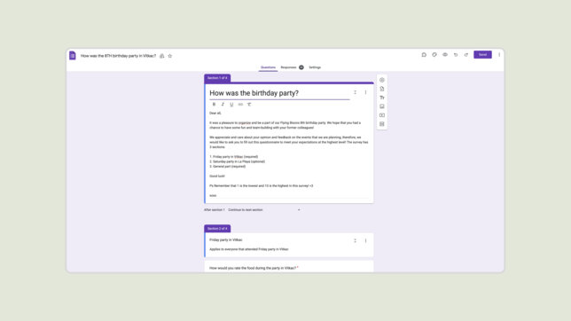
Google Forms uses a step-by-step wizard approach without top navigation for creating surveys. This design choice guides users through the form creation process without distractions, increasing task completion and ensuring that users can focus on crafting their surveys effectively.

TurboTax
TurboTax employs a similar strategy in their tax filing wizards, hiding global navigation during critical steps. This approach maintains user focus and reduces abandonment rates. Internal studies by TurboTax have shown that this design choice leads to improved completion rates and higher user satisfaction, underscoring the benefits of a distraction-free wizard interface.

Summary
Hiding top navigation in wizards significantly improves user experience by focusing user attention on the task at hand, reducing cognitive load, increasing task completion rates, and decreasing error rates. This approach is validated by both theoretical studies and practical case studies, demonstrating its effectiveness in guiding users through complex processes efficiently and effectively. By adopting this UX strategy, designers can create more intuitive and successful user journeys, enhancing overall satisfaction and engagement.


