Kamil Tatol
-
Dec 14, 2022
-
10 min read
Our digital consultants will take on every challenge you might throw their way – and they will succeed. No matter what type of difficulties you foresee, they have likely dealt with them on more than one occasion. Think we’re exaggerating? Then have a look at the top 10 most challenging projects we have already delivered.
1. Park of Poland
Our goal was to design and implement a complete, extensive e-commerce solution for the largest tropical-themed water park in Europe – and we had to start our work when it was all still little more than an ambitious idea.
Park of Poland needed much more than a simple e-shop for selling tickets – it needed a system as robust as its own entertainment offering was to become. The complex digital system we had to build also included an accommodation booking engine and integrations with the park’s wristband and ticketing systems, wellness bookings, and payment providers.
We knew online sales would be responsible for nearly all revenue of this massive undertaking, so our e-commerce platform had to be absolutely reliable and make customers want to spend money. That meant endless ticket customisation options, enabling users to book accommodations directly through Park of Poland, and upselling additional services and experiences throughout the process.
At this point, it may all seem obvious – but at the start of the project, neither we nor the client knew exactly what was needed to make the investment succeed. So how did we make it happen?
We decided to take a deep dive into the pool industry and learn all there was to learn, which included paying a visit to one of the most impressive water parks in Europe. More than 20 experts were assigned to the project, and they would commit over 10 000 hours to deliver the final result.
Our experience and involvement allowed us to lead the client through an enlightening discovery phase and map out the entire water park experience, making way for a seamless connection between online and offline touchpoints. Many, many touchpoints.
With Park of Poland aiming to accommodate as many as 8 000 visitors every day – nearly 3 million per year – building its digital layer was an enormous challenge, and it had to be dealt with fast. After all, the water park couldn’t start admitting visitors without a functioning e-commerce platform.
We won’t be keeping you on the edge of your seat, though. Park of Poland did launch in time and is now the pride and joy of the area – and as for our collaboration with the client, it has carried on for more than 4 years. The 5/5 on Clutch speaks for itself.
We are still responsible for the water park’s digital layer, with the platform’s code base constantly expanding and undergoing regular renewals – all taken care of by a stable team of Bisons who by now can probably be considered aquatic animals.
Park of Poland was the first project of such scale that we delivered… but it wouldn’t be the last.
Key insights:
- Design and development teams need to be involved in the business process creation process if they are to truly understand the client’s needs. That is how we managed to build a stable platform that fulfilled all requirements and has been expanding ever since.
- Long-term business relationships can only be built on full transparency. Difficult conversations need to happen right as problems arise – any later is often too late.
- Pressure makes diamonds… and is a frequent reality of building digital products. Fortunately, we have already become diamonds, so know we will never crack under pressure.
2. KFC for Amrest
Our goal was to design all digital channels for the largest chicken restaurant in the world – and we had to take the brand’s user experience and sales performance to the next level
The first challenge we took on was to build an all-new e-commerce website for KFC Poland in just 2.5 months. The company’s online presence wasn’t impressive back then – we knew we could do much better, and we knew the improvements we envisioned would translate into a meaningful revenue increase.
But we base ourselves on data, not hunches, so we performed a series of interviews and audits that not only confirmed our earlier intuitions but also uncovered insights that would take KFC’s conversion rates up by much more than a notch.
Mobile first, infinite scroll, transparent product descriptions and comparisons, a wisely designed product recommendation system for some casual upselling… Everything we discovered about fried chicken lovers’ needs and preferences, we put into practice. And numbers don’t lie:
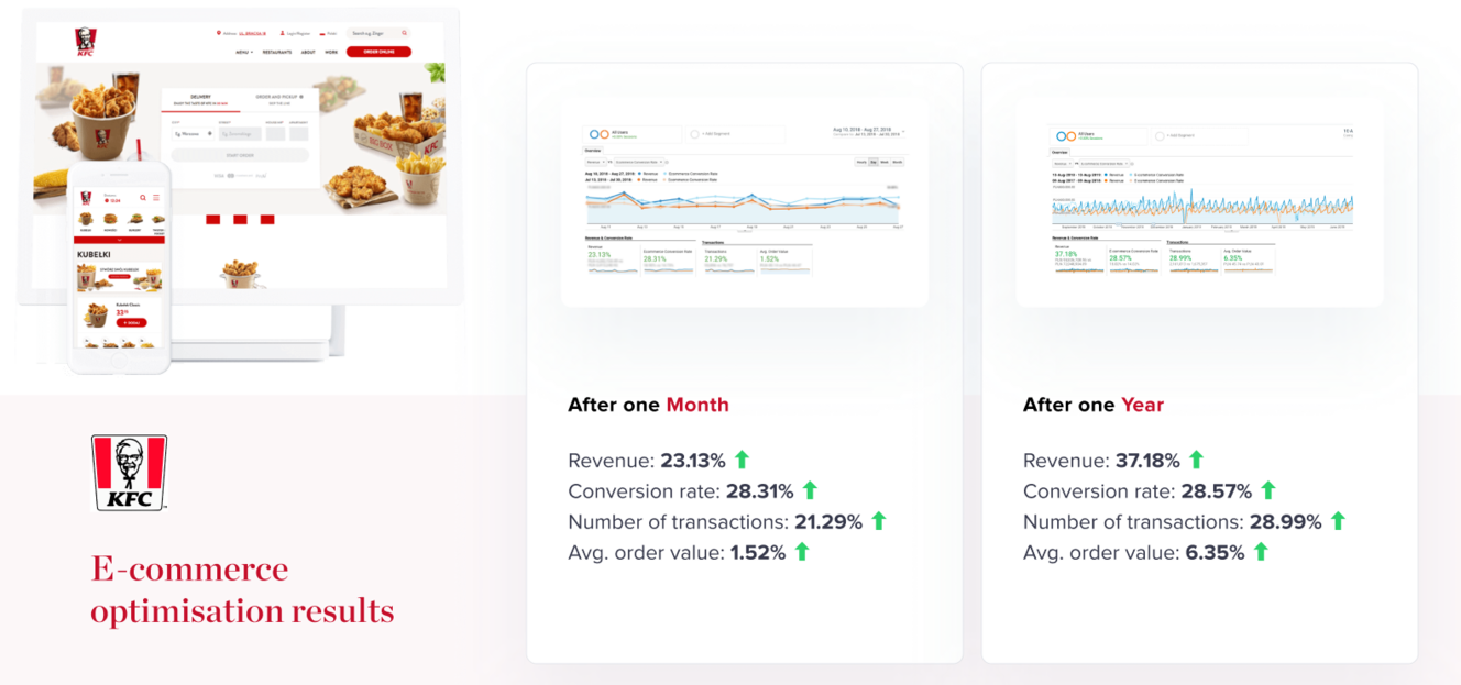
The impact on KFC’s financial results was so remarkable that the company quickly entrusted us with another mission: redesigning its remaining digital channels, including website, mobile app, and kiosk ordering system for 6 European markets.
At this point, we had to take over the sadly lacklustre work of external agencies and spend months reworking their designs and fixing their mistakes – but a proper challenge is what all Bisons love, especially with the vision of more KPI improvements in sight.
The hard work was worth it – Amrest started noting much-improved conversion rates, which made them ask us to take over Burger King’s and Pizza Hut’s digital channels. It’s been a great four years, as evidenced by the appreciative review that we received on Clutch.
Key insights:
- Any long-term collaboration is based on trust, and our approach to building trust is simple: we always advocate for the product, be it an app, a web platform, or a digital kiosk. If an issue needs to be raised, we raise it. No exceptions. This may lead to heated discussions… but ultimately, it always leads to great products.
- If doing something new has the potential to bring results, we see ourselves as obliged to push the client toward uncharted waters. We introduce a sense of pressure that motivates organisations to use new tools, improve processes, and keep becoming better and better.
3. Zain Kuwait
Our goal was to overhaul the existing customer experience and enable digital transformation for the largest mobile telecoms firm in the Middle East – which happened to be our first consulting project of this scale and the first time we worked in this region.
The situation at Zain was starting to look critical, with more and more customers switching to competitors…
But handling the boldest of challenges is what Bisons excel at.
Not only would we make a debut at auditing such a vast amount of online and offline touchpoints and mapping the entire customer journey – we would also have to work within a culture we had never encountered.
To gain a full understanding of user needs and preferences, we had to conduct numerous interviews, and the first immediate problem turned out to be the language barrier. Kuwait taught us everything about efficient collaboration with translators and analysing consumer behaviour no matter the linguistic background.
Still, our consultants found themselves facing yet more complications. Due to cultural differences, the male experts who were leading the project couldn’t be alone in a room with local women, whose perspectives obviously needed to be included. That also made it difficult to find candidates for interviews. The way we solved this conundrum was mostly by… recruiting participants and talking to them in a Starbucks.
The project required us to keep adapting to new circumstances while maintaining the excellent quality of service our clients are used to, and we delivered. In collaboration with the rest of the UX team back in Poland and our partners, PwC and Strategy&, our consultants equipped Zain with a 150-page-long report full of consumer insights, audits, and recommendations.
Putting them into practice took Zain’s digital offering to the next level, and the company’s high level of satisfaction turned us into frequent visitors to the Middle East, as we keep working on more and more projects in the region.
Key insights:
- Projects in distant countries are extremely demanding… and extremely rewarding. The key to building trust across cultures is being physically present and getting to know the client at a profound level.
- Local support is often crucial for efficiency, especially when it comes to recruiting research participants.
4. Hebe
Our goal was to design the first e-commerce platform in the history of the largest chain of cosmetics stores in Poland and bring its complex offline pricing system into the digital world.
Did we mention we had to pull it off in 2 months? (Spoiler alert: of course we did it).
With nearly 300 stores across Poland, Hebe had long been a local favourite, especially among female customers – but the company had only ever had a content-based website with no way at all to purchase its products online.
With the rapid growth in the e-commerce industry, that could no longer be the case. So, we set out to translate the offline Hebe experience loved by Polish women into an intuitive, elegant online platform.
We had to digitise dozens of algorithms that ruled Hebe stores, displaying the right prices depending on a number of conditions related to discounting processes and the physical card-based loyalty program.
However, despite the tight deadline, the client hadn’t yet chosen what technology would be used to implement the design when our work was already getting started.
The uncertainty meant we had to stay in close contact with Hebe’s newly-created tech team and remain flexible to ensure continuous feasibility within the most recent assumptions. Throughout the project, we collaborated with a Big Four consulting company – and in the end, we would all celebrate acing the first implementation of Salesforce in the CEE region.
Our work consisted of more than designing the new Hebe website with all its features, though: we also supported the client in setting up a user-friendly architecture for product categorisation and implementing a new loyalisation strategy.
Having launched right before the onset of the pandemic, the Hebe e-commerce platform proved to be a spectacular success that skyrocketed the company’s performance. We have since maintained a digital partnership with the client for more than 3 years and provided support for the implementation of Hebe Pharmacies.
Key insights:
An in-depth understanding of the tech side of the project is crucial when a large organisation like Salesforce is responsible for the development. Technical limitations, deadlines, budgets – to ensure we achieve our common goals, we always keep verifying that all stakeholders are on the same page throughout the project.
5. IKEA
Our goal was to digitise one of the Swedish furniture giant’s main revenue streams. We had to design and implement an online platform for planning, designing, and purchasing kitchen systems.
IKEA has long been a top choice for any customer who wanted to install a new kitchen. The company made it quick, efficient, and easy: just take some measurements at home, drop by one of the many IKEA stores, and talk to a consultant. You’ll be enjoying your dream kitchen installed in no time.
But we’re not in the 1990s anymore – who wants to have to take a trip to a physical store? IKEA realised more and more customers preferred to explore their options from the comfort of their own homes, so the company asked us to digitise the entire kitchen selection and purchase process.
We loved the challenge of bringing such a complex service to the digital world, and one thing is for certain – our consultants can now furnish their own apartments with ease. Mapping out IKEA’s entire offline kitchen purchase customer journey turned us into experts who could now provide advisory on cabinets, worktops, and drawers, not just digital product development.
As we created the new software solution’s visual layer, we had to work with IKEA’s global style guide and create a crisp and modern design that would remain consistent with the brand’s recognizable aesthetics.
Understanding the complexity of the client’s tools and APIs was one of the main difficulties we encountered as we progressed toward frontend work – we’d been hired for design only, but the collaboration was going so well that its scope expanded. We partnered with an external backend provider and engineered a complete kitchen customisation platform.
Our solution not only allows users to discover all the possibilities offered by IKEA but also includes an internal video call tool for consultants to provide personalised advice – like in the good old pre-digital times, except ten times more convenient.
The complexity of the challenge couldn’t stop us – the project was so successful that it turned into a 4-year-long collaboration with IKEA that only came to a halt due to a global-level corporate decision to expand internal teams instead of partnering up with digital consulting companies.
Key insights:
Only a full understanding of the customer journey allows for the successful digitisation of an offline process. The time spent on exploring pain points and mapping out touchpoints is a crucial investment.
6. Qiwa
Our goal was to push forward Saudi Arabia’s Vision 2030 national digitisation project by building a design system for Qiwa: a government platform at a scale similar to gov.uk or mObywatel.
Saudi Arabia decided to say goodbye to long lines at public offices and agencies – it was time for employers and employees to handle their business on the Internet.
But how do you digitise such a complex system with numerous rules and exceptions for various types of visas, work permits, and contracts? It’s easy: you hire Flying Bisons.
What was not easy was our side of the deal, though – if you want to digitise something, you first need to understand it. So, we travelled to Riyadh to perform the Discovery and Strategy phases of the project and study the country’s legal system down to the tiniest detail. By now, we’re certain we are the most knowledgeable experts on the matter outside of Saudi Arabia – and we’d likely compete with the very best even in Riyadh itself.
The new government platform would soon become compulsory for millions of Saudi citizens, so we had to ensure the design was sleek, intuitive, and fully accessible in accordance with the WCAG 2.1 standard. But providing a great end product wasn’t the only challenge – the components we were building would be used by a number of dispersed teams, so we needed to focus on easy reusability.
The project was so intense that it required the participation of over 20 designers, but with the expertise we had acquired, only creating visuals wouldn’t have taken advantage of all our potential.
Our consultants also prepared all written content for the Knowledge Center that Saudi citizens would use to make sense of the intricacies of their legal system. We were fully responsible for this part of the project – Saudi experts only performed a final verification.
Our work has made a great impression on the Saudi government as proven by the 5.0 Clutch review – and the tender we’ve already won to ensure further collaboration. We may now continue the relationship with the client by implementing the design system on the frontend.
Key insights:
- Content is king – but few companies can write well. Investing in content-related competencies unleashes hidden potential.
- Managing 20 designers within one project is a challenge that requires the highest level of component inventory management and a streamlined feedback process.
7. eobuwie
Our goal was to design amazing visuals for Poland’s leading footwear e-commerce company’s mobile app and bring to life the concept art created by a top American design studio.
E-commerce applications are about much more than looking pretty, though – their goal is to generate revenue. With millions of users and a dominant position in Central and Eastern Europe, eobuwie needed a state-of-the-art app that would become an industry benchmark.
Thus, before we would start the design process, we performed a thorough Research & Strategy phase, getting to know eobuwie’s customers’ needs to ensure the final product would help the client meet business goals.
The next step was to design an extraordinarily robust design system. Due to the complexity of eobuwie’s offer and the app’s processes, we had to create hundreds of screens for dozens of meticulously planned out user flows.
The client’s appreciation for how we dealt with this challenge was such that we were soon hired to also redesign eobuwie’s desktop website, which boasts over 15 million visits per month. These days, we continuously provide Research services and maintain a close working relationship with eobuwie.
Key insights:
- A large-scale design project can only succeed on the basis of a well-conducted Research & Strategy phase.
- Joining forces with internationally renowned experts is a great way to optimise the process, combine diverse perspectives, and create unique solutions.
- Exceptional customer experience is what a market leader should prioritise to stabilise its position and become regarded as an industry benchmark.
8. naTemat
Our goal was to design a new website for Poland’s leading media platform visited by over 10 million people every month. Due to the client’s digital-only character, our work would make a decisive impact on its business results… and oh boy, make an impact we did.
naTemat had long been a household name in Poland, but as the company’s 10th anniversary was growing near, the company decided it was time for a complete overhaul of the platform.
We knew our design would almost single-handedly decide how much of naTemat’s hidden potential could be unleashed. So, we performed an in-depth Research & Strategy phase and discovered the optimal way to balance the needs of content creators, advertisers, and site users – the three groups needed for our client’s KPIs to surge.
We then set out to design the ultimate online media experience: mobile-first, clutter-free, and empowering for both readers and writers. Users could now customise both the content and the colour of their feeds, while authors were free to adjust their articles and subpages using our modular system of easily interchangeable yet visually consistent components.
Words matter, especially for a content-based website like naTemat, but numbers are better suited to express the success of this project. After the launch of the new platform, our client achieved:
- +17% unique users
- +23% new unique users
- +30% sessions
- +29% page views
- +11% sessions per user
- 2300% uplift for Audiobrief
With all that in mind, it’s no wonder our design system would soon be used as a base for all other platforms belonging to the company: Inn Poland, Mamadu, DadHero, and ASZ Dziennik.
Key insights:
What companies need is growth – and what causes growth is satisfied users. The customer-centric design will never fail to achieve business goals.
9. delio
Our goal was to design a state-of-the-art mobile app for a new q-commerce venture that was soon to take the Polish market by storm – and we would have to make it happen in less than 4 months.
Delio’s ambitions were clear: the brand planned to instantly become a q-commerce industry benchmark by providing an incredible customer experience. The company was already implementing its web platform when we were tasked with designing the application.
Our delivery would have to be quick – just like Delio’s deliveries – and it was, but it did not allow us to overlook any important process. Before starting to work on the final UI designs, we performed standard Research, Strategy, Concept, and UX Design phases.
As we worked on creating optimised, efficient user flows, we prepared several concepts and alternative solutions that were later tested so we could follow through with the version that would ensure the greatest results.
Despite the complexity of the project’s business implications and the tight deadline, we also focused on ensuring the technical feasibility and high performance of the final product. We constantly analysed every module’s and feature’s value-to-effort ratio to make optimal decisions.
Did we succeed? Users seem to think so – the app has enjoyed impressive ratings since right after its launch, and Delio has been expanding throughout Poland at the speed one would expect of a q-commerce company.
Key insights:
- No matter how tight the deadline, there can be no skimping on quality. We do it right, or we don’t do it at all.
- Testing alternative concepts at an early stage of the project is a great way to focus resources on the most promising possibilities.
10. Your new digital product
How about we add your project to the list as number 10? Flying Bisons relish challenges, so whatever the complexity of your plans and ambitions – let’s have a chat and unleash your digital potential.
