Michał Durys
-
Dec 02, 2024
-
17 min read
What is Information Architecture (IA) in UX?
Information architecture is the practice of logically and understandably organising and structuring information. It creates a framework that dictates how content is grouped, organised, and presented. This makes it easy for users to find information and enhances the overall navigation experience of any digital product. It is a critical component of the practical product design process.
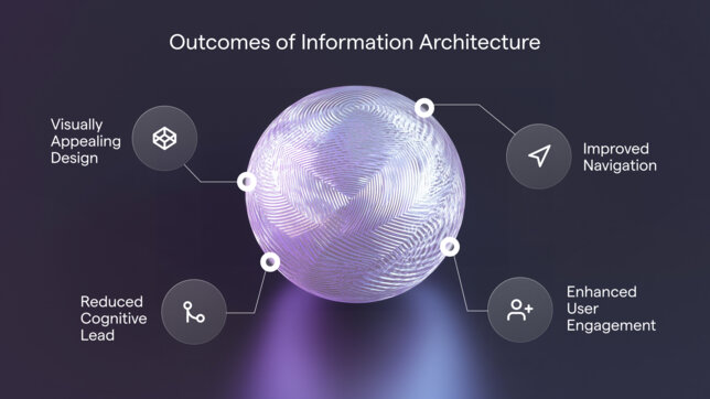
In the UX design process, information architecture influences deliverables like sitemaps, wireframes, hierarchies, navigation, and metadata. It also demonstrates the relationship between content elements and establishes their hierarchy and presentation. A vested interest in IA can help UX designers achieve vital goals such as improving site navigation, enhancing user engagement, and facilitating user interactions. It also contributes to a cleaner, more visually appealing website and reduces cognitive load.

How IA can impact your business
We have already mentioned that information architecture makes it easier for users to find, understand, and interact with any information on your website. However, there are other benefits. A solid IA on your website or mobile app could also impact areas like:
- Marketing ROI
- Customer service
- Hiring
- Employee performance
- Lead generation
- SEO
Information architecture is a powerful force within the digital industry, and the reason for this is simple. When a user gets lost on any website, they will leave and never return, which means they won't get the product or service they were looking for, and you'll lose the potential client. And that's precisely what IA helps you avoid – you're involved in a decision-making process on your site and can give users what they're looking for with every click. Finally, it establishes a logical framework that builds trust – one of the most valuable things you can achieve with your users.
It's essential to consider information architecture at the very beginning. However, before you start your journey with IA, learn about its principles.
The principles of good Information Architecture
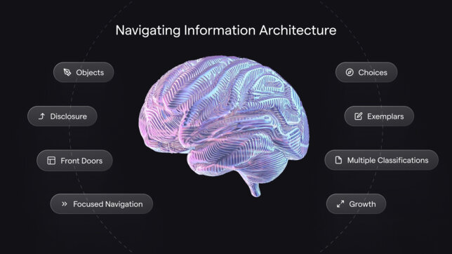
When discussing principles of good IA, we have to mention Dan Brown – an information architect and UX designer who first proposed the 8 principles of information architecture. Below, you can find a brief description of each principle.
Principle of Objects
This principle might be confusing at first. The goal is to think of content as breathing, living objects – unique and dynamic with their own behaviours, attributes, and life cycles. For instance, a blog post may change over time, acquiring new comments, updates, or tags, while products in an e-commerce store might gain reviews or change stock availability. Information architects should consider those attributes to use that content best. For example, you can archive pages of retired items or simply re-categorise them.
However, before organising and structuring content, you must decide what content you'll produce. Do you want to focus solely on blog posts and product pages? You may want to add videos or other types of content as well. If so, do you want to embed them into blog posts or product pages? Maybe even somewhere else? That's what you have to focus on first. Then, once you find your content types, you can start mapping out how best to provide this information to your visitors.
Principle of Choices
Following this principle means limiting the number of choices for users to only the most meaningful and relevant while related to a particular task. When users encounter too many choices, decision-making becomes difficult, leading to frustration or disengagement. For example, a website’s navigation menu might group related options under intuitive categories rather than overwhelming users with an extensive list of links. This way, you reduce the level of cognitive effort required of the user and improve the overall user experience.
Principle of Disclosure
According to this, you should only disclose what is necessary for users to understand what they'll find next and decide based on that information. Rather than overwhelming users with all the details upfront, it gradually reveals content as they explore. This method reduces cognitive load and keeps users engaged, encouraging them to delve deeper into the site. For example, an FAQ section might show question titles as clickable links, only revealing the complete answers when selected. This keeps the interface clean while allowing users to access relevant information on demand.
Principle of Exemplars
Just to make everything clear – exemplars are examples that illustrate the type of content or functionality users can expect from a category or section. Designers use those exemplars to clarify choices, make navigation intuitive, and reduce ambiguity. You can encounter a primary example of this principle on any e-commerce website. They tend to show representative images under a category like "Accessories" to guide users quickly. Exemplars also bridge the gap for users unfamiliar with specific terms, ensuring they make informed decisions. Using concrete examples strengthens IA by aligning user expectations with the system's structure.
Principle of Front Doors
The principle of front doors recognises that many users access websites or apps through pages other than the homepage, often via search engines or direct links. Designers must ensure these "front doors" provide context and support navigation, helping users orient themselves regardless of their entry point. This might include breadcrumbs, navigation menus, or contextual tooltips. For example, a user landing on a product detail page should still have access to broader navigation to explore related items or seamlessly return to the main site structure.
Principle of Multiple Classifications
In this case, the principle advocates providing several ways to access the same content to cater to diverse user preferences. Users might navigate by category, search bar, or filter, depending on their needs. For example, an e-commerce site might allow users to find products by brand, price range, or customer ratings. This flexibility accommodates varied mental models and ensures content remains discoverable, even if users approach the system differently.
Principle of Focused Navigation
Navigation should be purpose-driven and free from unnecessary complexity. The principle of focused navigation encourages designers to separate items by their function and reduce overlap, ensuring each menu or link serves a specific purpose. For example, a navigation bar might have distinct sections for products, services, and support, each leading to carefully curated subcategories. By maintaining clarity, designers ensure users can efficiently locate their desired content without confusion or redundancy.
Principle of Growth
The growth principle emphasises designing IA with scalability in mind. Systems must accommodate future expansions, such as new content, features, or user demands, without becoming cluttered or inconsistent. Modular design and robust taxonomy ensure that a site's IA remains coherent and functional as it grows. For instance, a news website might structure its categories to easily add new topics over time without disrupting existing navigation. Planning for growth ensures the system remains user-friendly and adaptable over the long term.

Primary components of Information Architecture
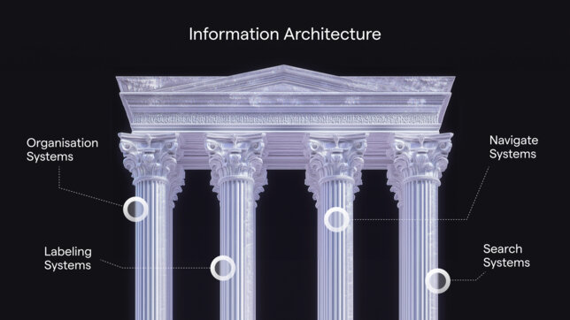
Similar to the principles, we must mention two information architecture pioneers – Louis Rosenfeld and Peter Morville. In their book "Information Architecture for the World Wide Web," they established four main components of IA. Let's go through all of them.
Organisation systems
When it comes to organisation systems in IA, there are three: sequential, hierarchical, and matrix. All of them have a similar goal – to connect different pieces of information and create an intuitive framework that helps users easily navigate and understand your product's features and benefits. Basically, this component is responsible for organising information on your website or application. After all, all of the content has to make sense, not only for you but for every visitor out there.
Labeling systems
Labelling in information architecture helps users find the information they're looking for using simple words or phrases. For example, a website's "Blog" page evokes associations with articles, newsletters, or authors, while a "Contact" page suggests the company's phone number or office address. These labels – "Blog" and "Contact" – organise related information into specific site sections, making it easier for users to locate. It's essential to remember that designers create labels that convey a lot of information in just a few words. To ensure effectiveness, they should also adhere to the principles of UX writing.
To learn more about UX writing, check out our recent article discussing the topic in detail.
Navigation systems
Navigation is the system that guides users through your website or app, allowing them to engage with the interface and complete their tasks successfully. You can think of it as a network of roads that leads users throughout your site. It's important to remember that categories organise navigation, so it must be carefully planned to prevent confusion and frustration, which can ultimately drive users away.
Search systems
The search bar on your website or mobile app is crucial for users looking for specific products. It allows them to find their interest quickly, eliminating the need to navigate the entire site. Therefore, ensuring that your search results page displays appropriate and relevant content is essential. This page’s overall layout and structure are critical components of information architecture. If your search results lead to a "dead end," it can cause users to abandon their search.

How to design a practical IA
We have already established some basic definitions, benefits, and principles of a good information architecture. Now, based on our expertise, it's time to show you how to design an effective IA.
User Research as a Foundation
The cornerstone of effective information architecture is a deep understanding of your users. Conduct detailed research to build personas that reflect your audience's key characteristics, behaviours, and goals. Map out user journeys to visualise their paths through your site or app, identifying moments of friction and opportunities for improvement. Methods like surveys, interviews, and usability testing are essential for gathering insights into how users navigate content and what they expect from the system. This foundational step ensures your IA prioritises real user needs, enhancing the usability and intuitiveness of your design.
Card Sorting Techniques
Card sorting is a powerful technique for organising content that makes sense to your users. In open card sorting, participants categorise content into groups they create, offering insights into natural mental models. Closed card sorting, on the other hand, evaluates predefined categories, testing how well users understand and navigate them. Combining both approaches provides a more comprehensive view, ensuring your IA is intuitive and adaptable. Leveraging tools like OptimalSort or UXtweak makes gathering data from diverse audiences easier and applying findings to create scalable structures that align with user expectations.
Site Mapping
Site mapping brings your IA to life by visually representing your site’s structure. This step involves defining clear content hierarchies and navigation pathways that guide users seamlessly through the experience. Begin by categorising content based on user needs and business goals, ensuring that essential information is easily accessible without unnecessary clicks. A well-designed site map highlights connections between content areas, helps identify potential bottlenecks, and provides future scalability as your site grows. This roadmap streamlines the design process and serves as a reference point for ongoing development and optimisation.
Testing
The primary rule is to test early and test often. When it comes to information architecture, there are several methods of testing to see if it's actually working. We'll describe two of them: click testing and Tree testing.
Click testing is a method that focuses on how users interact with available UI components. This quantitative approach provides valuable insights into which navigation elements users engage with and which ones they overlook or avoid. With this information, you can easily adjust your information architecture, modify the layout, or remove elements that your users are ignoring.
Tree testing determines whether the categories' names are straightforward and the content is organised user-centeredly. In this quantitative method, participants navigate your website solely using the link names. The insights gathered from this method enable you to modify the content or titles on your website, ensuring that everything is easy to find.
To learn more about Tree testing, visit our Digital 101 page, where we describe it in detail.
Summary
Strong information architecture (IA) is essential for a seamless user experience. It ensures users not only understand how content is organised but can also anticipate its structure. A robust IA allows users to locate items intuitively, like jewellery under "accessories" or an author's name on a blog post, enhancing speed and navigation. Even the most visually appealing and interactive designs without clear IA fail to create a satisfying experience, leaving users frustrated and disengaged.
If you need any help with creating or enhancing your information architecture, feel free to send us a message with a description of your needs. Our team is ready to help you reach new heights in the digital realm.
Also, since Information Architecture is a vital part of good UX, we encourage you to visit our Flying Bisons Academy and sign up for the upcoming course "Introduction to UX". Our experts can't wait to share their expertise with you!


