Anastasiia Kuzhda
-
Jul 07, 2023
-
9 min read
This interview was originally published on Ordering Stack.
Why are businesses such as restaurants interested in designing their interfaces and applications?
Over the centuries, there have been many industrial revolutions. Now, we live in the era of digital revolution, where customer experience is the most valuable currency. Digital solutions, including e-commerce, marketplaces, and mobile applications such as Pyszne.pl, Uber Eats, or Bolt Foods, are widespread. A user-friendly website for online food orders is essential; customer expectations drive ongoing change.
Brand experiences matter. Customers seek intuitive and functional solutions, and they’ve never had more options. If you wish to order food, you can go to your favourite restaurant’s website, Pyszne.pl, open 10 tabs with selected eateries, or browse the world’s various cuisines in the Uber Eats app.
At Flying Bisons, we design digital products every day. I know from experience that there’s fierce competition in pursuing customers and delivering digital services. Global solutions, such as Uber Eats or Bolt Foods, enhance their apps to optimise conversions and customer experience, maxing out all they have by fractions of a per cent and justifying their efforts with millions of users.
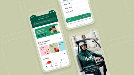
To compete, some restaurants join marketplace platforms, paying commissions on orders. Others opt for white-label solutions like Ordering Stack, using well-designed products under their brand for a monthly fee. This alternative is appealing compared to the costly and challenging route of building in-house or relying solely on marketplaces like Pyszne.pl.
Can we even quantify the results of something as elusive as “experience”?
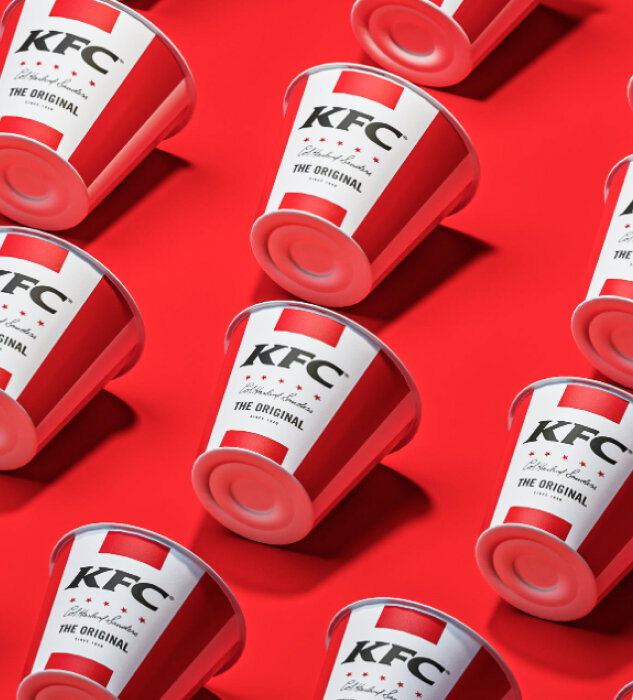
High-quality interfaces and user experience directly impact business outcomes. Flying Bisons’ solutions significantly increased conversion rates (+84% on mobile for KFC) and shopping cart value. Well-designed products can generate substantial profits when implemented at scale.
Digital solutions also enable process automation, resulting in lower operating costs. This dual optimisation approach – increasing revenue and reducing expenses – can lead to higher margins.
However, it’s important to consider the return on investment and scalability when making investments. The optimal solution depends on factors like the company’s nature, business model, and product margins.
Finding a universal answer as to when it is worth investing in UX and whether it is better to hire a specialised firm or start building your own team is difficult. The answer varies case by case. In practice, if UX becomes a company discussion topic, it’s usually the right time to address it. Neglecting UX may hinder growth potential, even if business owners are unaware or pressed for time.
What sets interfaces for HoReCa apart from regular e-commerce, and what to pay attention to?
E-commerce involves selling things online. In my view, digital solutions for the HoReCa industry are a unique type of e-commerce called food commerce (at least that’s what we call it at Flying Bisons), focusing on selling food online. Restaurants offer products with specific features like ingredients, categories (e.g. appetisers, main courses), and availability (e.g. at certain times of the day). HoReCa interfaces should accommodate these differences for easy browsing and selection. For instance, customers may want details like macronutrients or the number of chicken pieces in a set, which are uncommon in other e-commerce categories.
And next-day delivery no longer brings the WOW effect.
Exactly! In the food commerce industry, the product is food – ideally appetising, hot, and wonderfully fragrant. Customers often order when hungry and need their orders as soon as possible. A good idea is to have an attractive presentation of products (such as high-quality photos), enticing product descriptions, and clear delivery time displays. Customers ask, “How long do I have to wait for delivery, and why is it taking so long?”. If we have a good logistics partner (such as Stava) and offer fast delivery, we can use it as a competitive advantage.
Is it as strong as the price?
Restaurants often offer promotions, discounts, and special offers for regular customers. HoReCa interfaces must allow for the personalisation of the offer and adapt to individual customer needs. For example, product personalisation occurs when you order a dish with a chosen sauce.
That means a lot of clicking and tweaking around the product before purchasing it.
That’s why HoReCa interfaces must be integrated with kitchen and logistics systems to enable easy order processing, fast meal preparation, and customer delivery. Time and real-time integration are crucial, as everyone expects the dish to be hot upon delivery. The basis of UX is reliability and accessibility, so even the best system won’t help us if it simply... stops working.
That sounds complicated.
It is, but it shouldn’t be that way for the customer! HoReCa interfaces need to be user-friendly, intuitive, and fast. Customers want to place orders quickly without dealing with complex interfaces, especially in food commerce. Context is essential in HoReCa interfaces, focusing on the user’s path and product prices. Unlike traditional e-commerce, the product page is less significant as restaurant products are often cheaper and ordered in larger quantities. Customers usually add products directly to the cart from the category or product list, only using the product page for details or order changes. Therefore, HoReCa interfaces should consider this context and enable easy category browsing (e.g. a long page with scrolling or tabs) and quick product adding from the list or category level (e.g. “Add” button).
Having all these in place, it is no surprise that interfaces look alike all around the world.
In food commerce, we usually deal with returning customers. After all, we often order our favourite dishes from the same restaurants. This is different from one-off purchases like bikes or garden equipment. To cater to regular customers, our e-commerce should offer an easy and fast path. This includes user accounts with access to past orders, the ability to repeat them, and saving delivery and payment information. One-click payment is becoming a standard due to existing solutions like Allegro or Uber.
One of the pitfalls of design is attempting to create a universal interface for both customer and employee groups. It may result in an interface that is uncomfortable for both groups. Instead, there should be two separate interfaces for customers and employees, designed considering their specific needs. The customer and employee interfaces will be used differently in different situations and contexts. By accounting for these differences, the design can optimise usability for each group.
What aspects of running a restaurant can be transferred through UX to an app/device?
Many aspects of running a restaurant can be transferred to UX design for an app or device. For example:
- Personalisation, where the app can use customer preference data (e.g. their favourite dishes) to personalise the menu and recommend appropriate dishes.
- Quick ordering, where the UX is designed to quickly and easily place orders without having to browse the entire menu.
- Order tracking, where customers can track the status of their orders in the app and stay informed of the estimated delivery time.
- Online payments, where the UX is designed to make payments easy and secure without leaving home.
- Loyalty programs, where the app can offer loyalty programs and reward customers for making purchases.
This sounds compelling for fast-food restaurants. Can high-end restaurants also benefit from online ordering or UX design?
UX design can enhance the value and exclusivity of high-end restaurants. The application or device design can attract customers and provide unique dining experiences. For example, the app can have exclusive dish photos, and the UX design can reflect the restaurant’s aesthetics. Interactions with the app/device can show professionalism and high-end establishments’ service quality.
These elements improve customer experience, foster loyalty, and increase revenue and business growth. However, some aspects, like interpersonal relationships, can’t be replicated digitally. In high-end restaurants, waiters play a crucial role, offering advice and unique experiences and contributing to luxury and elegance.
While UX design enhances customer experience, interpersonal relationships, and staff interactions are irreplaceable in high-end restaurants. Their role in creating an atmosphere cannot be underestimated or fully replaced by the digital world.
We have at least three environments at our disposal – desktop, mobile, and kiosk – how do they differ from the perspective of UX?
Customers use different devices to browse content and make purchases. UX design must consider that. Desktops offer larger screens for comfortable browsing and complex interactions. Mobile devices have smaller screens, requiring condensed content and intuitive interfaces. Kiosks typically have touchscreens, influencing user-app interaction.
Designing UX based on the Omnichannel paradigm requires designers to consider that users may switch between different devices during a single application session. Consistency in the user interface and seamless transitions between devices are then vital. For example, users should smoothly move from desktop to smartphone to kiosk while maintaining a consistent and intuitive experience. Designers reconcile device differences by considering interface variations and ensuring UI consistency. Responsive design adapts to different screens and user interactions for a consistent and good experience.
It is also crucial to leverage the strengths of each touchpoint (such as more screen real estate on desktop or touchscreens on mobile and kiosks) while mitigating the weaknesses (such as limited space on mobile, which should result in simplified interfaces).
How can we reconcile different devices and their conditions with the Omnichannel paradigm?
In the context of omnichannel, it’s worth paying attention to terms like “phygital,” which refers to the combination of physical retail experiences with online channels, and “voice commerce,” which involves using voice assistants to make purchases.
Still, new buzzwords and trends are constantly emerging in the digital world. Currently, in UX design, trends include the “dark mode” feature, which reduces eye strain and increases user comfort, as well as the growing importance of personalisation and process automation. AI and machine learning will, too, lead to more intuitive interfaces.
In the HoReCa industry, key developments will revolve around mobile payments, automation, and sustainability. After COVID-19, there will also be increased emphasis on providing services safely and hygienically. This will likely introduce new solutions related to touchless customer service and increased attention to cleanliness and hygiene in gastronomic locations.
VR and AR solutions are increasingly popular and significantly impact the HoReCa industry. They enable restaurants and hotels to create unforgettable customer experiences, such as virtual hotel tours and enjoying food in unique locations. VR and AR can also aid employee training by simulating work scenarios or helping design interiors and arranging spaces, allowing customers to preview designs before implementation. For instance, AR applications enable customers to order meals using their smartphone camera, and they add an interactive layer to the restaurant menu.
We are talking about revolutionary concepts and disruptions in the industry. Can you see any interesting, game-changing applications today?
Le Petit Chef is a remarkable place on the Polish culinary map. In addition to exquisite dishes, it offers an interactive culinary animation show at the guests’ table. Special projection technology brings the little chef’s culinary adventures to life, creating a memorable dining experience. Guests are taken on a journey around the world alongside the animated character, with each dish from the menu playing a role in the storytelling. This unique approach appeals to food enthusiasts and those seeking novel experiences and technology.
What benefits can a restaurant gain through UX design?
UX design offers numerous benefits for restaurants. It attracts new customers and boosts loyalty by enhancing the user experience. Intuitive menus and streamlined ordering processes reduce errors and wait times. UX design increases business value by improving shopping cart value, conversion rates, and customer frequency.
Additionally, a restaurant can boost operational efficiency, reduce costs, and increase revenue through UX design. Optimisation of processes and easier access to information (such as menus or promotions) can help increase sales, and simplifying customer service processes can speed up the service process and shorten queues.
Doesn’t constant testing and optimisation lead to great repeatability of web services? For example, the design of airline ticket systems is nearly the same everywhere.
Design can vary based on the restaurant’s specific needs and strategies. The repeatable and consistent design builds a recognisable brand suitable for franchises. Unique and custom designs set restaurants apart and offer something distinctive. However, all designs should prioritise functionality and ease of use to ensure excellent customer service and satisfaction.
Tailoring the design to the restaurant's unique characteristics (e.g. niche, customer segment, budget, cuisine, dishes, and location) is crucial.
Designing for different age groups also requires adapting the UX/UI approach. Preferences and usage habits vary across generations. Older individuals may prefer larger fonts, clearer contrast, and intuitive interfaces. Younger generations expect faster and more interactive experiences.
What about apps like Ordering Stack, which serve basically everyone? We all have to eat.
Applications like Ordering Stack should consider age group differences in UX/UI design. This involves collecting age data, analysing user habits and preferences, and testing prototypes with different age groups. Design should be diversified to meet the needs of various age groups while maintaining consistent style and functionality, ensuring intuitive interfaces for users across age groups.
It's worth emphasizing the contexts in which the product is used, such as:
- Who is using the product?
- In what situation?
- What is their goal and motivation?
- What is their level of technological familiarity?
- What solutions do they use daily (what is standard for them)?
- What are the potential difficulties they may encounter (e.g. using a phone in direct sunlight or an older person with shaky hands)?
Also, everyone benefits from products that are accessible – not only to older people or people with disabilities. Accessible design is a good design for everyone, especially since all of us can sometimes be temporarily disabled (i.e. after surgery or with a broken hand).
What losses can be incurred by not investing in UX – I mean UX specifically, not just “pretty graphics”.
Not investing in UX results in significant losses for businesses. Poor UX quality reduces customer satisfaction, leading to customer decline and increased churn. It also impedes conveying vital information and guiding customers to relevant products, reducing cart value, sales, and revenue.
Additionally, a lack of investment in UX raises customer service costs due to user difficulties and subsequent support contacts. Application corrections and updates further incur expenses and may cause service delays.
In the HoReCa industry and beyond, businesses should ask, “Can I afford to neglect UX?”. The answer is almost always a resounding NO.
This interview was originally published on Ordering Stack.


