Kamil Tatol
-
May 10, 2023
-
5 min read
Navigation is an essential element of web design that is crucial in helping users find and access the content they need on a website. A well-designed navigation system makes it easy for users to understand the site’s structure, find the information they are looking for, and move between different pages or sections of the website.
Some of the key roles of navigation in web design include:
- Orientation: Navigation helps users understand where they are on the website and how to get to where they want to go. Clear and consistent navigation labels, menus, and buttons can help users navigate the site with ease.
- Discoverability: Navigation can also help users discover new content or features on the website. Effective navigation should make it easy for users to find relevant content, explore different sections of the site, and stumble across new pages or products.
- Access: Navigation provides users with access to the website’s content and functionality; therefore, it should be easy to use, accessible, and available from any page on the website.
- User Experience: Navigation plays a significant role in shaping the overall user experience of a website. A well-designed navigation system can create a sense of familiarity, coherence, and ease of use for the user, while a poorly designed navigation system can lead to confusion, frustration, and abandonment.
- Conversion: Effective navigation can also impact conversion rates by guiding users towards key actions or goals on the website, such as making a purchase, filling out a form, or subscribing to a newsletter.
Overall, navigation is a critical element of web design that should be carefully planned and executed to ensure a positive user experience and achieve the desired goals of the website.
Exploring the options for web desktop touchpoint
Top and side navigation
There are many different types of navigation, but two of the most common are top navigation and side navigation. Top navigation is a horizontal menu bar at the top of the website, while side navigation is a vertical menu on either the left or right side of the screen. Each type has its advantages and disadvantages, and choosing the right one for your website depends on a range of factors, such as the amount and complexity of your content, your site’s goals, and your audience’s preferences.
In this article, we will explore the pros and cons of each type of navigation and provide recommendations to help you choose the best one for your website. Whether you are building a new site from scratch or redesigning an existing one, understanding the different options for navigation is an essential part of creating a successful website that users will enjoy.
Understanding the pros and cons of Top Navigation
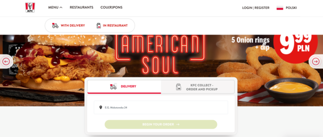
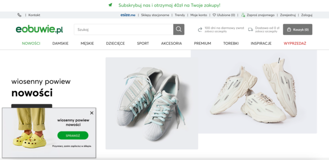
Top navigation is a popular and commonly used website navigation option. It is a horizontal menu bar that sits at the top of the website and typically contains links to the main pages or sections of the site. While top navigation has many advantages, it also has some drawbacks that must be considered.
Pros:
- Prominent placement: Top navigation is prominent on the website, making it easy for users to find and use. It is also one of the first things that users see when they visit a site, and this can help them quickly orient themselves and understand the site’s structure. Most users are used to top navigation as this is one of the most popular web patterns.
- Simple and clean design: Top navigation is often designed to be clean, simple, and unobtrusive, which can help it blend seamlessly into the overall design of the site. This can make it a good choice for sites that prioritise aesthetics and want to create a minimalist look. It also takes less space than alternative options.
- Works well for websites with few categories: Top navigation can work well for sites with few categories, making it easy for users to access the most critical parts of the site.
- It supports the use of ‘Mega Menus’: This type of hover-activated menu works well for complex platforms and is increasingly popular when it comes to e-commerce websites like eBay. If you need to accommodate several different options or show lower-level website pages, a top navigation menu is a good choice. You will also have much more space to show off your product and display adverts.
- It’s more compatible with hover-activated submenus: Drawer-style menus in a left-side navigation format require frustratingly precise diagonal cursor movements. Top navigation avoids this and also prevents blocking out existing vertical panels on the screen.
Cons:
- Users easily overlook it: Because top navigation can blend seamlessly into the overall design of the site, it can be easy for users to overlook it or ignore it altogether.
- Less streamlined for power users: Top navigation will commonly require a larger number of clicks to reach any particular part of the site. This can be suboptimal for power users who prefer to navigate using keyboard shortcuts and other quick methods which prioritise efficiency.
Recommendations for designing top navigation:
- Limit the number of level 1 categories: To make top navigation work effectively, it is important to limit the number of level 1 categories to no more than seven (+/- 2). This can help prevent the menu from becoming too cluttered and overwhelming for users.
- Consider using mega menus if the product is complex: Mega menus can help accommodate more subcategories and create a clearer hierarchy of information, making it easier for users to find what they are looking for. Good use of mega menus can make top navigation even more suitable for complex products than alternative options.
- Consider using 1 / 2 / 3 levels of navigation to organise information architecture in the best way. Remember, however, depending on the complexity of the site, and it may be sufficient to use only 1 or 2 levels of navigation.
- Use clear and concise labels: To ensure that users can quickly understand what each category represents, it is important to use clear and concise labels for each menu item. This can help users quickly find what they are looking for and reduce the need for additional clicks.
When to avoid top navigation:
- Sites with complex hierarchies: If your site has a complex hierarchy of information with two levels of navigation, top navigation may not be the best option. Then, it’s better to choose side navigation, as it provides more space to display the hierarchy.
- Sites with a lot of content: Similarly, if your site has a lot of content, top navigation may not be sufficient to help users find what they are looking for. You may need to consider other navigation options, such as side navigation or a combination of both top and side navigation.
Examples

Understanding the pros and cons of Side Navigation
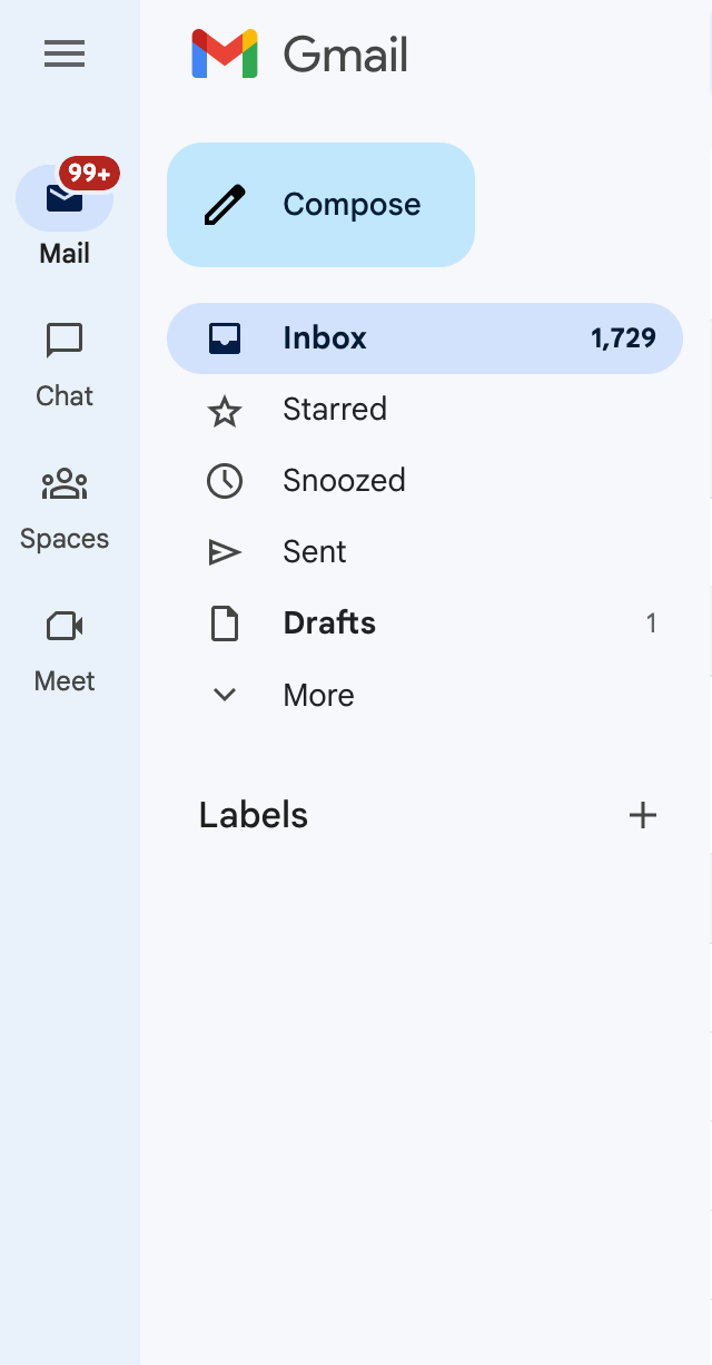
Side navigation is a common alternative to top navigation and is located on the left-hand side of the website. It has several advantages that make it a popular choice for many websites.
Advantages of using left-side navigation:
- It’s easier to scan: Users tend to scan web pages in an F-shaped pattern, and left-side navigation fits naturally with this pattern. By placing navigation on the left side, users can quickly scan the menu vertically, improving speed and reducing visual fixations.
- It’s easier to scale: If your website has a large number of top-level items that cannot be categorised into a few buckets, left-side navigation can be a good option. It allows you to add more items as your product or service options grow without taking up valuable space on the page.
- It supports variable menu structures: Left-side navigation is easy to scale, so if variable menus are important to your users, this is a good option to consider. It can help organise and present complex information in a way that is easy for users to navigate and understand.
- It’s consistent with most desktops: The side navigation pane is familiar to users of macOS and Windows products since the top part of the screen is used for the menu bar. This can make it easier for users to navigate your website and feel comfortable with the interface.
Cons:
- Limited screen space: Side navigation can take up valuable screen real estate, especially on smaller screens. This can make it challenging to present all the necessary information and content on the page without overwhelming users.
- It may be less accessible: For users with motor impairments or disabilities, using a mouse or trackpad to navigate a side menu may be more difficult. It may also be more challenging to navigate for users with visual impairments who rely on screen readers to access content.
- Fewer options with hovers.
Recommendations for designing side navigation:
- Prioritise the most important categories: As with top navigation, it is important to limit the number of top-level categories to no more than seven. This can help prevent the menu from becoming too cluttered and overwhelming for users.
- Use clear and concise labels: To ensure that users can quickly understand what each category represents, it is important to use clear and concise labels for each menu item. This can help users quickly find what they are looking for and reduce the need for additional clicks.
- Consider using icons: If your website has a lot of categories, consider using icons in addition to text to help users quickly identify each item. This can help reduce cognitive load and make the navigation menu more visually appealing.
When to avoid side navigation:
- Mobile-first design: If your website is primarily designed for mobile devices, side navigation may not be the best choice. Mobile screens are smaller, and side navigation can take up valuable space that could be better used for content.
- Limited screen space: If your website has limited screen space, side navigation may not be the best option. You may need to consider other navigation options, such as a hamburger menu or a combination of both top and side navigation.
Examples
![[final] 2022-06-new-sidebar-ui-announcement-in-product-education](/uploads/media/x644/03/2013-2022-06-new-sidebar-ui-announcement-in-product-education.jpg?v=1-0)
What about Responsive Design for Mobile?
Responsive design has become essential for any website, given the growing use of mobile devices. When it comes to navigation on mobile, both top and side navigation may end up being similar to left navigation due to the natural vertical orientation of left navigation. However, it’s important to consider various factors when designing navigation for mobile.
- Simplify the navigation: On mobile devices, the navigation should be kept simple and streamlined. Users have less screen space and less time to find what they're looking for. Therefore, it's essential to prioritize the most important categories and avoid cluttering the navigation with too many options. Consider using collapsible menus and minimising the number of levels in the navigation.
- Make it accessible: It's essential to make navigation accessible on mobile devices. One way to do this is to allow users to interact with the navigation at the bottom of the screen, i.e., a bottom navigation panel. This allows users to easily access the navigation with one hand and eliminates the need for reaching to the top of the screen. Additionally, the size of the clickable areas for menu items should be increased to avoid accidentally clicking on the wrong item.
- Use clear and concise labels: On mobile devices, it's important to use clear and concise labels for each menu item. This helps users quickly understand what each category represents and reduces the need for additional clicks. Consider using iconography and concise language to help users quickly identify each menu item.
- Use visual cues: Visual cues can be used to help users understand the navigation structure and hierarchy. For example, using colour or bolding to indicate active pages or using arrows to indicate submenus. Additionally, visual cues can be used to help differentiate between primary and secondary navigation options.
- Optimise for speed: On mobile devices, speed is critical, and slow load times can negatively impact the user experience. To optimise the speed of the navigation, use lightweight design elements, minimise the use of images, and prioritise loading important navigation elements first.
In summary, when designing navigation for mobile devices, it's important to prioritise the user experience. The navigation should be simplified, accessible, and streamlined, allowing users to quickly find what they're looking for with minimal effort. Additionally, visual cues can be used to help users understand the navigation structure and hierarchy, and the navigation should be optimised for speed to enhance the overall user experience.
Comparing the different structures
Research by Jennifer Rose Kingsburg identified major benefits of choosing a left-hand navigation panel. The study found left-hand navigation faster to navigate and helpful for minimising user navigation. It also leads to fewer cursor movements and reduces selection errors. What’s more, most users in the study expressed a strong preference for a left-hand side primary navigation over a top one.
Overall, the study revealed the preferred navigation layout as left/top/top, followed by left/left/left. The least popular option was top/top/left, followed by top/left/top. Details of the research findings are available here, but here’s a summary:
- Best for fast navigation – left/top/top or top/left/left
- Best overall UX – left/top/top or left/left/left
- Preferred user option – left/left/left or left/top/top
- Best to avoid – top/top/left and top/left/top
Although the outcomes of this study are useful, bear in mind that it was carried out in 2004, so things have evolved since.
The bottom line
When choosing a navigation style, it’s important to choose the one that’s best suited to the context of your product. To summarise:
Top navigation
- Takes up less space
- Prominent on the page
- Appropriate for products without too many navigation options
- Good for general websites, e-commerce sites and web apps without a hierarchical structure
Left side navigation
- Good if your product has lots of navigation options
- Easy to scale and configure to user preferences
- Best for complex apps and websites, admin/desktop apps
- Well suited to products where user customization is important
- Supports a folder/tree structure





![[final] blogImg](/uploads/media/x1328/04/2014-blogImg.jpg?v=1-0)

