Kamil Tatol
-
Jul 17, 2023
How to design an e-commerce site?
Designing an e-commerce site is a task one should not take lightly. We certainly don’t. We know that e-commerce design is a challenge. The e-commerce website has to be beautiful, high-performance, and, most importantly, provide the users with a seamless user experience. It takes a strategic approach to fully realise e-commerce’s potential and drive business results.
The first step is usually defining the user experience. The customers should enjoy using the website and have no trouble accomplishing their goal: making a purchase. That’s why the UX design of an e-commerce site should be based on research. The collected data about the users’ needs, goals, and pain points should drive every design decision. Any features or additional functionalities of the e-commerce website should also be thoroughly checked and researched.
The second step is developing wireframes that outline the structure and layout of the site. They will also show potential paths the users can take and give direction for UI design. At this point, it’s also important to know what the e-commerce website requires and choose an e-commerce platform accordingly (e.g., Shopify, WooComerce, or Magento).
With the basics covered, it’s time to create the UI design for the website. A responsive design approach guarantees that the e-commerce page works on all devices, including desktops, tablets, and smartphones. And a great e-commerce design is simple, clean, and user-friendly, making it easy for the users to navigate the website.
Once we have the design, there’s the matter of the content. Product information should be detailed and offer customers images, description, and price of the product.
The user’s shopping experience can’t be complete without the shopping cart and payment and shipping options. Adding products to the cart or simply viewing it should be easy. The same goes for checkout – customers should have no problems moving to the choice of payment and shipping.
After all that, all that is left is testing and launching the site. That’s when the marketing team takes charge of encouraging all potential customers to use the new e-commerce website to do their online shopping.
Why a thoughtful e-commerce design is essential?
In e-commerce, user experience is what makes or breaks the site. If the page is easy to navigate, users find the products they’re looking for with ease and have no problem figuring out how to buy them, which means that the e-commerce design is effective. However, if they can’t work out how to use the e-commerce website, find the products they want, or successfully go through the checkout process, it will lead to abandoned carts and smaller traffic.
The e-commerce page is often the first time a potential customer interacts with the brand, and as a result, it can make all the difference. If the e-commerce design is successful, it elevates the brand. It shows the customer its personality and values, and when aligned with a positive shopping experience, e-commerce design builds brand loyalty and encourages the customers to return.
If the e-commerce website works and the design makes navigating the page easy for the user, it automatically seems more trustworthy. Trust can’t be bought in a traditional sense, but you can buy e-commerce design and development services that will bring the credibility you want for your brand’s reputation.
Finally, a thoughtful e-commerce design drives the business results, which you can see in the increased conversion rates and higher revenue. When the e-commerce page looks good and works well, a potential customer is happy to place an order.
How to make a website beautiful and well-performing?
The goal of every website is to be visually appealing and well-performing, and it is no different for an e-commerce page.
1. Create a positive user experience
For a positive user experience, add intuitive navigation. Understandable labels and navigation enable your users to quickly find whatever they need on the e-commerce website. Your call-to-action links and buttons (e.g., a buy button on a product page) should be clear so that users can easily do what you want them to: create an account, add a product to a shopping cart, or pay for their order. And don’t forget to add a search bar to make sure the users can easily look for things they need.
2. Prepare a clean and visually appealing design
The design is crucial; the user’s first glance decides whether the first impression is good or bad. If the visual aspect is to the users’ liking, they’re more likely to give the business a go. Use a clean, aesthetically pleasing design to make the e-commerce page worth a dive-in. This means using a simple layout, clean lines, easy-to-read fonts, and high-quality images.
The e-commerce design should still be in line with the one of the brand. So across all pages and other digital touchpoints, the colour palette and typography should remain the same.
3. Include high-quality product images and descriptions
Quality pictures showcase the products better, and detailed descriptions inform the users. The users are more likely to engage with a website with quality content where they feel their buying decisions are more informed.
4. Optimise for speed
The speed should be your priority – no one likes to wait for the page to load or to add something to their shopping cart. Speed and convenience are also why people often choose online stores instead of traditional ones. Website performance is a big part of user experience and helps with SEO, leading to happier customers and a bigger audience. Your website will perform better if you use a content delivery network (CDN), optimise pictures, and minify the code.
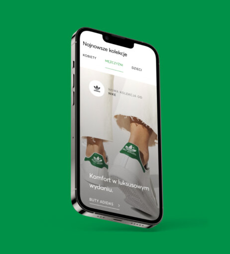
5. Ensure that the website is mobile-friendly
These days, most customers shop online on their mobile devices, so it is crucial that the e-commerce website also works on a smartphone or tablet. That’s why any e-commerce design should be responsive and adjust to any screen size.
6. Offer multiple payment options
Not every website needs multiple payment options, but every e-commerce should have one. It makes the checkout process more convenient for the customers and leads to more conversions for you. The most popular options are credit cards, Apple Pay or Google Pay.
7. Give social proof
Social proof is something that most e-commerce pages benefit from; it’s the service or product reviews from other customers that make the page look more legitimate and increase the customers’ trust.
8. Test the website
Beauty may very well be in the eye of the beholder, but performance is measurable. Take advantage of tools like Google Lighthouse, PageSpeed Insights, or WebPageTest to see what issues may be there and solve them before they become a problem for your customers. Use the stats to improve your website and optimise it for better performance.
E-commerce design tips
We already mentioned some of these design tips, but we will give them all here, served together on a silver platter.
Intuitive navigation
We mentioned the navigation, but we’re not afraid to repeat ourselves in this case. The user needs to be able to move around your e-commerce page as easily as possible, and clear navigation is key to that. Make sure that each product has a category and a subcategory if needed and that the categories are understandable (a great way to ensure that is to conduct card sorting, as we explained in our Digital 101).
High-quality pictures
Any pictures or images you want to use on your website should be high quality and optimised for fast loading. If you’re selling a tangible product, photograph it from all angles to give users a better look. If you have a large number of products, make sure each has at least one picture on display.
Clear calls-to-action
Any call-to-action button on your website should encourage users to take a specific action, e.g., buy a certain product, add a product to the cart, or complete a purchase (you can read more on writing microcopy in our article “What is microcopy?”).
Easy checkout process
The easier and faster it is to buy something on the e-commerce website, the better. Streamlining the checkout starts with simplifying it, preferably to a one-page process.
Branding
The e-commerce design should be unique – that can only happen if the design is consistent with your branding. E-commerce design may be similar across different online stores, so how your brand stands out will make your e-commerce stand out as well.
Accessibility
Accessibility in the digital world is now a necessity. Anyone can come across your website, including people with disabilities. They may not be your target audience, but an accessible website benefits all users. We talked more about accessibility in the article on WCAG, but for the e-commerce, you should stick to the following:
- add alt texts for all pictures,
- ensure the website is keyboard accessible,
- use clear and simple language,
- offer sufficient colour contrast,
- provide captions and transcripts for audio and video content.
Responsive design
People should be able to enter and use your e-commerce page regardless of their device. Responsive design ensures that the screen size doesn’t matter; the e-commerce design of your website remains intact for every desktop, phone, or tablet screen.
Best examples of e-commerce design
Fashion
Muscat

Muscat is a Polish retail brand selling high-quality designer eyewear. We redesigned their website to the eye-catching e-commerce design you can see now and developed a new tool allowing customers to try on glasses in an online fitting room.
Health and beauty
Hebe

Hebe is the leading beauty brand in Poland for whom we created a beautiful e-commerce platform. Our design makes shopping and exploring beauty products easier than ever.
Food and grocery
Grocery: delio

Delio is an online grocery shopping app that launched in 2022. We designed their e-commerce mobile app – a benchmark for any company looking to join the online shopping industry.
Food delivery: KFC

For KFC, we redesigned their entire digital ecosystem: kiosk, app, and website. Their new website has consistent product listing pages and product tiles, and with improved user experience came higher sales across five key European markets.
Household goods
Biedronka Home

Biedronka is a Polish discount retail giant that decided to extend its offer and sell household products. As partners of Jerónimo Martins, which owns Biedronka, we were asked to build an e-commerce platform for Biedronka. We gave the brand a significant refresh and created a homepage encouraging users to explore the digital shop.
Entertainment
Empik bilety

Going is part of Empik Group, an entertainment and lifestyle leader in Poland. We prepared for them a beautiful app with a daily calendar of cultural events where customers can buy tickets to the most interesting events happening in Poland’s major cities.
Design examples
Homepage design
eobuwie

The design of eobuwie’s homepage is vibrant and easy to navigate. It elevates the brand and allows for over eight thousand customised looks while displaying a full range of products each time.
Biedronka home

Biedronka home’s homepage shows that the user has been at the front and centre of the design. It opens with an engaging hero section, a clear CTA, and concise information. The design encourages the users to explore the offer and makes shopping an enjoyable experience.
Listing page design
KFC

The design of the listing page is consistent across all channels – website, mobile app, and kiosk. The users can easily switch between categories and look at the menu while browsing their dish options. The cart only appears once the products are added.
Product page design
Muscat

When users wish to buy eyewear from Muscat, even when they’re simply browsing, they can get a good look at the product on the listing page. Once they move to the product page, they can see the product from all angles and even try it on in the digital fitting room we’ve created.
Cart and checkout design
KFC

We delivered consistency across all channels for KFC so that chicken lovers could have the same positive experience regardless of where they order: a mobile app, a website, or a kiosk. That’s why the cart and checkout look similar on each digital touchpoint. All it takes for them is to order just once to be able to use any other channel to buy their favourite chicken. Adding products, removing something, going back to the previous screen – all of those actions are easy for the users.
Park of Poland

In the world of Polish largest and most enjoyable water park, the cart and checkout are called Ticket Creator. We designed the Ticket Creator according to the users’ needs. They can easily change tickets, add accommodation if needed, and choose anything extra they want for their stay. They have an overview of every step and how many of them are to get to checkout. If they don’t need an overnight stay or don’t want any upsells while buying the ticket, they can easily skip those steps and go straight to payment. Purchasing tickets to tropical paradise has never been easier.
Summary
The e-commerce website is often the place of the first interaction between the customer and the brand. Making a good first impression is crucial, so the design must be visually appealing. However, ultimately it’s all about upholding this impression, and you can only do that with the excellent user experience of the whole page. Good e-commerce design takes care of that and can turn any first interaction into a meet-cute the customer won’t forget.
Need a partner to design your e-commerce website? Contact us, and let's unleash your digital potential together.