Maciek Owsik
-
Apr 02, 2024
-
15 min read
Introduction
In the UX design industry, there are certain principles. Still, at the same time, some patterns are, let's say, against those principles and are considered not so ethical, let's say it this way. Namely, we are referring to dark patterns in UX design. Those patterns refer to manipulative elements that trick users into taking actions they may not intend to take. In this article, we will show you one of the most famous dark patterns, explain why you should avoid them, and explain how to do that in your next projects.
Sneaking
This dark pattern, often called obstruction, focuses on including a secondary option in the middle but often at the end of a primary action. For example, hidden costs. Let's imagine a hypothetical situation where you are buying something online. You added everything to your basket and are now ready to pay. When you pay, you visit your bank account and notice that you spent more than just the product's price. Why? Well, as we already mentioned, some companies use this pattern and hide such options at the end of a primary action: buying a product. So, probably at the end of your basket, written in a small font, there was information about additional costs. Those costs are probably minimal, and if you were informed about them, you would probably still buy the product. But, since they hide it, you may feel a bit cheated.
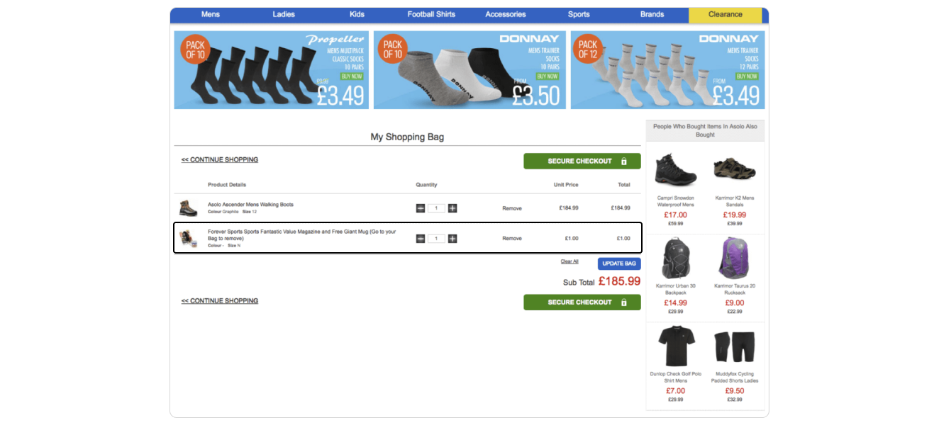
Another example is that companies used to add products to their customer's baskets without their knowledge. Of course, those products were very cheap, but they also were totally out of the client's interest. For example, imagine buying clothes and ending up with a one-dollar mug in your basket. You do not want it, but the company needs to sell it, so they hope you will not notice it and buy the additional, magically appearing product.
To avoid it, remember that if there are optional add-ons or extras, users should be asked explicitly if they wish to include these in their order. This should be a clear choice, not a pre-selected option that users must opt out of.
Additionally, if a promotion or special offer includes adding a product to the cart, explicitly ask users for confirmation before doing so. This ensures that any additions are genuinely desired by the customer.
Roach Motel
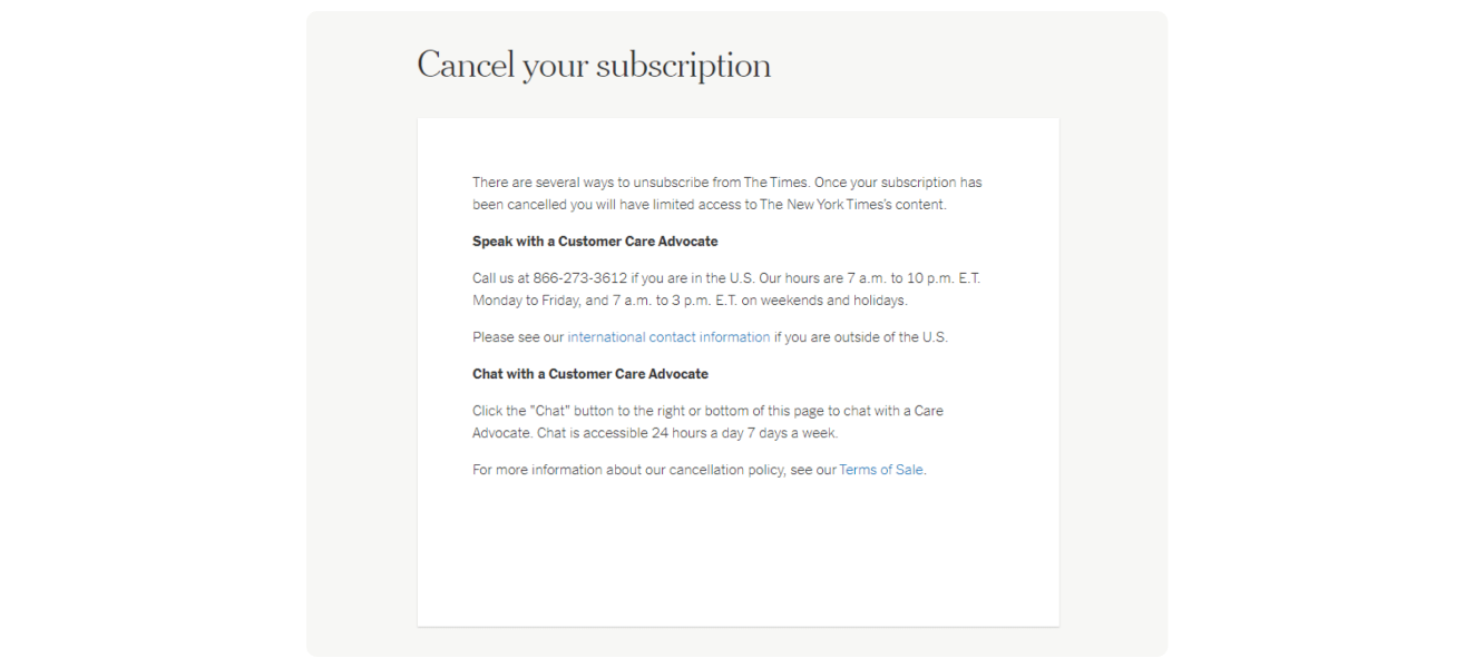
Now, it is time for a very tricky pattern that most of you have probably experienced on a daily basis on some of the most popular apps in the world. This pattern works this way – actions that benefit the company are intuitive, pushy and way easier to go through. On the other hand, actions that benefit the user are complex, tedious and ambiguous. Let us dive into an example now. You bought a premium subscription to your favourite video streaming app, but after a while, you decided to cancel it and save some money. The roach motel now kicks in because, as you probably will notice, it is way more challenging to find the "cancel my subscription" option than it was to find the "buy subscription" option. It is exactly how this dark pattern works. Unfortunately, there are no tips for users on how to avoid this pattern, but the only thing we can say is to not give up on looking for those options because they must be there; sometimes, they are hiding at the end of the page in the smallest font possible and with the font colour similar to the background, but still, the option is there. Even so, there are no tips for users; you already know there are tips for designers on avoiding them. So, let's dive straight in.
First, you can make the cancellation or opt-out process straightforward, with as few steps as possible. Avoid unnecessary hurdles, such as requiring the user to call customer service when they sign up online.
Moreover, consider offering a simple confirmation step when users decide to cancel or change their service level. Provide them with clear information about what will happen next, including any changes to their service or potential data or functionality loss.
Nagging
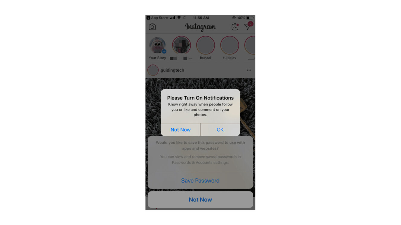
Have you ever met someone who didn't take "no" for an answer? Well, most of us have probably dealt with this type of people. This is precisely what nagging is; for example, when you are using your favourite app, and out of nowhere, you receive pop-up notifications with offers on premium subscriptions or newsletters without allowing you to refuse permanently. You can not do that permanently simply because they replaced the word "no" with "not now", "maybe later, etc. This pattern often results in users just giving up and accepting those conditions because the app kept nagging them once or twice a day for a couple of days straight. It is so irritating that for some users, it is better to pay the fee than to see those notifications, and that's also the goal of this dark pattern.
To avoid implementing this pattern into your designs, there are two main things you should do. Firstly, it provides clear and straightforward options for the user to accept or decline the offer.
Also, instead of pushing offers through frequent interruptions, focus on demonstrating the value of your premium subscriptions or services through the natural use of your app. Use contextually relevant moments to highlight features that users might be interested in based on their app usage patterns.
Misdirection
Using visual or text content that is ambiguous, vague or even has the opposite of the desired outcome is the definition of a misdirection pattern. An example? Not a problem. Let's stay in the hypothetical situation of the subscription I already mentioned. You found out that the company charged you, and now you want to cancel your subscription. At the moment when you are on the cancellation page, you can see a button with text saying "cancel", but this button may have two meanings. You see, "cancel" might mean that you want to cancel your subscription, but it might also mean that you want to cancel the cancellation. It is tricky even if you are just reading about it, but that is precisely why you should always be focused and read the website pages carefully. If you do not do that, you will probably get frustrated because you will have to go through the same processes multiple times.
So, to avoid misdirection patterns in your designs, remember to ensure all text, especially on the buttons or instructions, is clear and unambiguous. Also, all buttons and links should be designed so their function is immediately apparent, avoiding designs that could mislead or confuse users about their purpose.
Fake Urgency
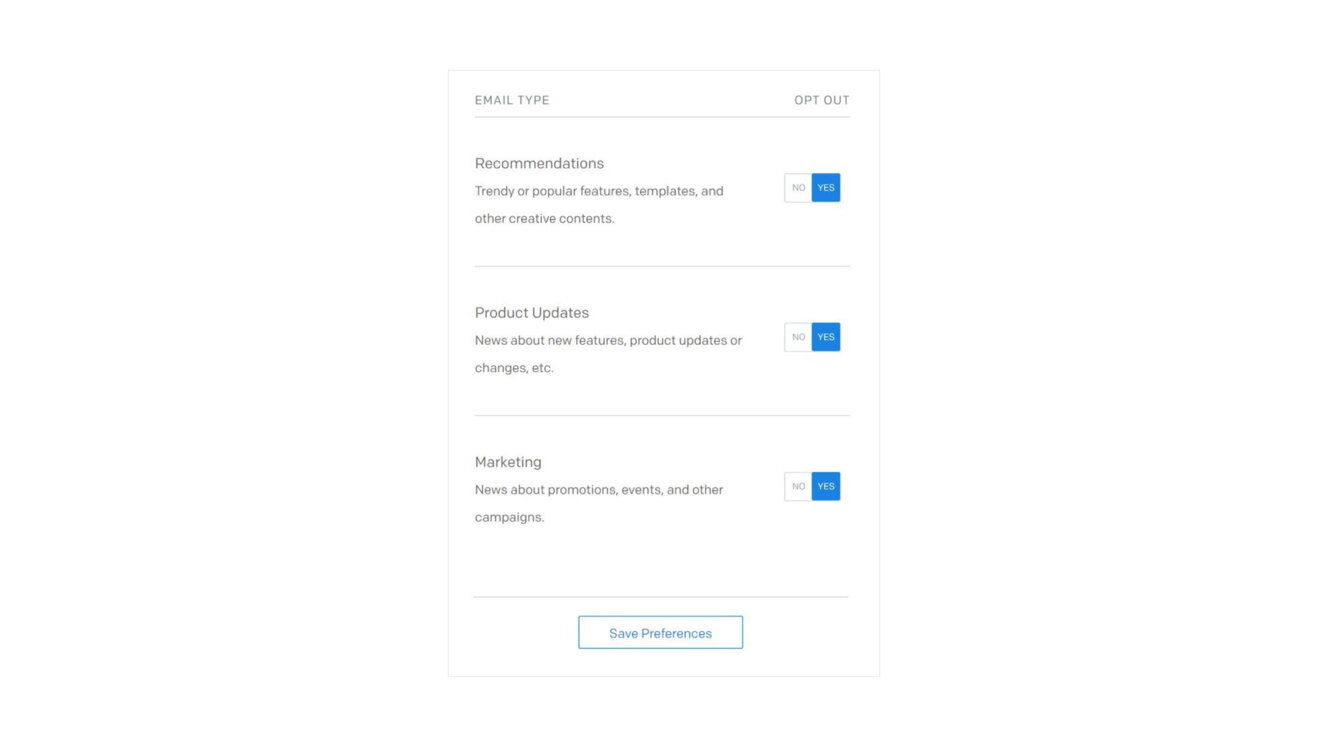
What is crucial to remember is that dark patterns prioritise the company's interests over the users'. Here, companies use manipulative language and emotional triggers to make it seem like urgent notifications are valuable to the users. It might be seen most often on social media platforms, which use it to create a fear of missing out by hinting that something is happening within the app without providing any details.
If you receive a notification that says "waiting for you: 3 updates", "Your friends miss you", or anything like that, you will know that those are examples of the fake urgency pattern.
It is a common pattern nowadays; however, it is better to avoid it or fix it if it is already in your designs. To do so, remember that if promoting a limited-time offer or event, ensure that the urgency is based on true scarcity or a genuine deadline. Clearly explain why the offer is time-sensitive, such as an event date or a sale ending, and provide transparent details about availability.
What is more, instead of using urgency as a hook, focus on providing value through educational content or informative updates. This approach builds a positive relationship with users, encouraging engagement without pressure.

Confirmshaming
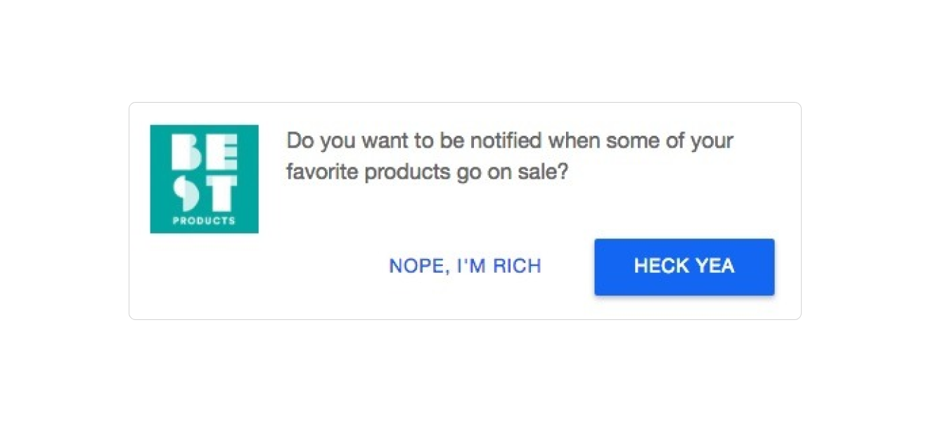
One of the most common dark patterns – based on emotional blackmail to persuade people to confirm or stop actions from taking place. It is completely normal to ask your users if they are aware of and wish to proceed with their decisions, but sometimes, the wording and the way that it is presented can quickly turn into a dark pattern. Let's imagine that you are visiting a website with e-commerce solutions. The very first thing you see is a big notification with an advertisement for a book on "The best e-commerce practices for every business owner", for example. You can receive this e-book by sharing your email address with the website, but if you do not want it, you have to click on the button saying "I don't read". At this moment, your emotions kick in because you probably do read, but this e-book is not in your interest. That is exactly what confirmshaming looks like.
To not emotionally blackmail your users, remember to provide clear, neutral language for opt-out or negative options. This respects the user's choice without attaching negative connotations. Moreover, you can encourage positive engagement by highlighting the benefits of the offer without demeaning those who choose to decline. For example, "Sign up to receive our free e-book on e-commerce best practices" can be followed by a simple "No thanks, maybe later."
Preselection
Preselection is a type of dark pattern where users are not enticed or manipulated into taking action. Instead, the platform has already "pre-selected" these actions for them. This pattern is used for actions that benefit the company and that users would not typically choose on their own. It's very similar to the roach motel pattern, and we can often see them together.
Even so, it is very similar to the roach motel pattern; let's focus on things you should keep in mind in order to ensure that this pattern will not appear in your designs.
Avoid pre-selecting options that incur a cost or subscribe the user to services, newsletters, or other commitments. Users should actively choose to opt into additional offerings by making a conscious decision rather than having to opt out of pre-selected choices.
Preselection can sometimes be beneficial for users. If they have to choose an option to go further in the process, and it doesn't require any form of cost, you can select the default choice. Thus, you decrease cognitive overload by overcoming decision fatigue.
Bait and Switch
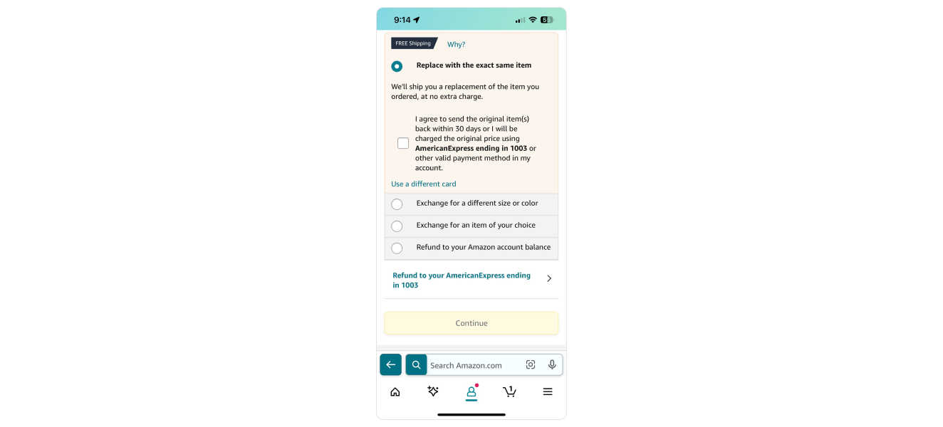
Have you ever been in a situation where you found a perfect product for yourself, and it was even on sale, but then it turned out that the product was suddenly unavailable? What is more, then you probably received an offer for a completely different product, right? That is exactly how bait and switch patterns work. The "bait" part shows you the product you are interested in on sale, but it turns out that it is unavailable (the company knew that from the start). After this part, the "switch" part comes in. Namely, it shows you completely different products with the hope that you will buy them instead of the ones you initially wanted to purchase.
Unfortunately, there is no easy way to overcome this from the user's point of view because they will only notice it if they click on the product, so basically, only when they get tricked into the "bait" step.
Fortunately, there is an easier way to overcome this from the designer's point of view.
Clearly state the terms and conditions of sales and special offers, including availability periods and stock limits. This reduces misunderstandings and builds trust with customers.
Also, if a customer engages in a promotion for a specific product that turns out to be unavailable, consider extending the offer to a similar product or providing a discount on a future purchase. This goodwill gesture can help maintain a positive relationship with the customer.
Disguised Advertising
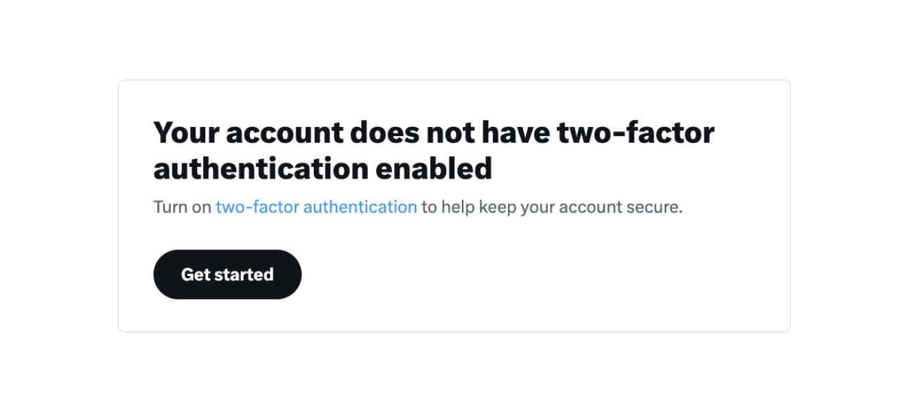
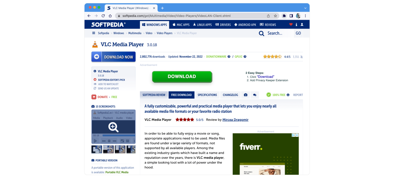
Have you ever encountered an advertisement that looks like real content and not necessarily like an ad? That is exactly what disguised advertising is – it tricks users by making it hard to tell the difference between real content and ads. These ads might look like a part of a website's normal buttons, interesting articles, or other stuff you would want to check out, tricking you into clicking on them. Discovering that what appears to be genuine content is actually a disguised advertisement can erode trust between the user and the platform, as users may feel deceived.
And you, as a designer, can not let that happen. So, in order to avoid it, clearly define a separate space where all the ads can be placed. Also, clear and unambiguous labels like "Sponsored Content" or "Ad" should be used near the paid content and advertisements.
Forced Continuity
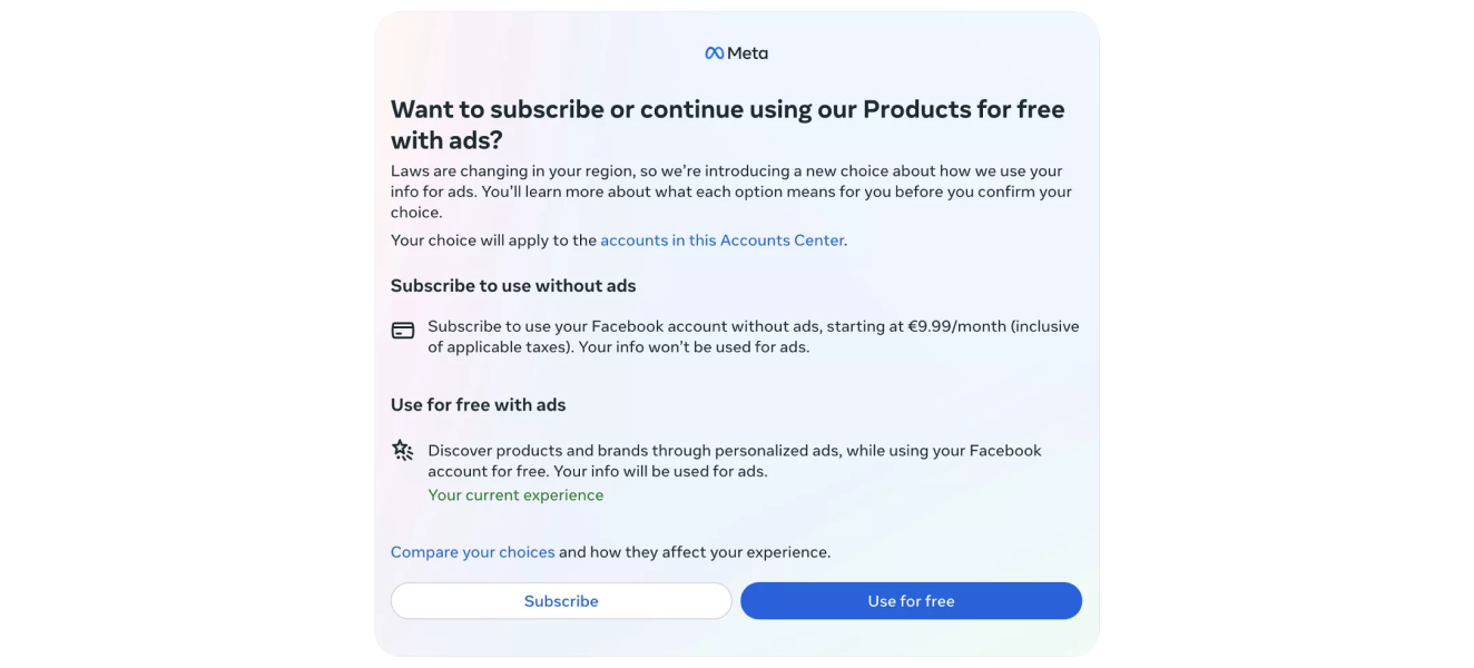
If you are a UX designer, you probably know how crucial it is when designing a product to give the user control and freedom over the actions taking place on the platform, right? Especially when it comes to their billing information or personal data in general. This pattern is the exact opposite of control and freedom. Basically, it is all about manipulating the user into giving, for example, their billing data, often promising a free trial if they share this type of information. After a certain amount of time, the company will start charging a recurring bill or subscription. They do that often after a month or two, when the user has already forgotten about the free trial they signed up for, giving them their billing information. You usually see manipulative sentences in this pattern, such as "You don't have to pay anything now". Those actions are a prime example of taking away the user's freedom and control over their actions.
However, there is an easy way for companies to fix this: simply by sending an email a couple of days before the end of the free trial. This way, the user has control and can decide whether or not they want to pay and extend the subscription.
The other good thing to fix this pattern is offering an optional feedback form to users who cancel their subscriptions after a free trial. This can provide valuable insights for improving the service and user experience.
Summary
While dark patterns may offer businesses short-term gains through increased engagement or sales, they are detrimental in the long run. These manipulative tactics erode trust, damage brand reputation, and can lead to legal repercussions. They exploit user psychology for immediate benefits but at the cost of customer loyalty and satisfaction. On the other hand, making ethical decisions fosters a positive relationship with users, builds trust, and enhances brand credibility. Ethical practices contribute to sustainable business growth by promoting transparency, respect, and a genuine understanding of user needs. In the ever-evolving digital landscape, where user awareness and regulatory scrutiny are on the rise, prioritising ethical decision-making over dark patterns is not only morally right but strategically advantageous for long-term success.


